Visits to Birmingham Art Galleries 04/05/19
Having not yet visited any art galleries for research, I went to Birmingham city centre on 04/05/19 and intended to visit three galleries whilst I was there.
I began with the Birmingham museum and art gallery which I had not been to for years. As well as the many paintings, I wanted to see the “Too Cute!; Sweet is about to get Sinister” exhibition as well as the work of contemporary artists. The “Too Cute!” exhibition was fascinating and I saw the use of various media and it was very inspiring.

Some of the exhibits were certainly creepy and did provoke feelings of childhood nightmares.


I moved on to the exhibitions of contemporary artists and found it very interesting.


The above painting was by an artist named Patrick Hughes and is “Superduperperspective” (2002). The piece was an oil on board construction of paintings in a gallery, Hughes created thee-dimensional paintings which appeared to shift and move as your head moves to view it. At first glance from the right hand side where I was standing the painting appeared flat but as I slowly side stepped to look, the painting did move and it was such a strange sensation like the brain could not process what I was seeing. I liked how it was so clever and precise.
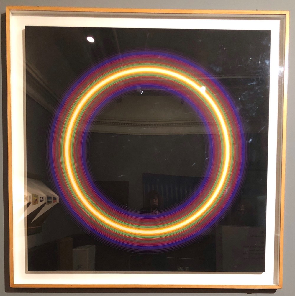
Peter Sedgley “Cycle” (1965)
This painting was done using acrylic paint and was created with the emphasis of the soft edged concentric circles pulsing with light and colour with the colours being main focus, again the effect changes when you move around it.
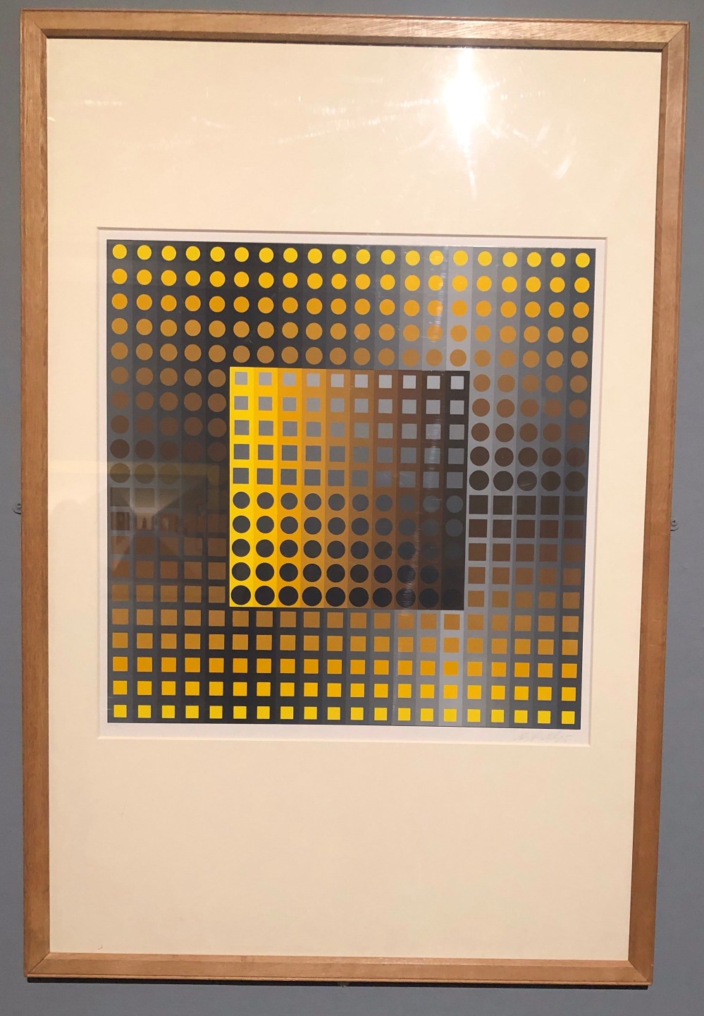
Victor Vasarely “Permuatations” (1969)
The above screenprint again an optical effect piece, Vasarely was considered to be one of the originators of optical art, having begun experimenting with optical patterns in the 1930s, he was influential in the development of geometric abstract art. I particularly liked this piece as it reminded me of Assignment 2 Collage “Stripes and Spots” and what I was trying to create for the exercise. I could see how having a background of differing tones of the same colours could be used to great effect and I enjoyed looking at this screenprint.
I moved onto the museum section for Ancient Egypt as it is a time in history which has always interested me as I liked to see how advanced Egyptians were compared to other groups in society.
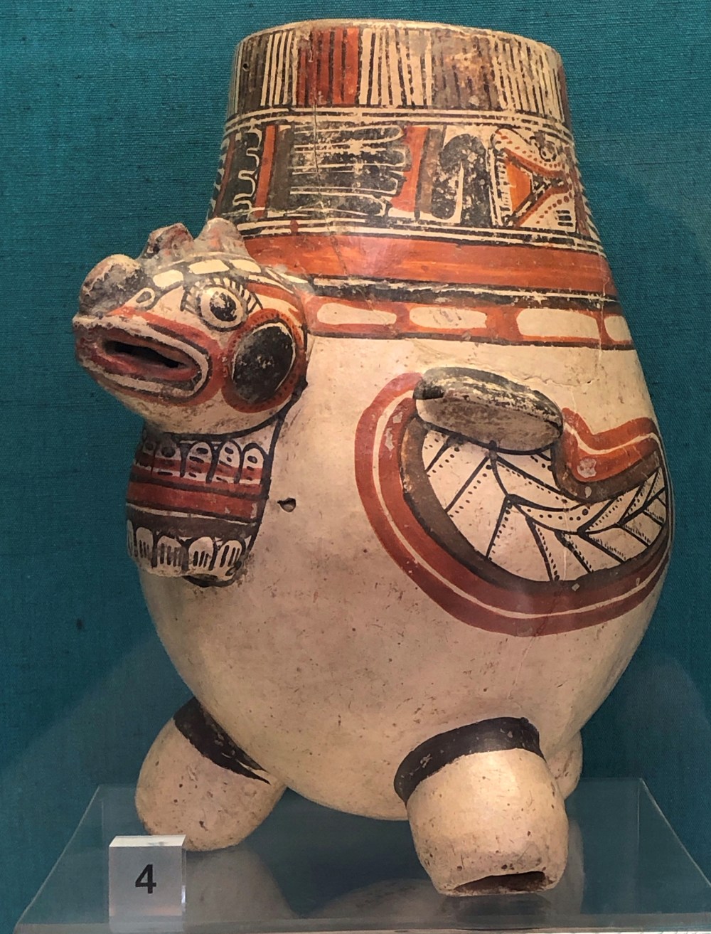
Nicoya ware vessel (750 – 1000 AD)
This tripod vase showed such beautiful marks and I liked the detail of the marks and the colours used.
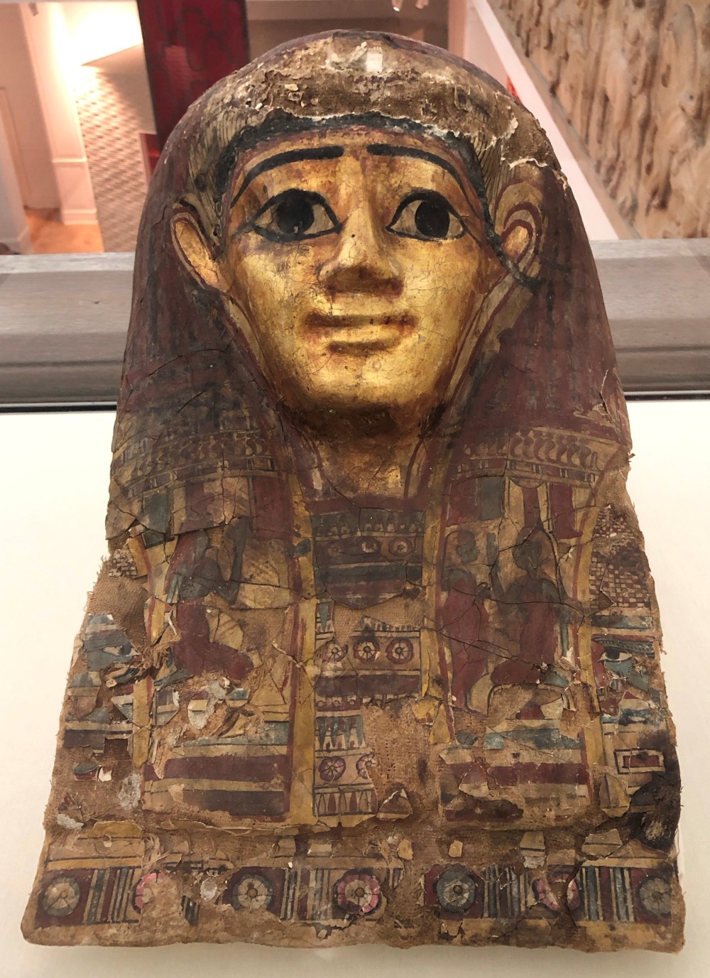
Funerary Mask (Late Period 664 – 332 BC)
This mask would have been used to be worn over the wrapped head of a mummy and was to protect the head of the deceased and also when the spirit of the deceased left the body in the tomb as believed by the Egyptians, then the spirit would be able to recognise its body from the face of the mask. The detail on the mask is incredible with the varying patterns and symbolic characters as well as the use of ancient language.

Stone vessel of various types (Middle New Kingdom 2000 – 1000 BC)
This bowl had been carved out of stone and the surfaces on it were perfectly smooth, I loved the colours and texture which the bowl was made from as it really showcased the stone and again reminded me of mark making and collage.
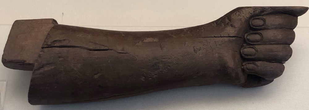
Arm from a wooden statue (New Kingdom 1500 – 1100 BC)
This arm was carved from wood and I was surprised how accurate the detail was and how well the arm was preserved. As good quality wood was so scarce in Egypt, large objects were often made in several pieces to avoid waste.


This mummy fascinated me and was possibly my favourite item on display in the museum as the bandaging was so intricate. Bandaging from the 21st Dynasty gave more emphasis on the elaborate full effect than preservation of the body within. The bandaging was held in place with gilded terracotta studs. I found the delicate bandages to be so beautiful and complex and it gave a three dimensional effect to the overall look.
I took a close up photo as I wanted this to be in my mind for Assignment 3 Fabric Manipulation of the course.


I moved upstairs to the exhibition of “Birmingham: its people, its history” as my father was born in Birmingham and was a small child when World War Two took place. The exhibition had artefacts from the war years and times of austerity. I particularly liked some of the vintage clothing on display as I really love dresses and clothing from the 1920s and 1930s and have a small collection of clothes from that era.


I like patchwork and in particular crazy patchwork where random shapes of fabric are sewn together. The hand stitching on the housecoat was both delicate and perfect and made a real feature of the coat.


The above dress is a tennis dress from 1910. I really liked the embroidery detail and it stood out from the rest of the dress as it was so bold in size and shape. The dress was very flattering in its shape but it must have been difficult to play tennis in.
I also viewed some pieces from the Industry section of the gallery and particularly liked the display of tile panels from the 17th century, handpainted and thought to be Syrian. The colours and styles made me think of pattern repeat blocks and I was drawn to the skill and detail of the tiles.


The next art gallery I visited was the IKON contemporary gallery which features artists from around the world, showing a variety of media including sound, film, photography, painting, sculpture and installation.
At the time of my visit the IKON was displaying the work of Hew Locke and the exhibition ‘Here’s the thing’ showed a variety of his work. The installation below entitled ‘The Nameless’ was comprised of cord and plastic beads and filled the room. The installation was of a marching band with part human and part animals playing instruments. The art’s theme was centred around death and the cliché of global conflict and did remind me of the Dada movement in its theme of portrayal of war.


In the same exhibition, Locke had his works ‘Souvenirs’ (2018-19) which consisted of porcelain busts of Royal family members which were adorned with found objects and materials, I found these fascinating to look at as they were so detailed and also represented the theme of the slave trade.


I also particularly liked another exhibit ‘House of Windsor’ (2002 – 08) which was a portrait encased with a variety of plastic toys and jewellery. The theme Locke was portraying here was a response to globalisation and the proliferation of cheap goods transported by sea in the 1990s. Locke quoted his observation of the piece as “I like how it looks. It is aspirational – in that I try to take out the cheapest thing that I can find and work with it to make it look precious. The irony here is that the material I am using – such as the golden plastic toy weapons and jewellery – are trying to look expensive.”
For me this was possibly my favourite piece as since having my youngest son I have been more aware of the proliferation of cheap single use plastics and also the amount of plastic childrens toys on sale, such as the currently fashionable LOL Surprise miniature doll sets which due to their popularity have spawned a whole host of other miniature toys and figures. I have often wondered what will happen to all these products when children tire of them as they will certainly end up in landfill as they cannot be recyclable in any way.


The final piece which I viewed was an installation entitled “Armada” (2019) and was an installation of ships either built or customised by Locke. The attention to detail here was incredible and fascinating as the ships were so varied to reflect the theme of the current refugee crisis and also the vast history of human migration. I liked the use of textiles in this installation and how delicate the stitching and fabrics used were, the whole piece was so dramatic.


The third gallery I visited was hosted by Birmingham library which was a building I had not visited before and was a exhibition by artist Ian Andrews entitled “The Sketchbook and the Collider: Collision Event” and the theme was about drawing links between fine art and particle physics. I was particularly interested to see this exhibition as I have been trying to learn more about sketchbooks.


I was very intrigued by the use of partially assembled boxes and screwed up paper which were also used as part of the sketchbook and this was highly effective and helped me see that a sketchbook does not always need to be a flat piece of work. There was a series of framed drawings entitled “Collapse of the Wave Function” which were created from layers of fine and delicate tissue paper, similar to the paper used in dress patterns. Each layer had fine ink details and was built up to portray movement and I liked this concept.


I thoroughly enjoyed visiting all three galleries and can see how important it is to conduct this kind of research as it is so relevant to the textiles course.