Part 4 Sketchbooks
Feedback from tutor
I was genuinely very pleased to have a lot of positive feedback from Assignment 3 and I felt I was finally beginning to get to grips with Textiles. I had really enjoyed making the natural dyes and using them within the colour palette I had chosen and my tutor commented that I was “developing “research via making”” via “the experience of making to inform your next steps”. I think it is important for me to make more of “happy accidents” as I would term them as literally spilt dye or fabric falling onto the floor in a random way has actually made me see an idea which could have otherwise been ignored.
I had produced a knitted sample from strips of black bin liners and my tutor had commented that this was “very effective” and that this could be continued on bigger needles. It is certainly a concept that I had in mind for my final assignment as I wanted to produce a large piece of work regarding the theme of plastic pollution in the ocean. I was happy that I am at last “taking risks” regarding my work. I was also pleased to receive good feedback on my use of both hand stitching and machine stitched regarding samples, particularly the hand stitched work as I have had to realise that within textiles it is not important to be neat but more to express freedom.
My tutor discussed the need to “develop further the links that you are making with both primary and secondary research enquiries by including images adjacent within your online log and sketchbook”. This is certainly food for thought as I don’t feel I am using my sketchbook enough and of a high enough quality, to me my sketches have looked more like cartoon type drawings and with mostly single pen lines when the sketches need to be graphically more flowing and convey movement and texture investigation. I have found that I enjoy continuous line drawing and I should be concentrating on this as a theme a lot more. Having images next to sketches or samples can be more thought provoking, plus sketching some of the samples does make much more sense to me. I do also need to take my sketchbook out with me all the time to capture things of interest that I often see and only take photographs of. I had visited castle ruins last summer and had taken many photos of the carvings of names and dates in the stone walls of the castle and these fascinated me, as well as where and how some of the sandstone bricks had deteriorated and decayed, a sketchbook and pencil would have produced more insight into this as well as ways I would have been able to convey this into a textile sample, such as drawing with machine stitch some of the carvings and their details.
Exercise 4.1 Making a sketchbook
Stage 1 Preparation
I created the two sketchbooks as required in the course materials and liked this approach. I was lucky enough to have done a sketchbook day course in Kent with Cas Holmes recently and I learnt a lot from Cas about making a concertina sketchbook and how to use it. Cas took us to a local graveyard and explained about positive and negative use of the pens and pencils and also took time with each course participant to give one to one advice. I learnt first of all that I was holding my pencil all wrong and needed to hold it further up and not like holding it to write with. Having drawn on one side of the sketchbook, we then used collage to create different surfaces to draw on and I was surprised by how effective this was. It totally changed my way of thinking and we returned to the graveyard to sketch on our customised work. I quickly found that this gave a very different perspective and a better quality of drawing rather than on a flat piece of paper. I have often been frightened to draw on a page of white paper in case I do it in the wrong way but working on different textures really opened my mind to new ideas and was a confidence boost.
Cas gave me a greater understanding of how to construct and use a sketchbook and so I feel this will be of great benefit for the future, I have a better knowledge now and don’t feel as critical of my style of sketching and interpreting what I am drawing and that it does not necessarily need to be a Da Vinci or perfect to convey a subject matter. I think this can be the barrier when distance learning as it is not always easy to know what is required from an exercise, whereas someone standing next to you and pointing out areas which need more detail or improvement and how to actually hold tools makes such a difference. We were given information to take away and naturally we all demanded to have photos taken with Cas Holmes at the end of the workshop and so here I am with my very favourite artist holding my work.

Stage 2 Drawing from memory
Following the course materials I took my first sketchbook and decided to draw a trip to the local farm shop from memory using a wooden coffee stirrer and a cork and black ink. I drew from several different perspectives to try and show places on the journey that were closer and then farther away. Using the wooden stick this time was much easier as I quickly got used to it and found that I could use it at different angles for very thick and thinner lines and with more control than Part 1. I was happy with the effects for this and it helped with my confidence with drawing, plus I liked drawing a long line of sequences in a scene. I was particularly pleased with the effect that the cork made in the creation of trees and bushes along the route as this was something I would not have achieved using a pen.
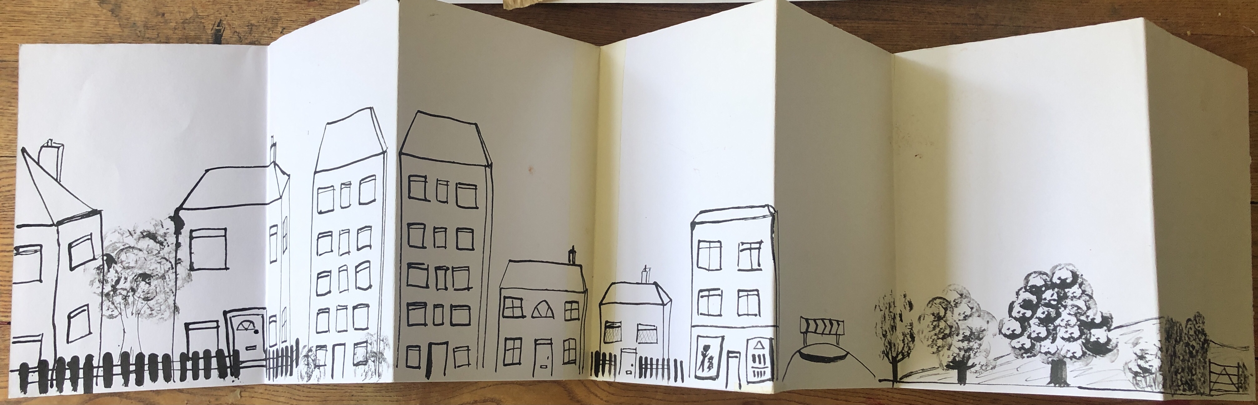


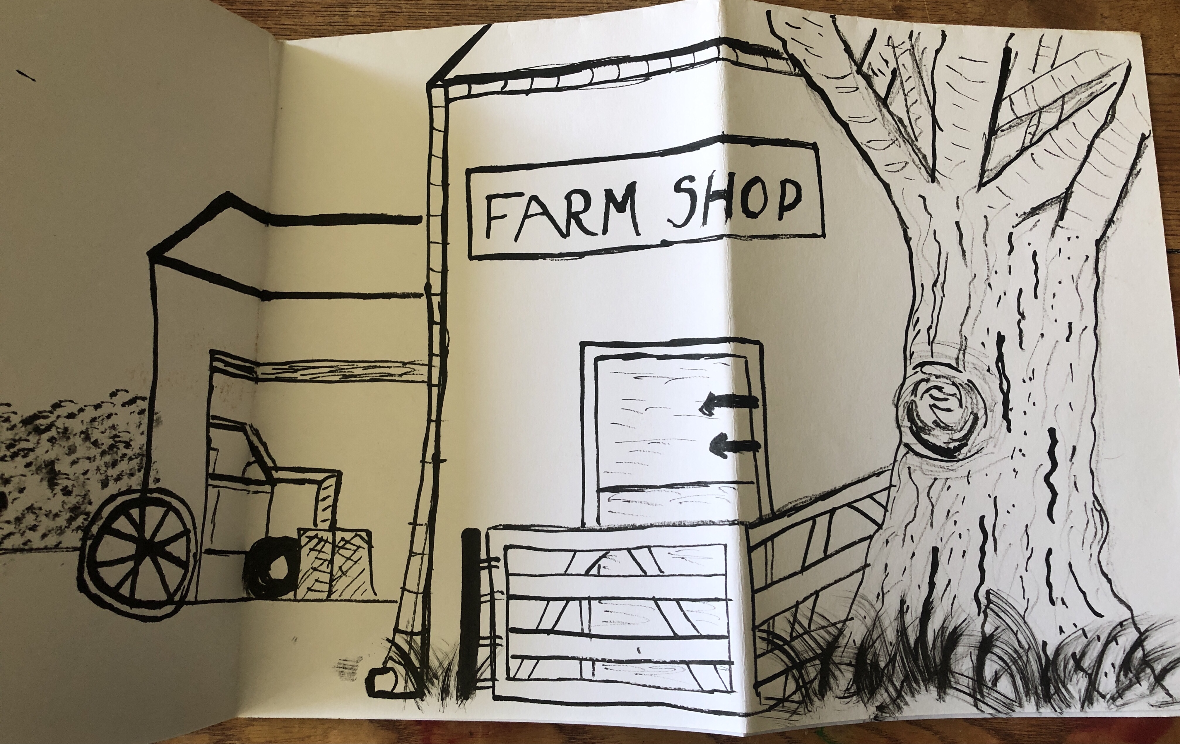
I think critically that I was too concerned with the buildings and details looking perfect as the examples in the course materials were more fluid and this attitude of mine does need to change. What was interesting was that as I drew the journey, it was more detailed and actually looked better as it went along. The buildings to start with looked childlike in expression but I think I was holding the wooden stick in the wrong way and that I was getting frustrated if the lines of the buildings were not perfectly straight. I was also trying to keep to the hour long time limit and that the initial part of the journey was too rushed, once I relaxed more the drawing improved. I did have some trouble with the tree to the right of the farm shop but I was trying to depict the surface of the trunk and so the branches were not quite right but if I was drawing the tree whilst standing next to it rather than memory then this would have been improved.
Stage 3 Drawing from life
I then took the second sketchbook and drew the view of the stairs from my dining room where I was working, a wall and objects in my kitchen, my garden gate and an area of the garden where I keep my hens. I used felt pens and colouring pencils along with a black pen to draw with but I disliked the sketches and felt they looked more like awkward cartoons, I much prefer black and white and would like to experiment with watercolours at some point as I would feel more comfortable with this. I did feel that this side of the second sketchbook was a failure.


I then drew on the reverse side of the sketchbook with the wooden stick and black ink again and tried to capture a walk along my local canal where narrowboats are moored. As someone who comes from a family who loves sailing I have a dream of owning a narrowboat some day so I enjoyed this sketch. I wanted it to be less detailed than the trip to the farm shop to show off the lines of the boats and I added a water effect with a toothbrush dipped in the black ink. I felt this was more successful than the coloured sketches even though it was simpler. I experimented by drawing right to left with this and liked this more than standard left to right.


Exercise 4.2 Customising a sketchbook
I had been looking forward to this part of the course having found an old music book in a local junk shop. It was priced in shillings and pence and my initial guilt was met with excitement as the book covers were sturdy and I saw that the whole book would hold together well. I have recently got into a new hobby of making junk journals and this involves making a book using ephemera and used pages of books or magazines, the purpose of the journal is to hold favourite memories, quotes and motivational words. Junk journals are usually designed to look aged and vintage, often done using coffee stained water on A4 paper which is then baked in the oven to create a crunchy and aged texture to the paper. The pages of the music book are thick and would be perfect for painting and collaging on to help me grow more used to working with colour. I was however unsure how comfortable I felt about the quote in this section of the course materials explaining how Mr Gillivan-Cartwright found an 1839 edition of Lord Byron’s work and was using it as a sketchbook as to me this is tantamount to vandalism!
Stage 1 Research and preparation
As advised in the course materials I began by researching the following artists: Elizabeth Blackadder, Patrick Heron, Cy Twombley and Ben Nicolson and wanted to add a few notes to my learning log on the artists.
Elizabeth Blackadder
Dame Elizabeth Blackadder is a Scottish artist and alongside her work with oil paints, watercolours and drawing, she also made works using printmaking. Dame Blackadder worked mostly in still life, creating portraits and landscapes which earned her much acclaim and much of her later works were devoted to very detailed paintings of her cats and flowers.
There were a great many of Blackadder’s paintings and artwork online and so I chose four that really caught my interest. The painting below attracted me particularly as it reminded me of the continuous line drawing in Part 1 and how much I like working in black and white.

(Source: http://www.cambridgeprints.com)

(Source: http://www.gpsarchive.co.uk) Irises
The painting of irises I chose as I do like colourful nature paintings and sketches, the detail in this still life is beautiful and it particularly conveys the delicate petals of the flowers, I also noticed that the stems are less bold so the attention is drawn to the flowers themselves.

Left: (Source: http://www.mutualart.com) Still Life with Fan, 1991
Right: (Source: http://www.pinkpagodastudio:blogspot.com)
The painting on the left I found to be my particular favourite as it seemed to me to be about negative mark making, almost like a scraperfoil piece. I couldn’t quite decide if it was white paint on black paper or the other way around but it gave me a flood of ideas for work that I wanted to try out in monochrome.
The painting on the right I enjoyed looking at as I liked the colours used and the abstract nature of the piece. I could see the movement and the depth as Blackadder had painted fish further down in the water and rocks beneath them. The deep orange used for the upper fish was perfect and really showed them in detail and the use of white captured the look of the reflections in the water.
Cy Twombly
Twombly was an American artist who produced artwork via painting, sculpting and photography who mostly worked on large scale drawings comprising of scribbled and graffiti type works. Later in life he moved on “romantic symbolism”.
I began by looking at some of his graffiti style work and I have to admit that I am not a fan of it. To my vastly uneducated eye, it is a jumble of colours, circles and lines and it did remind me of a young child’s first attempts at putting crayons to paper. I tried very hard to see what message was within it and emotionally it frustrated me.
Every Day: Cy Twombly & the rapture (Source: http://www.blogspot.com)

I moved on to Twombly’s later work and looked at this painting, entitled “Roses Gaeta”. I loved it straight away for the bold colours and subject matter, I have several types of roses in my garden and I like their delicate petals as well as fragrance and how roses differ in the colour distribution on the petals, particularly where the edges of the petals are a deeper or lighter hue to attract and interest the bees. Twombly’s painting reflects this and to me it also conveyed the fragility of roses, almost with the rose melting away as it fades.

This second painting “Quattro Stagoni: Autunno” (translates as Four Seasons: Autumn) is of a similar theme of decay and change, showing the bright colours of summer dripping from the trees and plants to be replaced with brown, rust and spiky bare branches. I have always liked the initial start of autumn with the extensive range of colours such as russet, deep red and gold. As a child I liked to collect handfuls of large leaves to admire their changes and I think there cannot be a person who dislikes kicking their way through a pile of fallen leaves and enjoying the crunch and rustle as well as that earthy odour. I also liked to look at the fragile skeletons of the leaves and their complexity, it is incredible to look at their structure of veins and to imagine how each leaf contributes to the health of the tree.

Ben Nicolson
Nicolson has many ways to express his creativity and has worked with oil paints, watercolour, drawing and printmaking. Nicolson works mostly in still life but as well has produced portrait and landscape paintings.

This painting caught my eye as it was the bold outlines that I tend to favour and I liked the more sublime muted colours as I felt they promoted the use of black and red. I noticed that the lighter colours had a lot of texture, like I have seen when I’ve been roller painting a wall in my house. It was that almost bubbled look when the paint first goes on and then is flattened more by the action of the roller. I could also see that it seemed to be depicting a china cup which was distorted in a block jigsaw style.

This still life painting of pears in a bowl interested me in the angle that it was painted in as it displayed as much of the fruit as possible. I liked the gradual blending of the green, olive and deeper brown hues and the way that the pears did and did not overlap due to the translucent use of the paint. It was like an x ray was being taken of the fruit as I am able to see the inside as well as outside and I thought this was a very compelling and clever take on a still life. I spent many minutes contemplating this painting and I came to my own conclusion that perhaps the overlaps were a visual effect of showing the colours and ways in which the pears would deteriorate and/or ripen. I could well have got that whole emphasis wrong but I have always felt that we interpret art in our own individual way.
Patrick Heron
Patrick Heron is best known for his early works of figurative and non-figurative works and liked landscapes as well as abstract as themes. Heron changed his physical painting approach from painting with his wrist for more delicate watercolour work to painting with his arm for the works to come together through the actual act of painting.
The abstract painting below is entitled “January 1973” and is very bold and colourful, it did remind me a little of Henri Matisse’s cutout abstract art which I am fond of. It is a very psychedelic piece and I found it to not be a jigsaw type piece where the various sections would fit together. I thought this could influence printmaking and collage which I want to try with this part of the course if possible. I would also like to experiment with holding the paintbrush differently to see how this could alter the style.

I then chose another abstract painting by Heron as I liked the perspectives and angles in which it is drawn and painted.

“Table with fishes” (Source: http://www.pinterest.com)
This painting is again colourful and busy in nature as the objects fill the whole space. It gave me a sense of how still life does not automatically have to be an exact and precise representation of the subject matter like a textbook but that having the items presented at such a different angle gives far more information. In this painting I am able to see the contents on the plates and the chairs do not cover the table and plates but sit neatly around the edge. I also was very interested in the use of what could be a charcoal like effect to draw the lines and then that the colours did not completely meet those lines as it gives a greater impact that way and this approach for me defined the whole painting. As before, this was a technique that I wanted to try with my own work.
One notable point of interest for me was that by completing the initial concertina sketchbooks prior to doing the research on the artists mentioned in the course material, I would want to consider doing the sketchbooks again and to use some of the ideas and techniques I have seen whilst doing the research. My tutor did highlight the concept of “stealing from other artists” and signposted me to a book for further information and I can now understand why this is not a negative attitude but a way of further developing skills and ideas. I have always wanted to come up with my own ideas rather than ride on the coat tails of someone else’s but this way of thinking could be holding me back.
Stage 2 Painter-inspired translation.
I decided to go with my third favourite artist from my research, Cy Twombley as I saw this as much more of a challenge to see if I could like his style more and also to take me out of my comfort zone by experimentation.
In my customised sketchbook I began by mixing paint for the colour palette. It took some time to try and find the right gradient of colour of the gouache paint but I did like the way that the paint was thin enough to still see some of the detail of the pages I was working on. I also made a mood board to try and get my mind into the theme of the artist, with yarn wraps, photographs and fabric swatches.

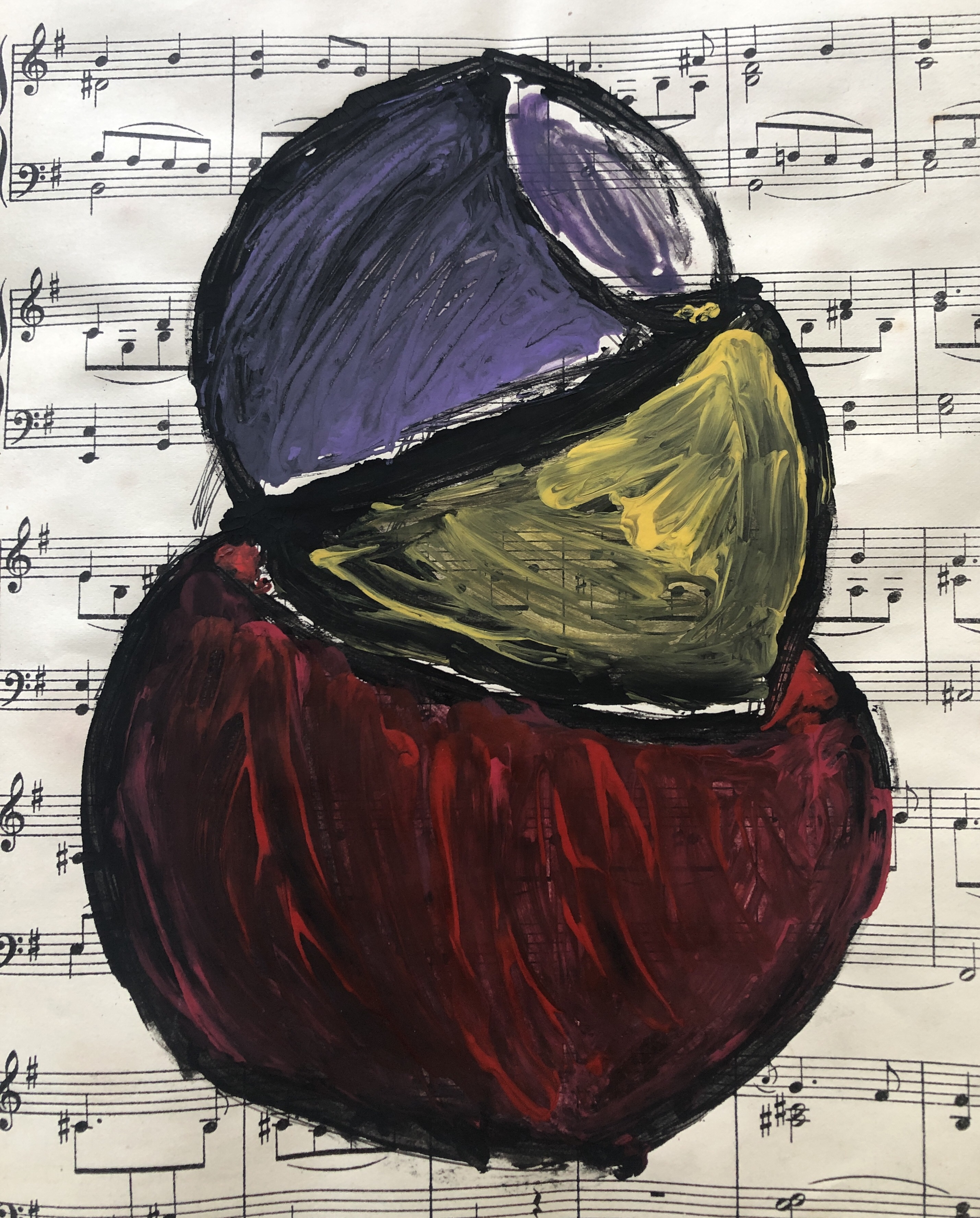
I began by using opaque paper to trace the dark areas of the rose and then I painted onto the reverse side to try and gauge how to try and paint the image. I then painted the rose in monochrome having taken a photo of a rose in my garden and I used this to try and get inspiration on construction of an image. This was made using masking fluid and black ink drawn using a toothbrush.


I then did a warm up paint and texture test, creating a rose beginning with dark red paint and then light red over the top using a small twig. It did convey the “melting” aspect of Twombley’s rose but it looked too flat and not as expressive enough as I wanted it. I painted a second rose using the end of a cork and again built up the darker hues behind the rose before moving onto the lighter red and yellow details. I felt this was an improvement on the last piece but it still lacked the details of Twombley’s rose.


Using the art deco jug I have drawn before and tried to collage, I began trying to paint in the style of Cy Twombley. I used the same colours as I had used for the roses. Working in series, I painted the jug with my left hand and used a brush, again I worked in layers from dark to light. However the jug was not “messy” enough in my opinion. I then painted the jug again and this time with my left hand, keeping the paint wet so I could blend the colours. I liked this jug painting much better and it was a much more abstract piece.


I painted the jug again and this time used a stick, this painting was my favourite as it had the “melting” aspect of Twombley’s rose and it looked more textured and almost three dimensional. The fourth painting of the jug was painted using a cork and although I liked the way that the hues were distributed, I did not feel it was successful.


The next work I undertook was to paint the rose again. I used a roller to give a dark layer of ink in the background and then used a cork to push paint around to create ribbons of texture and I felt this piece was more successful. On the following page I painted the stacked bowls that I had created in collage exercises to see how they would look using the colour palette but I wasn’t sure that they looked like bowls.

For my next working in series I again painted the background using a roller and black ink and tried something new, I dipped string in the different red hues in the colour palette and used the roller to crush the string to release the paint. It was however very difficult to see the different colours and lacked the vibrancy of Twombley’s rose.
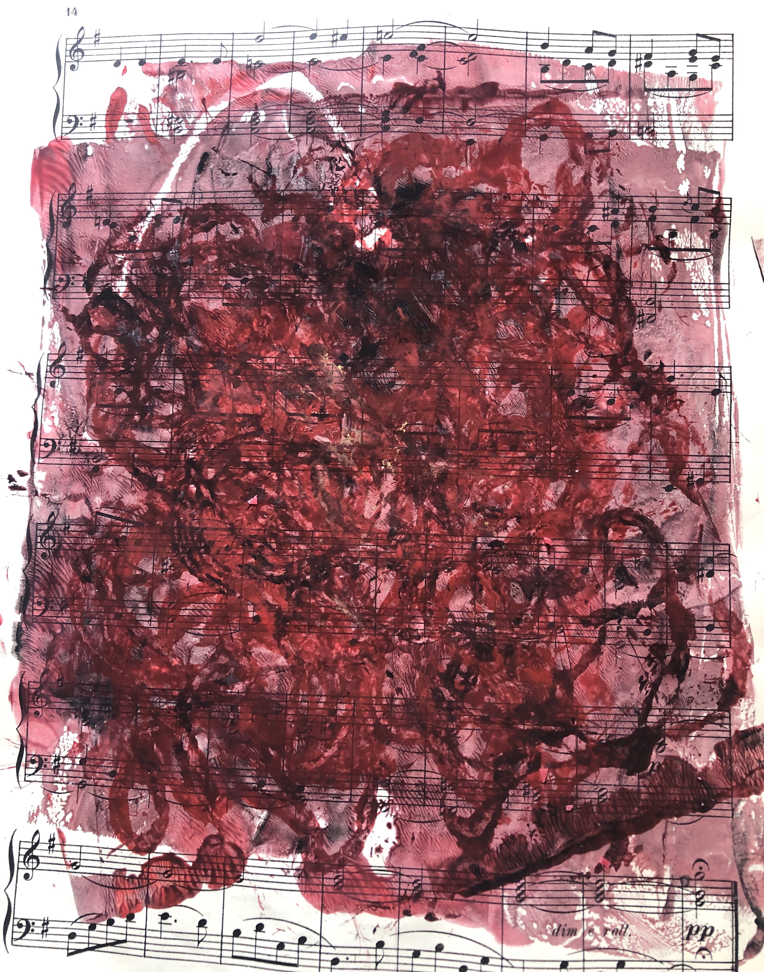
I then tried to work in negative and made cut out forms which I placed on the sketchbook page, I then rollered black ink over the top and let it dry before removing the forms. I wanted to try something completely new and so dripped red candle wax down the sketch to see if I would be able to represent the bleeding rose. I didn’t like the finished work and felt it was too childlike.


I finished the sketchbook exercise by using the string dipped in paint and I mixed it with PVA glue to try and create texture and depth. I also created a messy background as a border for the finished piece. I liked the effect but felt it was too simple and not the look I had been hoping for. I felt it was time to move on to the next exercise as I had exhausted most of my ideas here.
Exercise 4.3 Collating a sketchbook
Stage 1 Research and preparation
I began this exercise by looking at the work of the textile artists suggested in the course materials and I chose Suzumi Noda. Noda visited inner Mongolia to educate herself with wool produced locally and also was aware that she would be able to incorporate junk ,such as packing materials or literally rubbish and stated “I use junk materials but I think we should not make light of junk materials. New ideas, new thinking emerges from new ways of juxtaposing junk materials which have lost their value, with exclusive materials” (www.transitionandinfluenceprojects.com). This was so important to me as I see things that have been thrown away as having a second use, possibly I am a Womble in that respect. I have spent much time accumulating materials when out on country walks and also on beaches last summer. Not only is it beneficial for a beach to have old ropes and nets removed but to have them repurposed in some way will also combat landfill and reduce carbon footprints. I was delighted to find old sacking material in a stream as it had aged and decayed so beautifully and it gave me so many ideas for slow stitching or weaving into it, or incorporating it into a fabric sketchbook or an art piece.
The photos below show some of Noda’s work that I found particularly interesting and something I wanted to replicate and sketch.
I printed off the photos of the above textile garments for me to reflect on and began collecting some materials such as thin wire, sari silk ribbon, thin yarn, tissue paper, chiffon offcuts, old string, matchsticks and bubble wrap to start with. I liked the fact that knitwear was part of Noda’s textile art as I particularly like knitting with very thin yarn and have made a large shawl from black mohair.
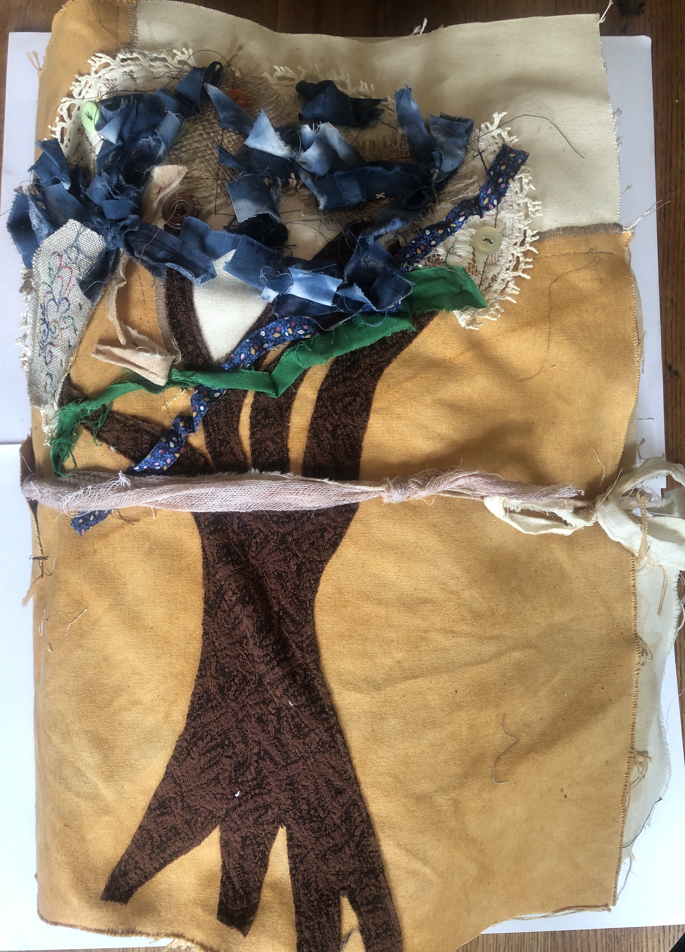
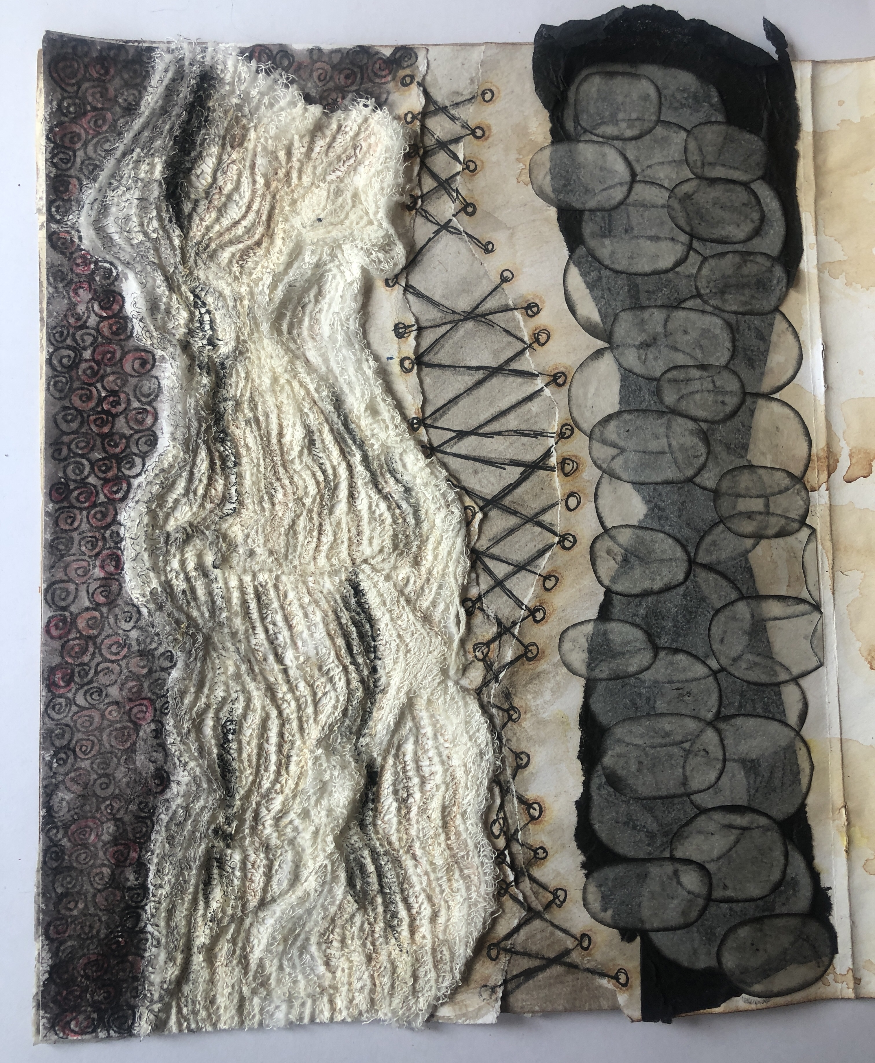
I wanted something special for this Part 4 assignment and chose to make a sketchbook out of fabric to incorporate some sewn or knitted samples and also to house other sketchbook pieces on paper and card. This was an A4 size with a concertina effect so as the pages were turned then it was easier to look at each item as a whole. The sketchbook was two sided like the initial sketchbook was in Exercise 4.1 to enable me to utilise the space within to its maximum.
This was where I felt very disheartened and disappointed by OCAs decision to no longer send work to tutors to assess and for students to photograph their textile work and upload it onto the learning log. I had worked so hard on this piece and I do not see how a photograph can convey texture and movement. It has made me rethink whether I go on to do the full degree should the new way of submitting work for textiles continue. I really wanted my tutor to see it!
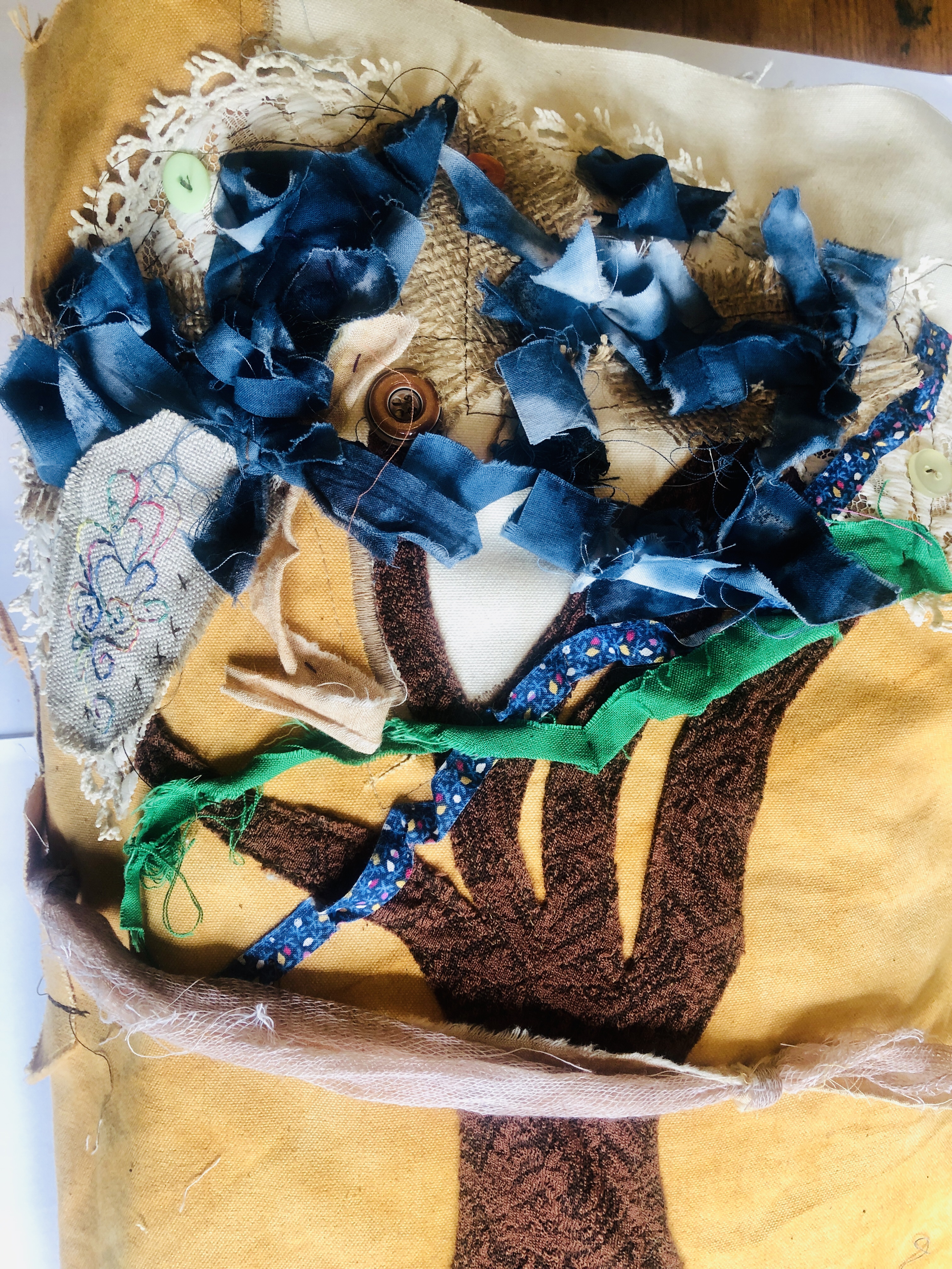
So here is the full sketchbook when closed, it fastens with a cheesecloth rope which has been dyed with beetroot juice and it is a very heavy piece. I made the covers and most of the sections from calico which has been dyed with natural dyes, my favourite colour being the rust dye as it is bold and distressed looking. I did an applique tree on the front using fabric scraps to add interest.


One thing that I wanted to do was to try new materials and ways of working with paint so I bought a Gelli plate printing set. A Gelli plate is a silicone block which is fully reusable and paint can be applied to it to create different shapes and textures on paper which is pressed to the painted plate. I also bought some Luratex fabric (known also as Polyproylene) which is a heat resistant fabric but can also be altered using a heat gun and some Luratex sheets which can be moulded into shapes using a heat gun too. Alongside this I bought some shrink plastic which can be drawn on with felt tip pens and then is put in the oven which makes the plastic smaller and thicker and can be used in jewellery making.
I began with some initial sketches using black pen and mixed media as I wanted to incorporate as much as possible to reflect some of the themes of Noda’s work. I made a tea dyed small A4 booklet and the front was made from old music sheets, some burnt Luratex fabric and cut out pieces of silver paper.

Inside this I drew with black pen and coloured pencils and used a section of old bandage, torn paper and cut out circles of parchment paper to create images to interpret Noda’s knitted pieces on the left hand page and on the right hand page I made a collage of distressed paper with small drawings stuck on and also two raised squares. The mounted squares comprised of a small knitting loom made from twigs with yarn threaded through it and with the second square I had pierced a small section of thin calico with twigs to create a three dimensional weaving loom to which I added yellow paint to add interest.
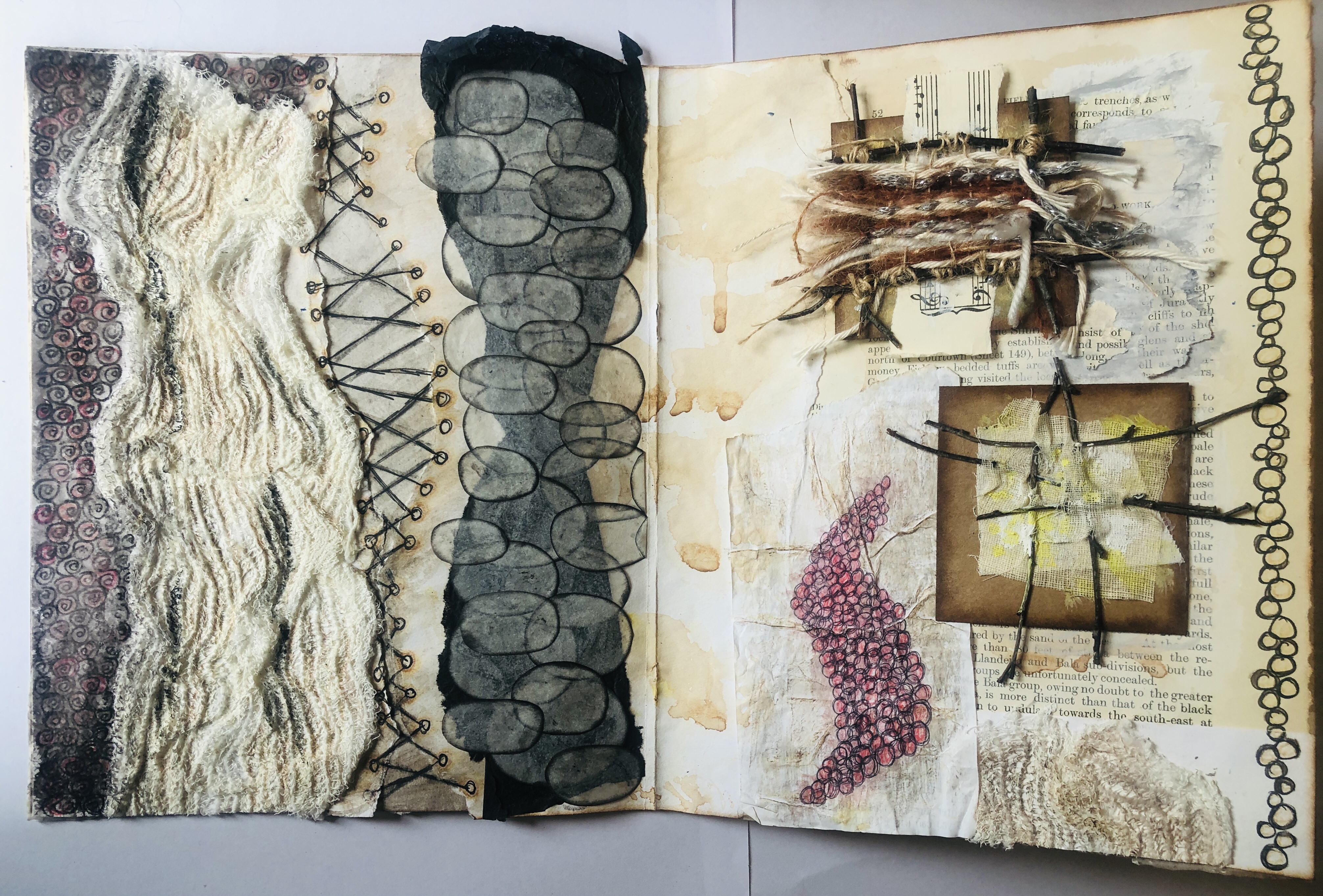
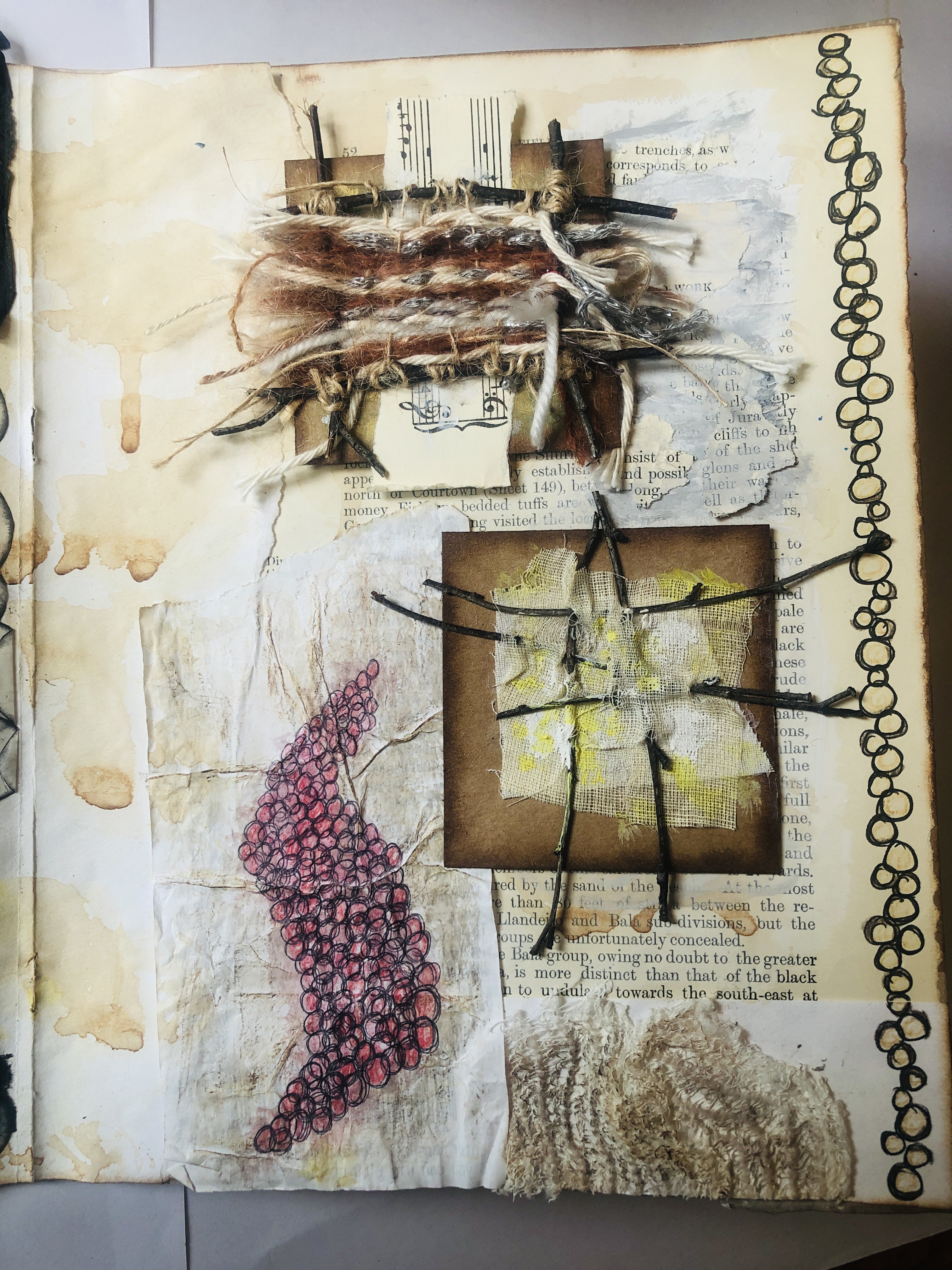

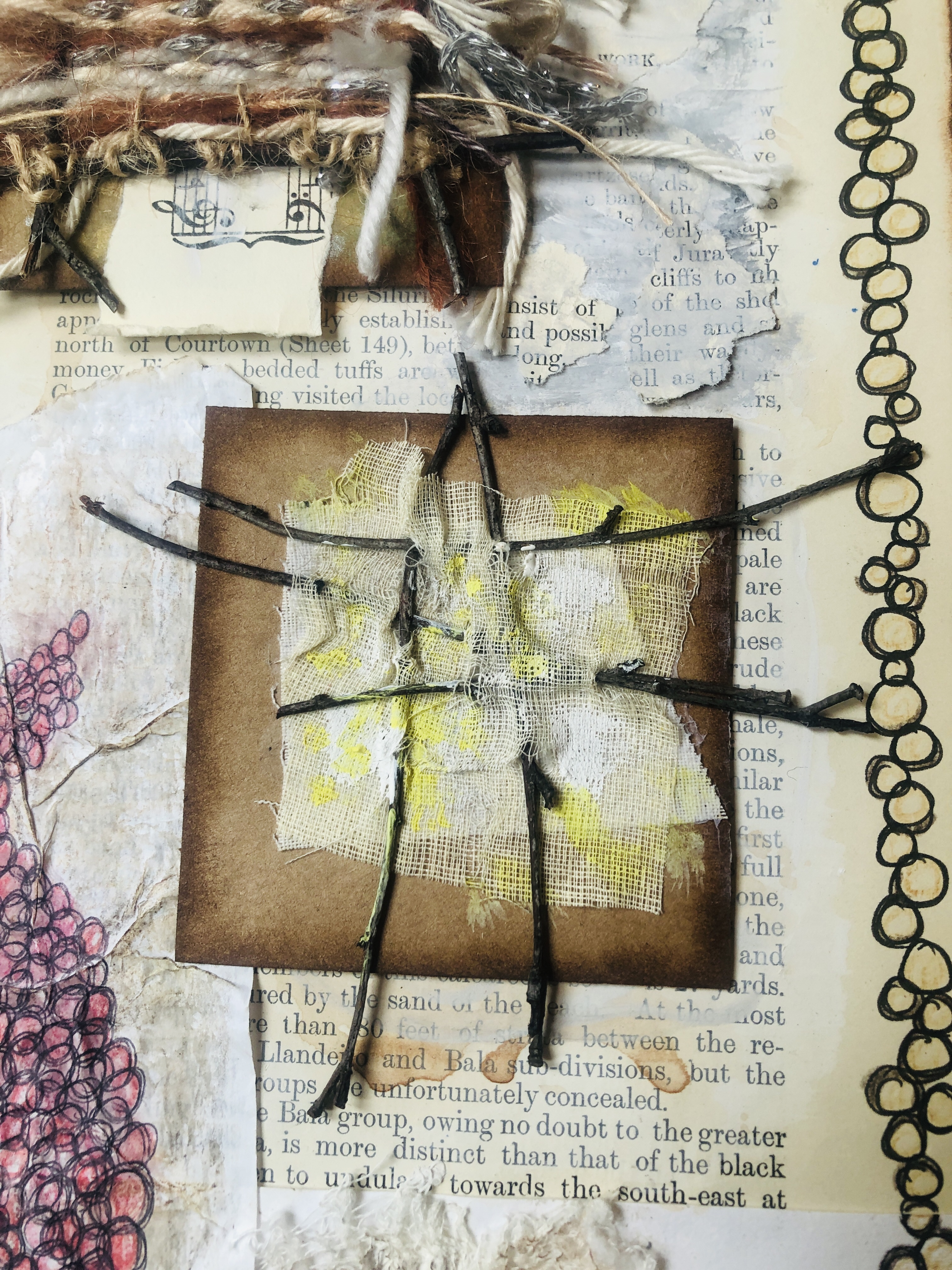
I enjoyed making the small loom, I had tried making a bigger loom using branches from a tree but I was not able to get the strings tight enough to be able to weave into. I do want to explore this further as I realised there is huge potential in weaving on a much larger scale and it is what I have in mind for Part 5 of this course.
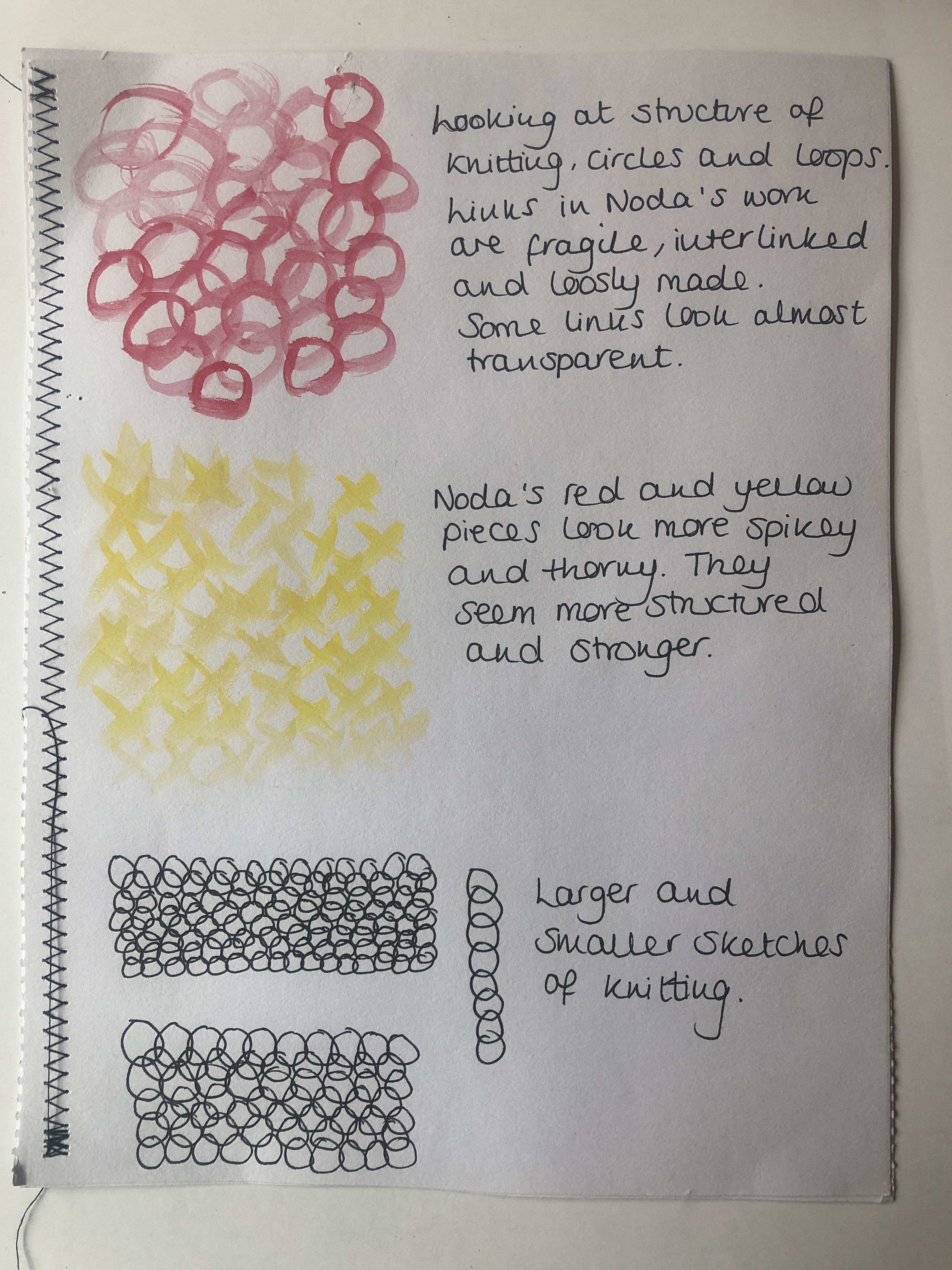
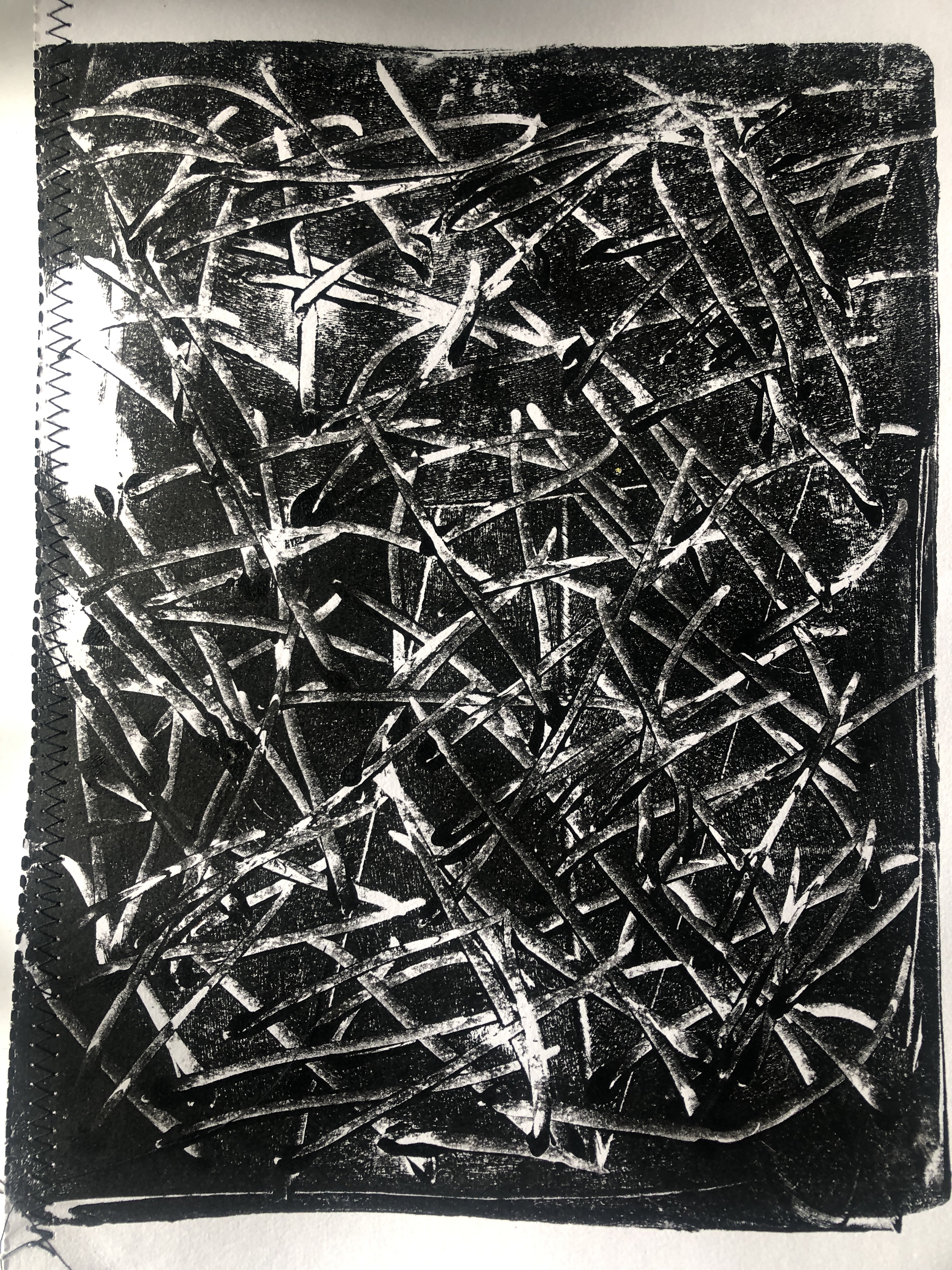
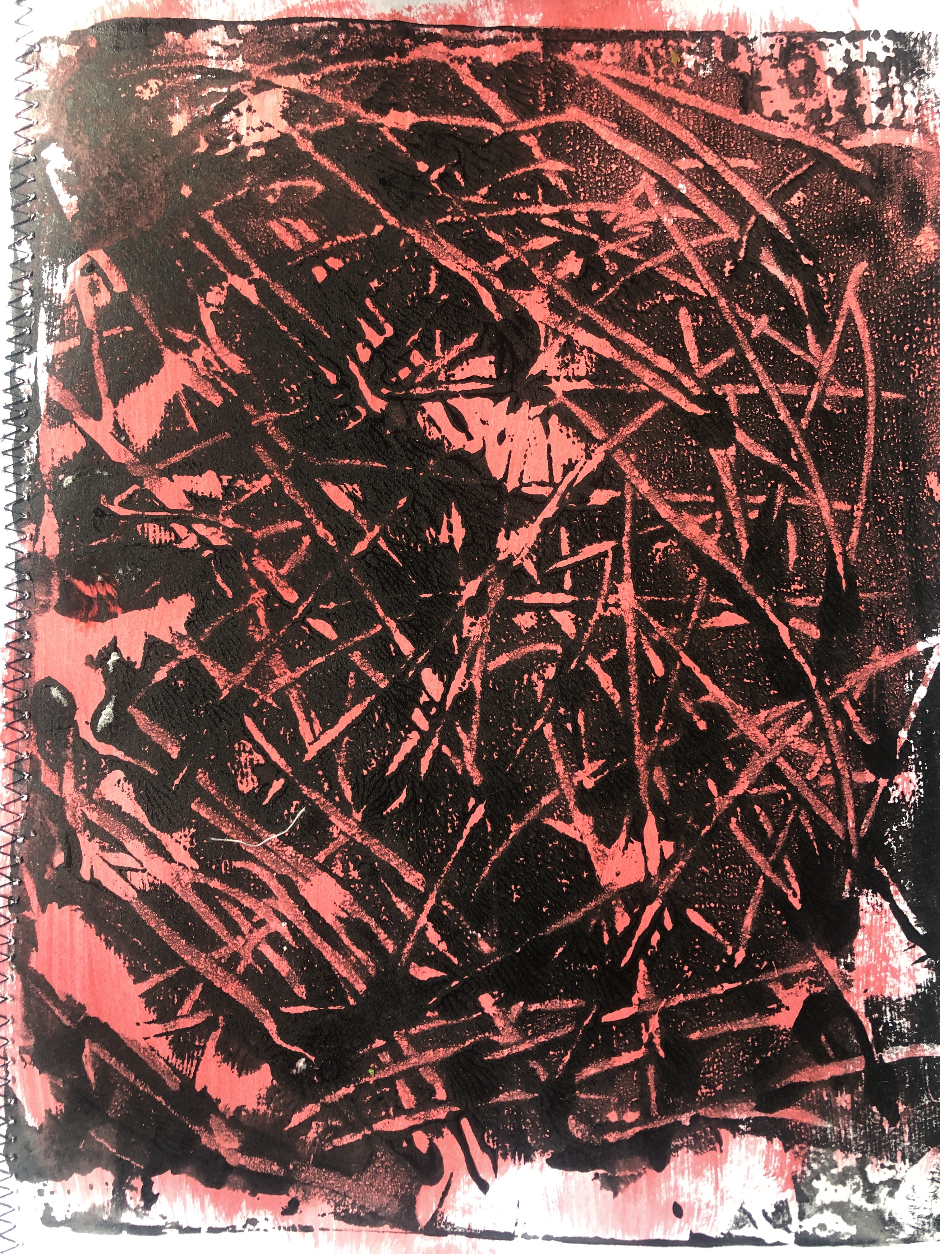
I began looking at mark making and to try out sketches of Noda’s knitted work, I used black ink to test out different media and used twigs, a turkey feather quill, a cardboard straw, a quill made from a fir tree twig and a wooden spoon handle (see left image). I then used a paintbrush to try and replicate the knitted sections of Noda’s work. I was looking at the structure of knitting, circles and loops as Noda’s work is fragile, interlinked and loosely made and some of the links look almost transparent. I had seen that Noda’s red and yellow pieces looked spiny and thorny and that they seemed more structured and stronger. I also did a black line drawing looking at the interlinking of small and large circles.

I completed further work on this and looked at how different fabrics interlink and painted a piece of hessian to show better to how the hessian adapts to colour and to show its strength against a piece of naturally dyed cheesecloth. I used a piece of sequin waste to show its preciseness and again how strong it is. I think this could be very effective if different yarn and strings were threaded through it.
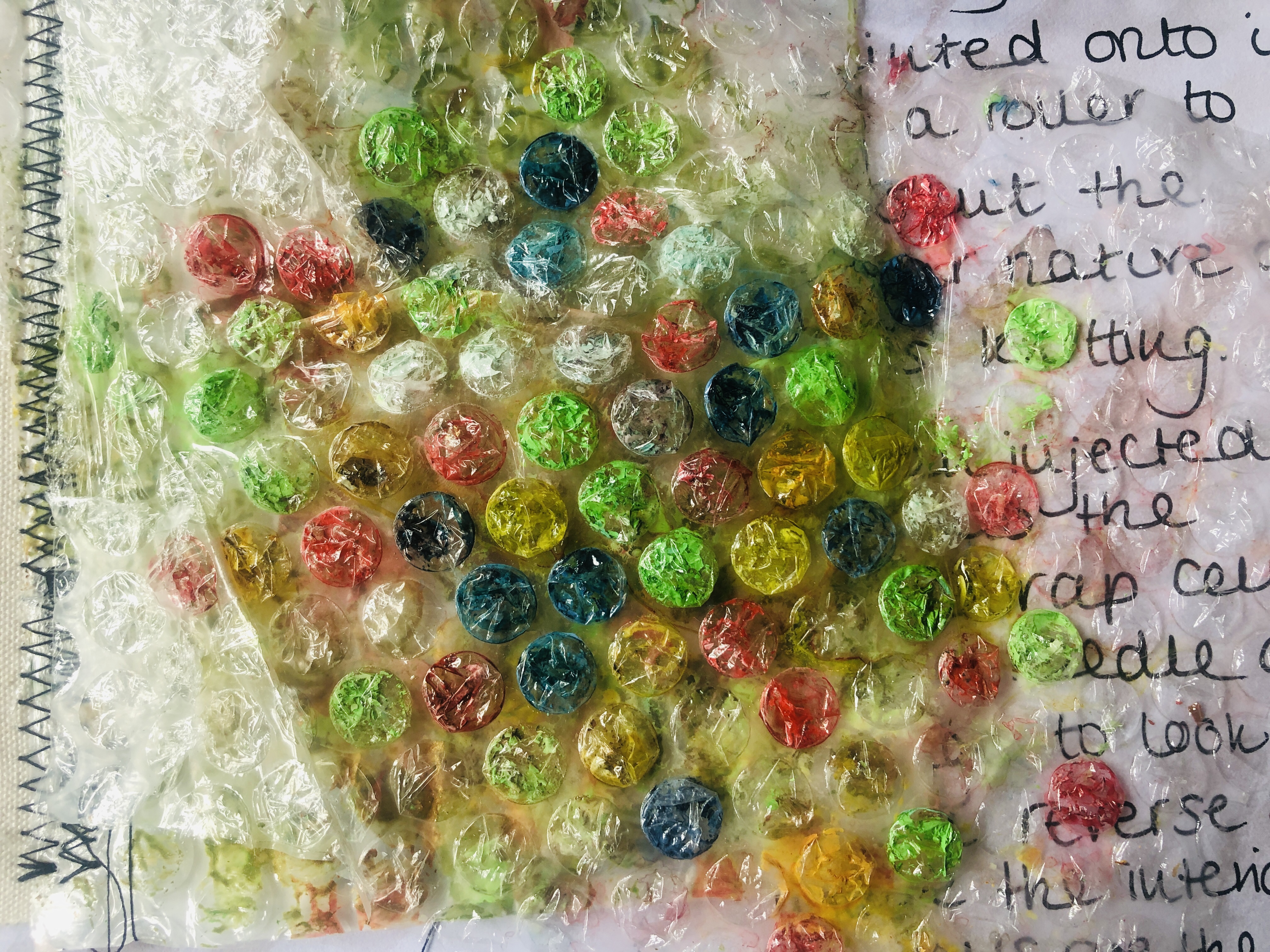
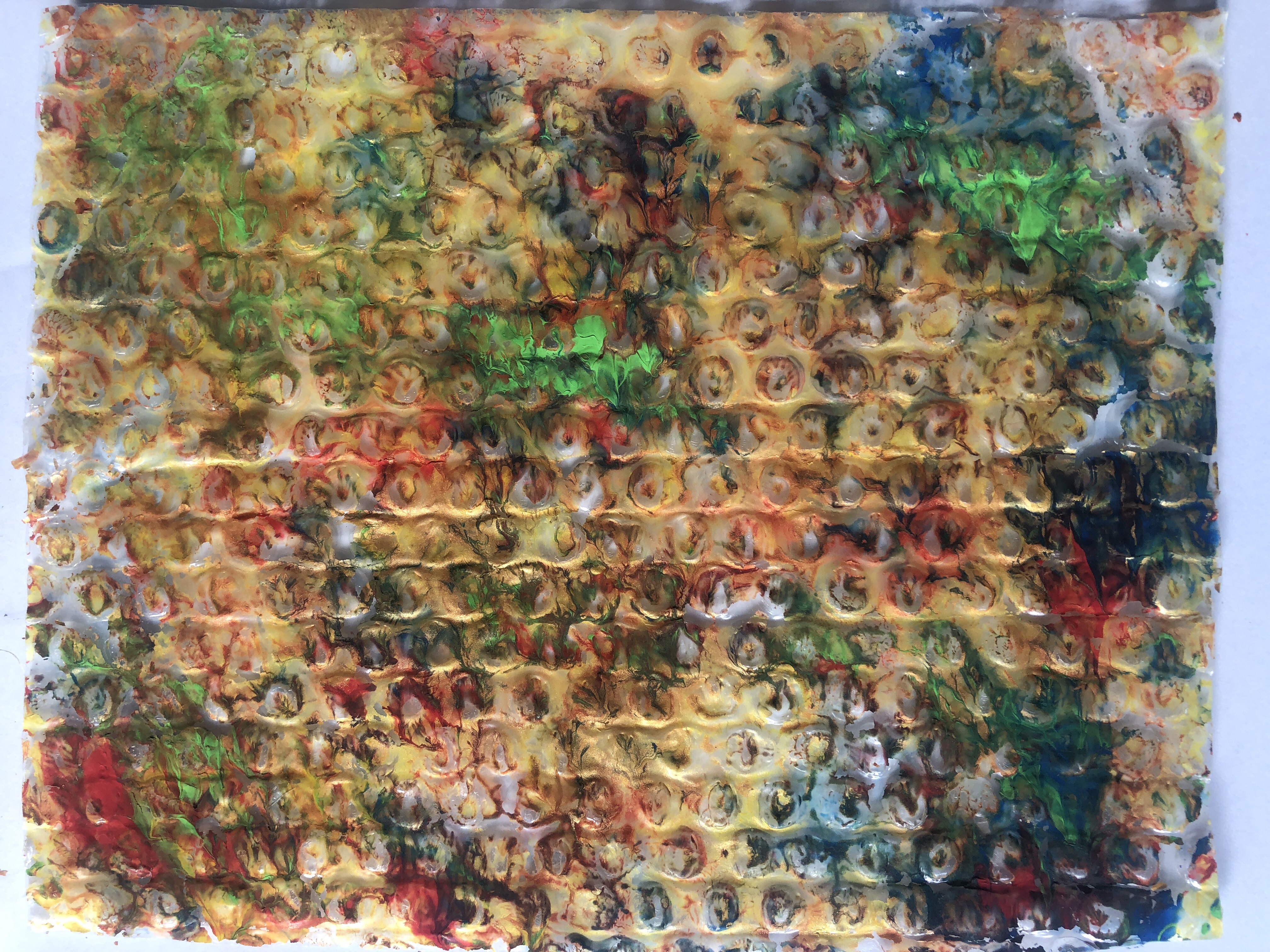
I moved onto bubblewrap as I planned to use this in my Gelli plate printing and painted onto a section of bubblewrap from a padded envelope and was interested on how the colours showed up the pattern. I also obtained a hypodermic needle from my local vets practice and injected thinned paint into the bubbles on the more flexible wrap and I really liked this effect although it was very fiddly to do.


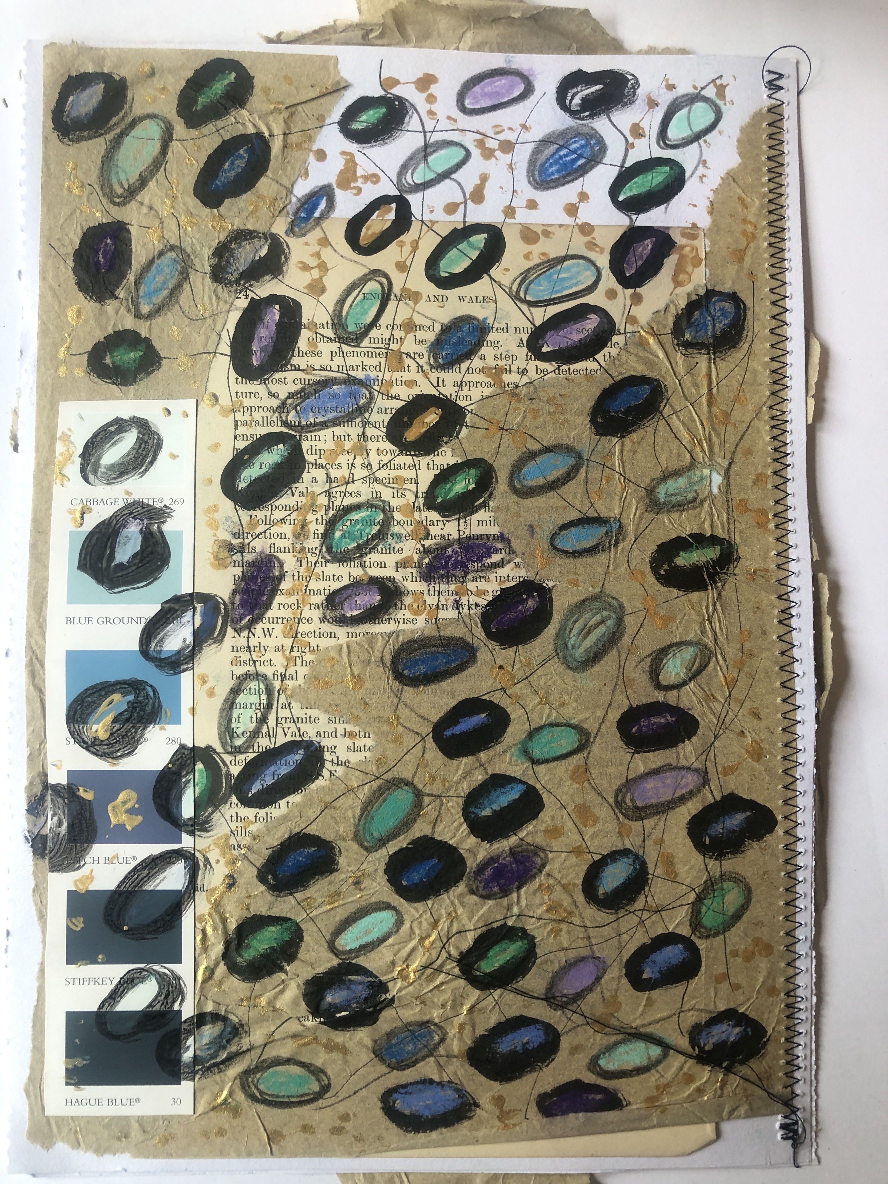
I then drew circles using a brush and black ink and used a cork to stamp different colours of paint onto a piece of card and I wanted the colours to semi blend together to create a more structured look, I used some gold paint too and the reflection of this was highlighting areas of the piece. On another piece of paper adapted with some brown packing paper and a book page I drew loops and added drips of gold paint which worked well when I had added chalk pastel inside the loops.

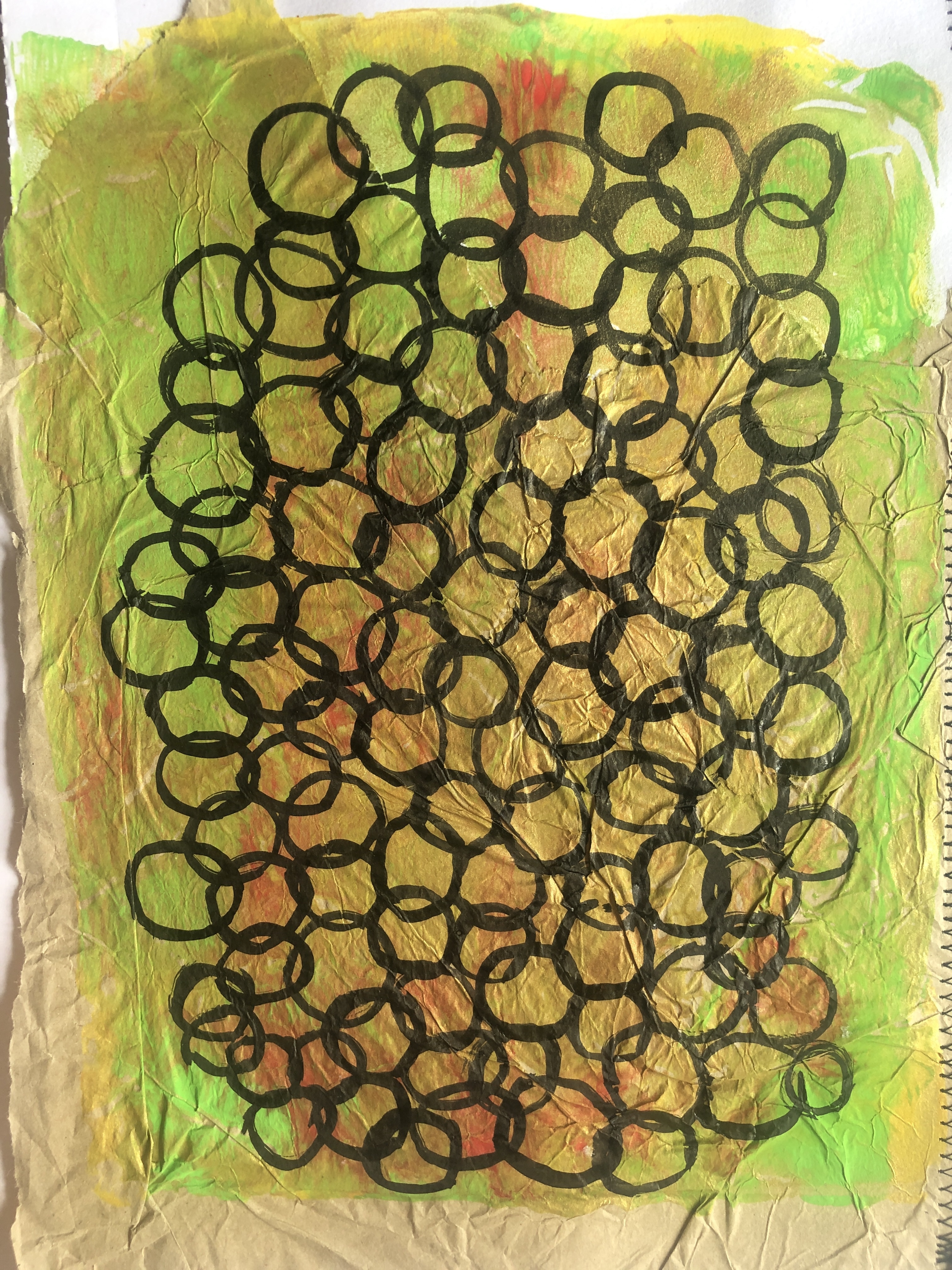
I moved onto a new page and this time painted a background onto brown packing paper and then drew a lattice work of circles over the top, I felt this was more successful than some of my other sketches as it looked bolder. Then I rollered a mix of colours over bubblewrap and used it to print onto a new sheet of paper and drew circles over it. I liked this one better as it looked more like Noda’s jumper.
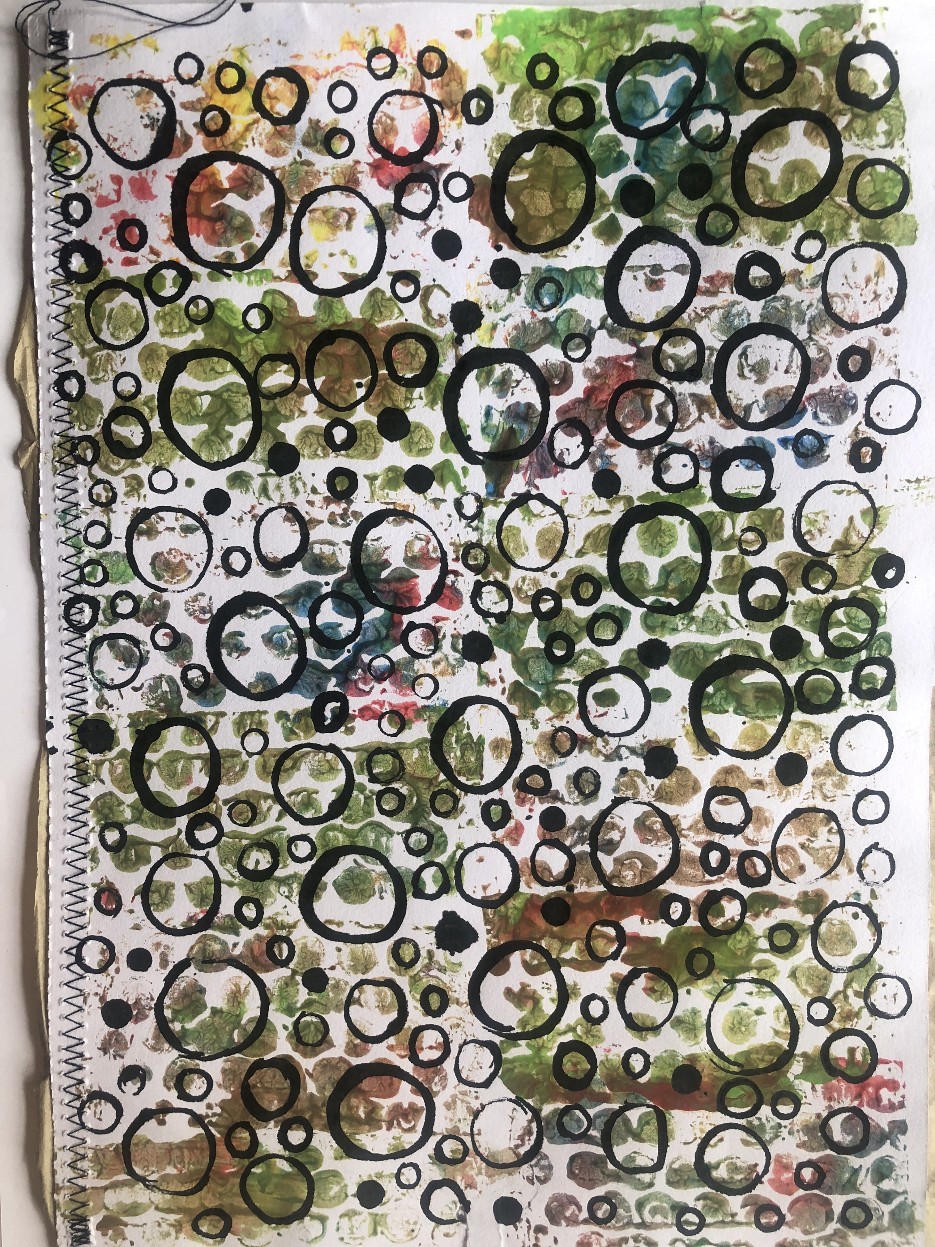
I decided it was time for some sketches from the other examples as I needed a fresh approach and using the Gelli plate I rollered on paint and pressed paper on it to see how it would interact with colours. I then did a continuous line drawing in black pen. To me this sketch looked less like a cartoon than the other ones, I think I am often too rigid in the way I draw

I moved onto a different way to draw more like Noda’s work and again using my Gelli plate. I rollered more paint onto the plate and this time looked at a more simple approach and used the paper to make a series of plainer images.

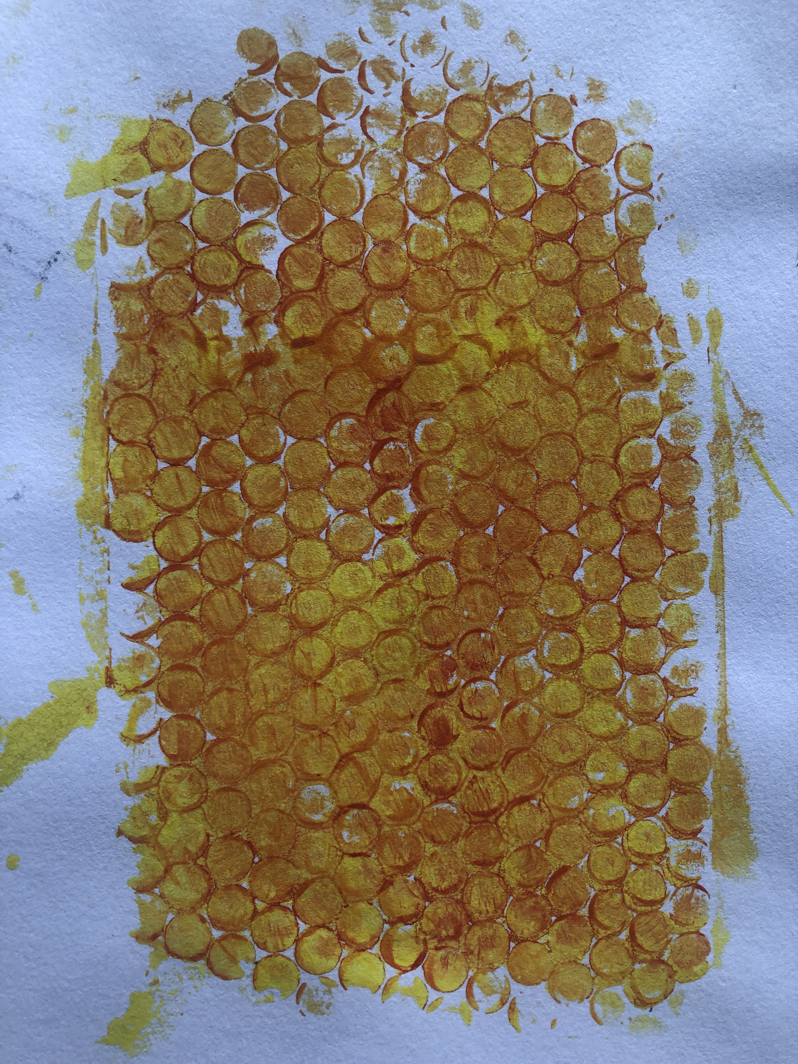
I liked the image on the left as it looked fragile and like distressed fabric. The second left image was made using bubblewrap again and it did resemble a knitted pattern but in the form of a negative pattern. The image on the first right was again made with bubblewrap and gave a more honeycomb effect as did the second right which was made by painting again on the Gelli plate and this time pressing the bubblewrap on the plate.
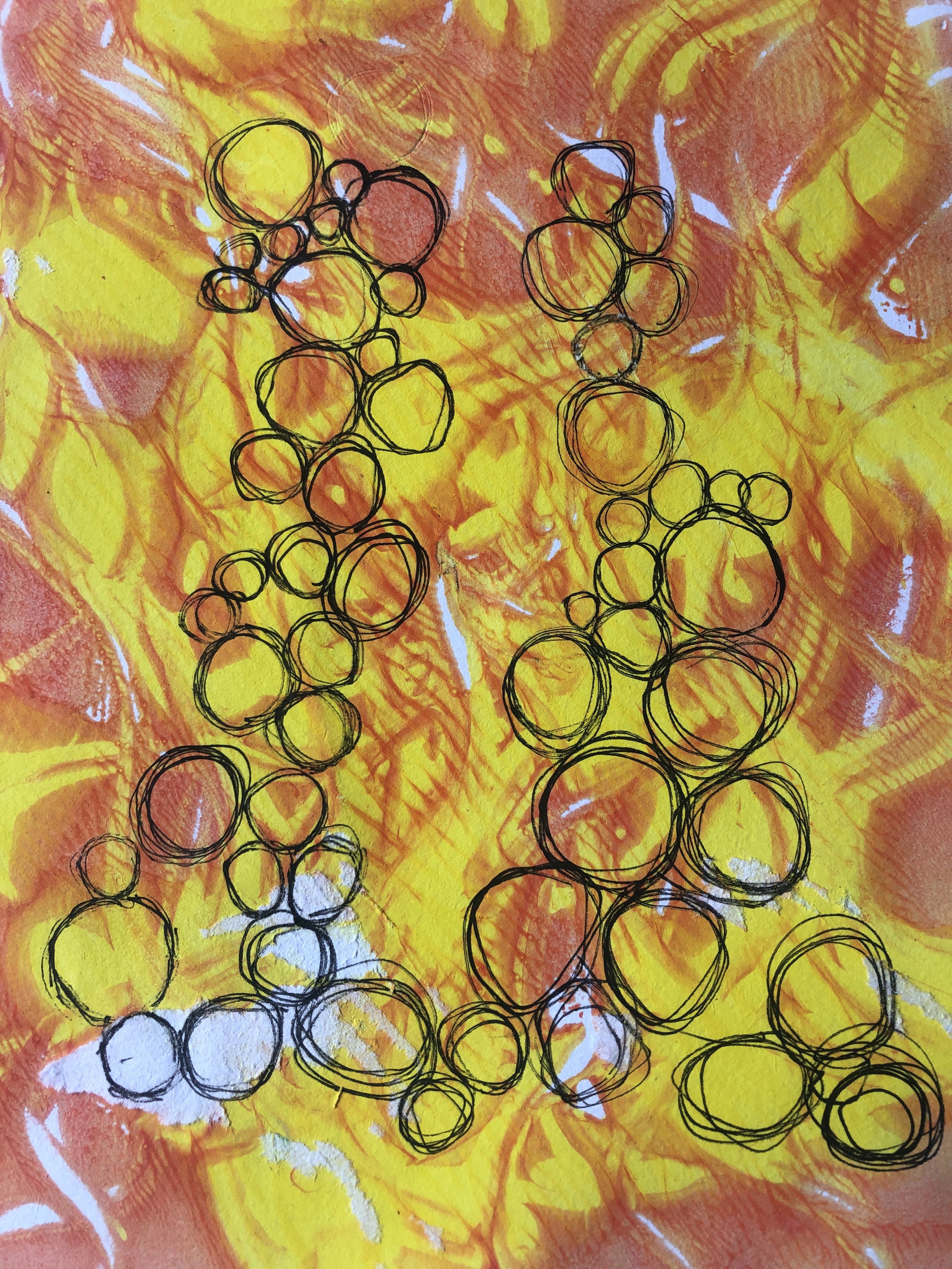
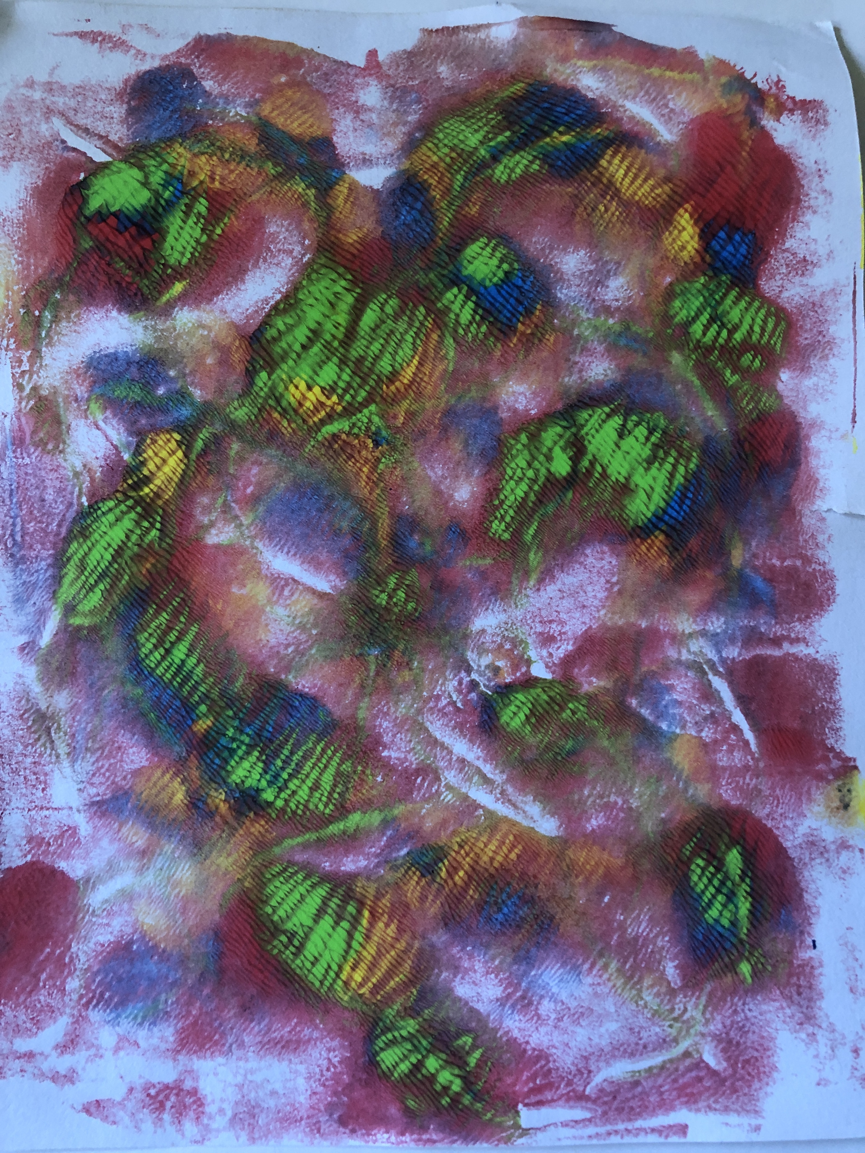
I wanted to make a more “spiky” image and having added paint on the plate I drew into it with a chopstick, I repeated this to create a series with different colours to try and find out which looked the most like Noda’s blue and green jumper.

My favourite was the monochrome image as it was negative mark making which I like to do. I thought this was bolder than the other two but I would have liked to have then used blue paint to colour in the marks.
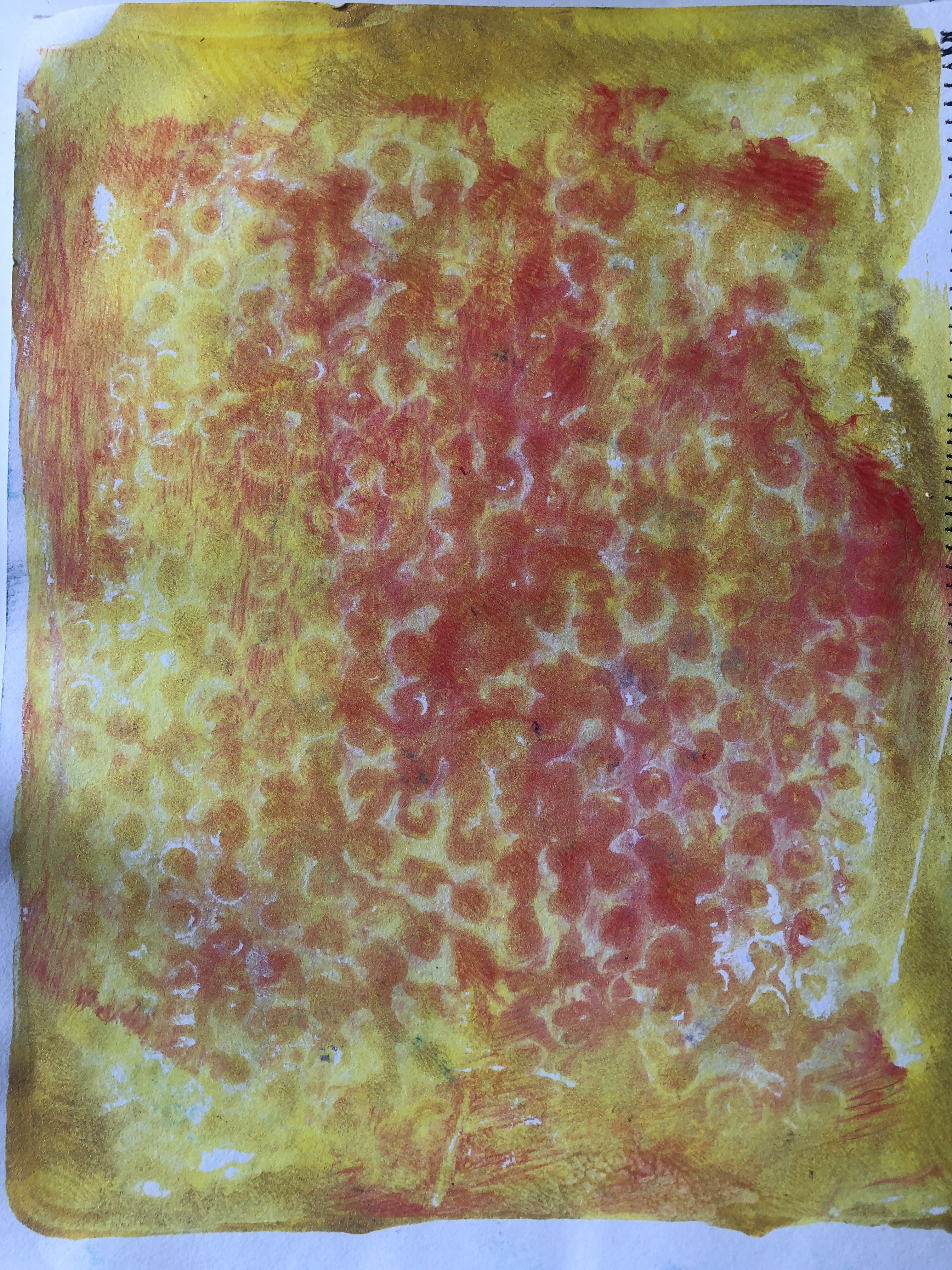
I moved onto using the paint in a different way and put random spots of paint on the plate and instead of using the roller I pressed the paper straight onto the plate to see what would happen. I really liked what it produced as it created new shapes and in particular some of the pages looked like abstract paintings of bushes and flowers.
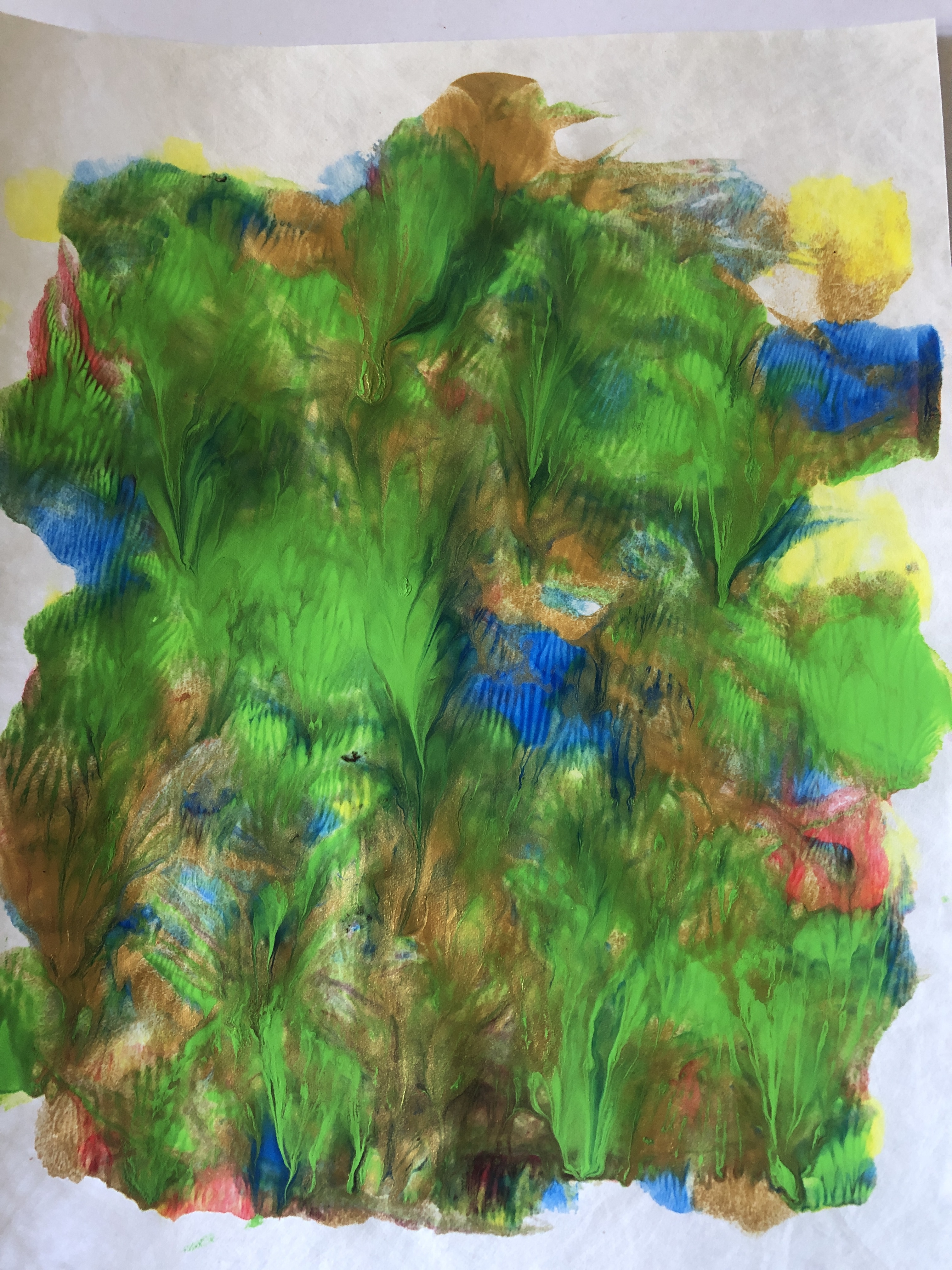

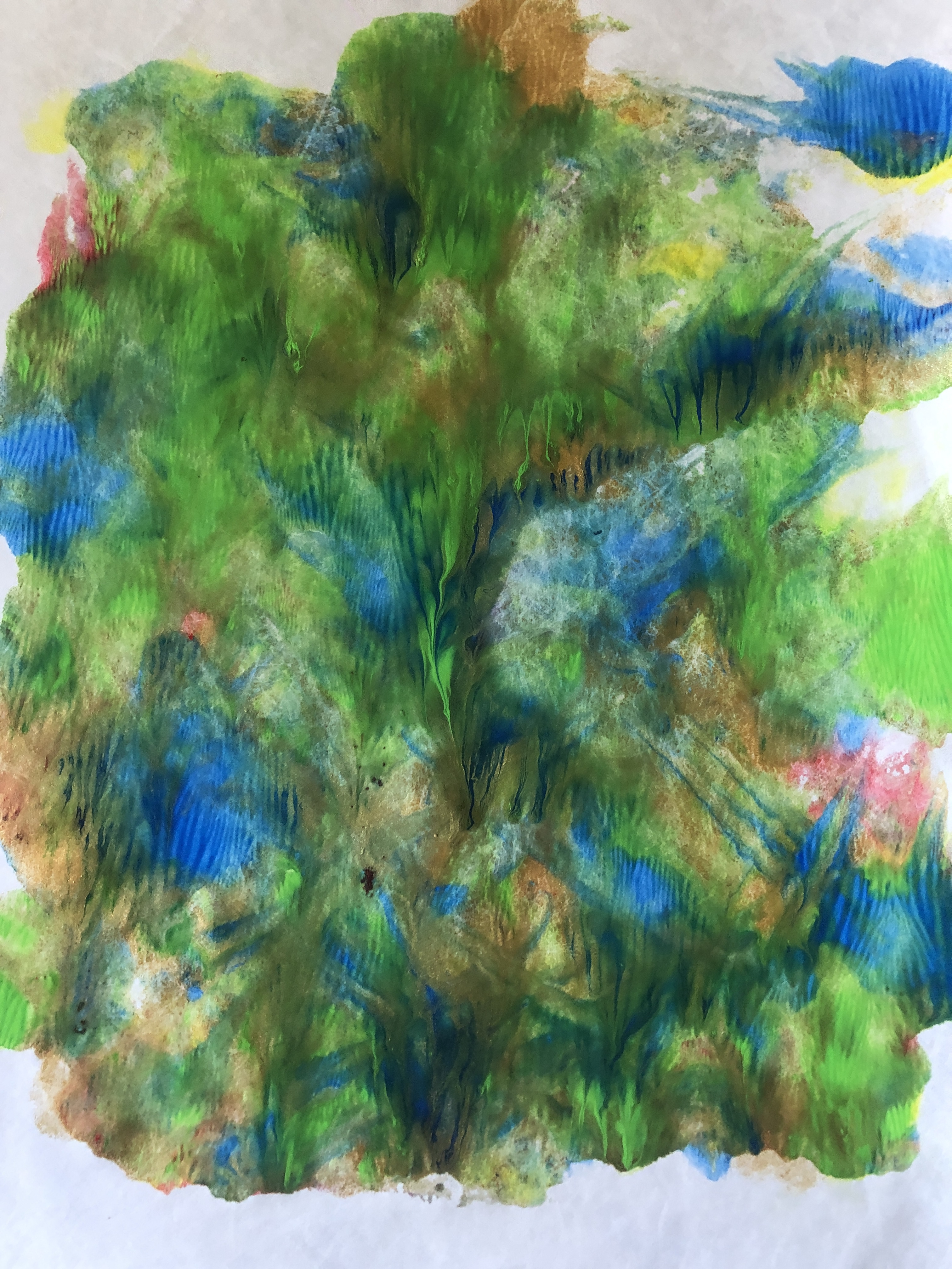
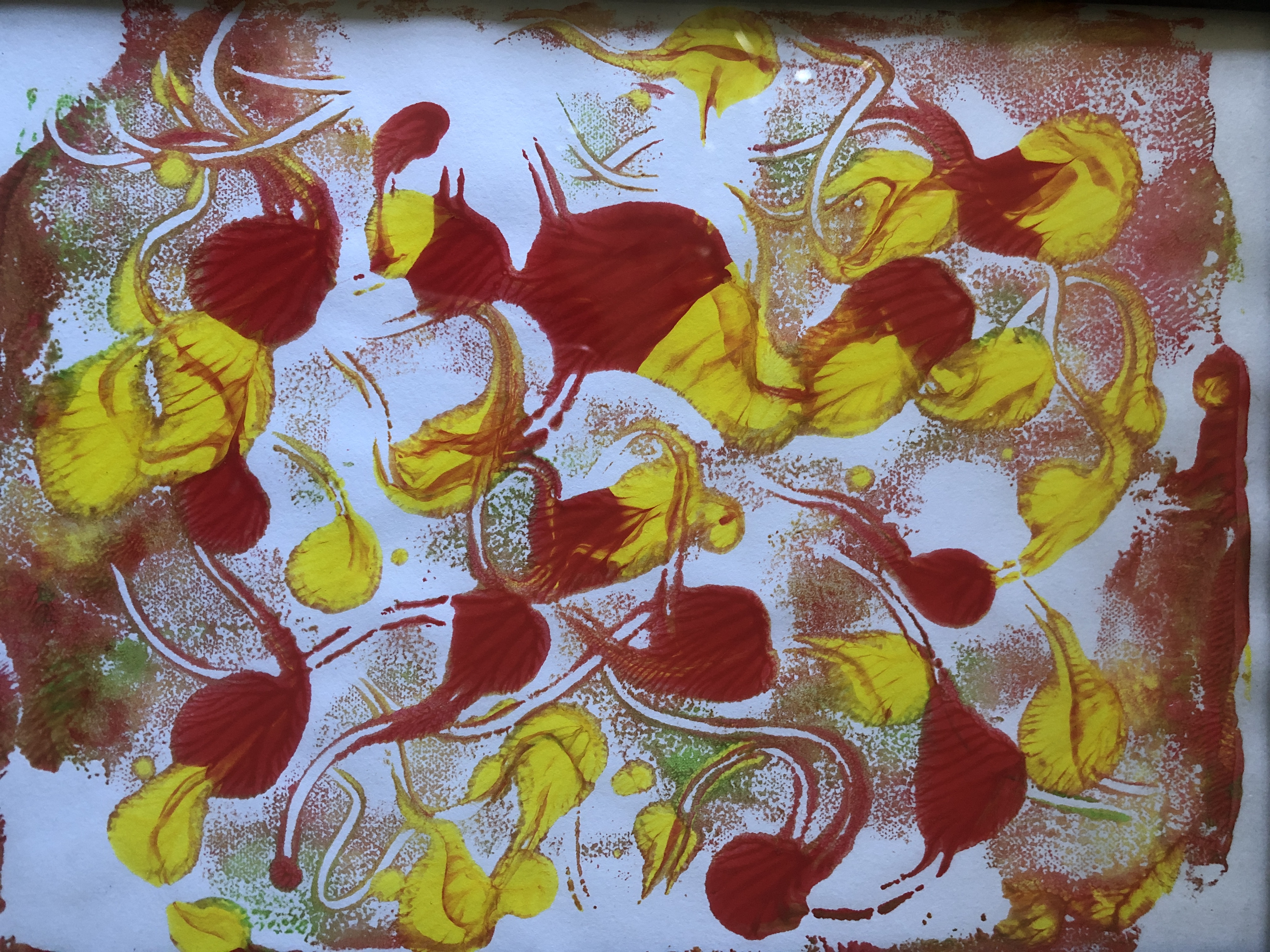
The red and yellow image looked more like Noda’s knitted art and a better interpretation of the texture too. I had really enjoyed researching her work and the story behind it.


