Reflection from previous assignment
Having completed Part 1 Line, I read my tutor’s feedback which I found extremely helpful indeed. My tutor encouraged me to have confidence in my playful side and not to be afraid of being messy, also to use bolder mark making through the use of masking tape and other similar ways which I particularly enjoyed. My tutor also suggested that I continue to create mark making tools and that having a collection of such tools would help me in further studies. I had not thought of this at all and now I fully intend to develop more mark making tools.
I was pleased about feedback on right hand left hand drawing as I had genuinely been surprised that I could draw at all with my left hand as I certainly can’t write with my left hand and had so assumed that drawing would be impossible. Although I did not like drawing blind, I agree that my drawings are too controlled and I need to explore deviation and as my tutor suggested, to challenge myself to push the parameters by using less controllable mediums over expansive surfaces. I have always wanted to not be as precise and have the need for order and so I am going to listen to my tutor and start thinking in different ways regarding the practical work.
My tutor also encouraged me to use my sketchbook more. I admit all too often that I have an idea and will try and create it but will miss out on the sketchbook planning and recording. I can see how having concepts and thoughts not recorded to revisit are extremely important, even if I do not use them for that particular piece of work.
I am also quite slack on research if I am being honest. I will happily buy books and leaf through them looking at the photos and having a flurry of ideas of things I would like to try but then I put them to one side for a while. My new resolution is to properly read my textbooks, make notes and start recording this in my learning log. These changes may not happen overnight but I need to get into the habit of making time for research if I am able to go onto the degree level Textiles with OCA.
Exercise 2.1 – Preparation and research
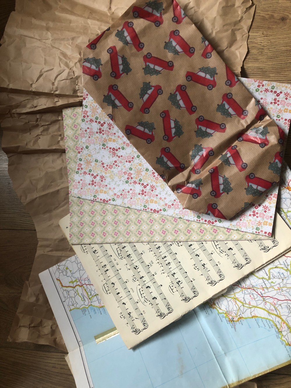
I have posted a separate learning log for my research on collage artists so will go straight into preparation. I am a collector of things that may be useful and so I had a good amount of found papers at home. I have also been collecting packaging paper which was in abundant supply following Christmas. I had a mix of patterned papers, paper bags which I had liked and kept (some for years!). I really like paper with texture and I do have papercraft equipment. I enjoy using embossing folders as they can change a piece of paper and give it a whole new look, especially when mixed with a variety of other embossed papers.
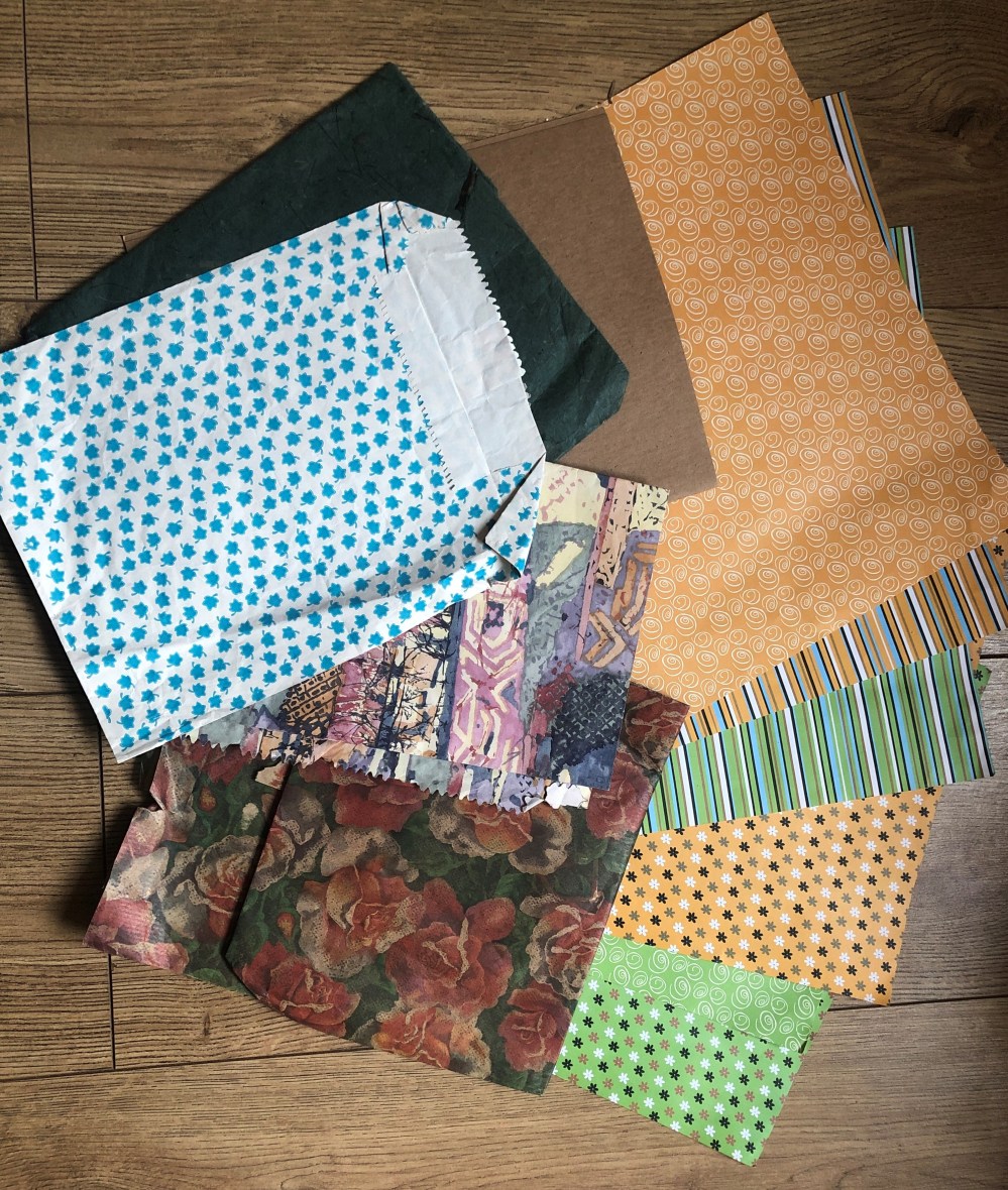
My found paper collection.
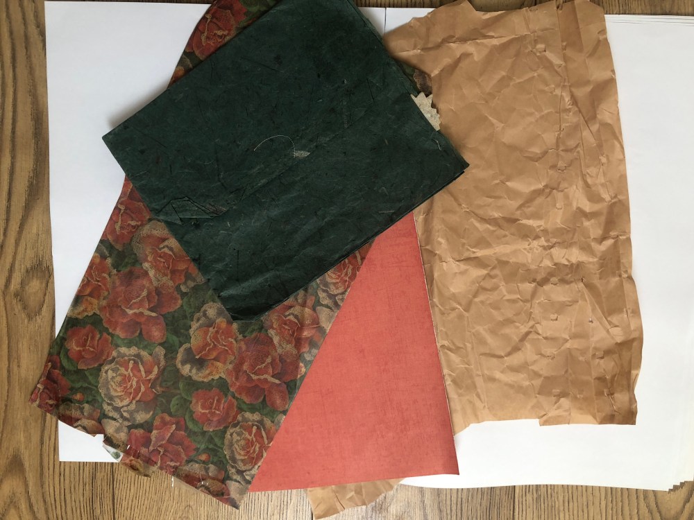
In my pack of found papers I had also sourced old sheet music, a vintage map, an old picture book of natural history and a broken book that I had found dumped outside an independent bookshop. I did have to get over my fear of cutting up literature but I thought of it as repurposing something that could be kept.
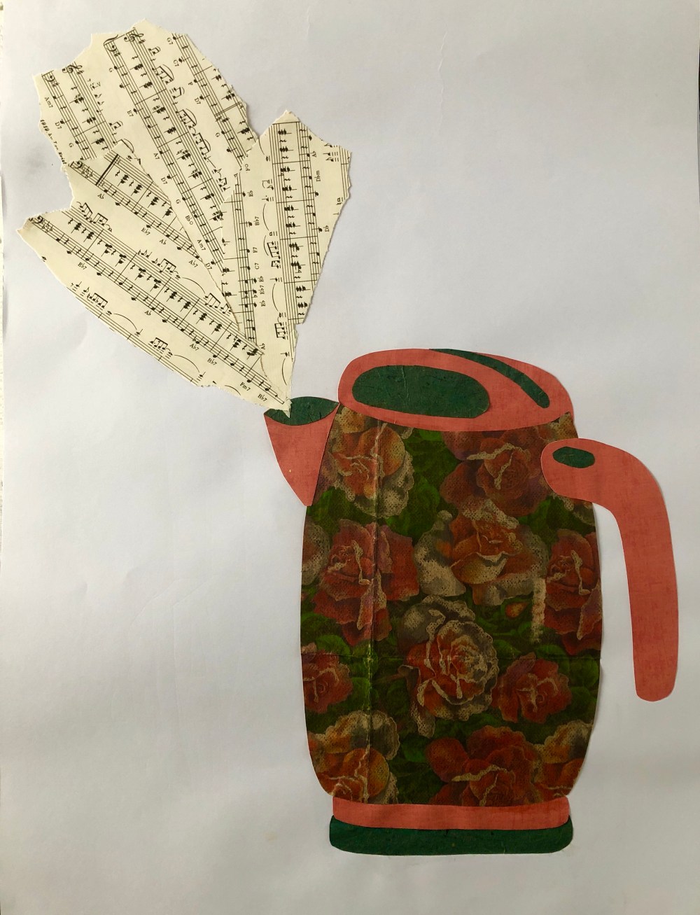
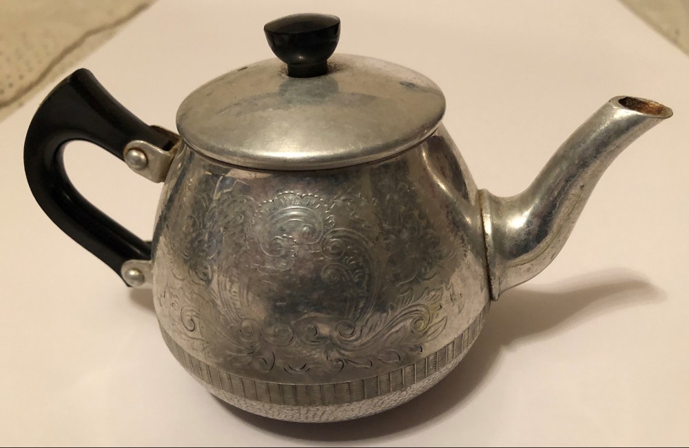
I did a few sketches of my chrome kettle as the brief in the course material specified kitchen related subjects. I thought my kettle was a good way to start as it is has a simple and basic structure and working on A2 cartridge paper I chose a floral paper bag for the main section of the kettle and more coloured unpatterned paper for the handle, lid and base. I quite liked it but felt it needed something else and so I decided to add some torn up music sheets to provide “steam” and as I’m old enough to remember when kettles were heated up on the gas stove to provide a lively whistle.
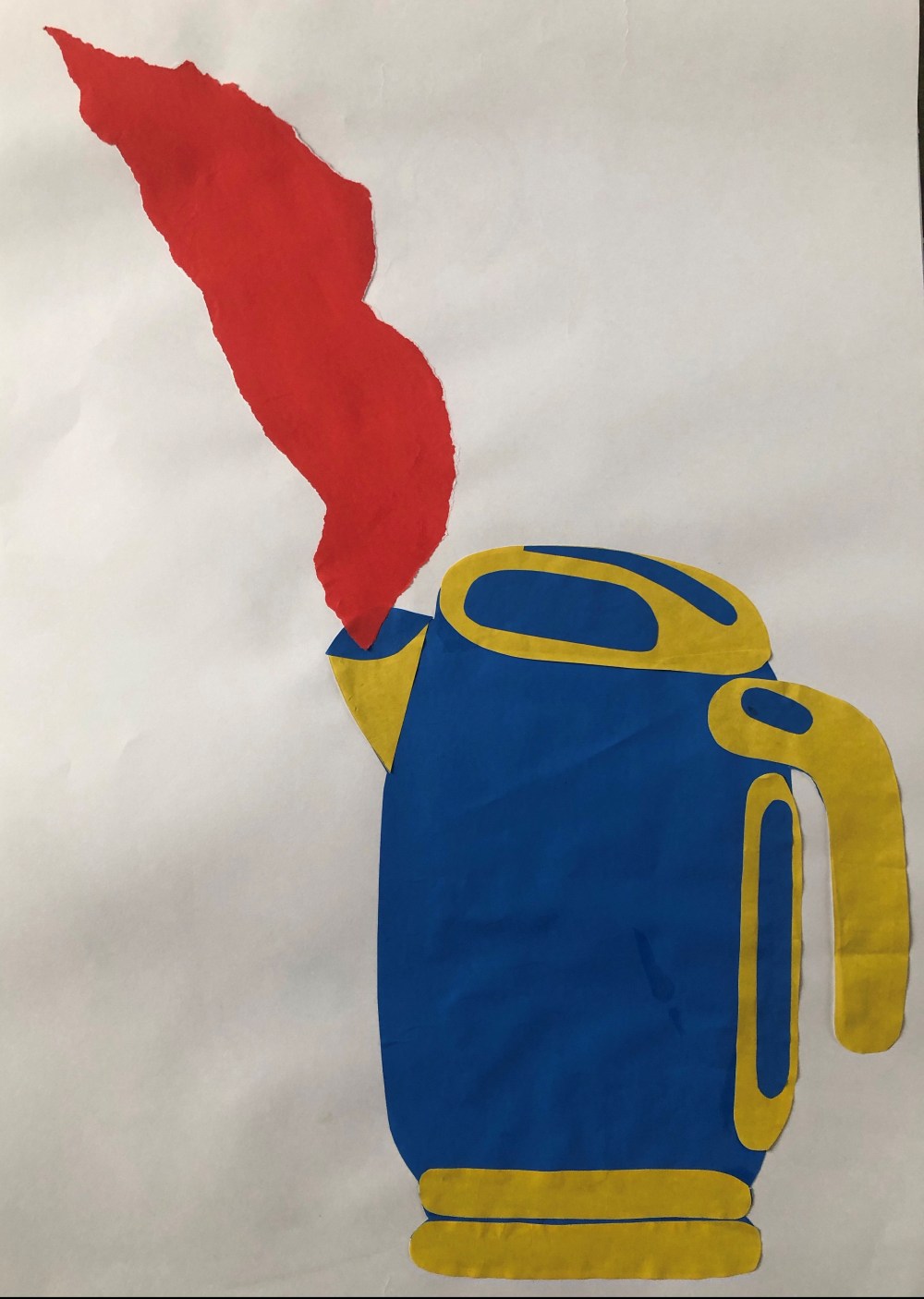
I tried the kettle again in plain paper working on A2 cartridge paper to see what it would look like and stuck to two colour combinations to see how it would look in bolder colours. I used red again for the steam to emphasise heat as an add on but to me this looked too simple and like a series of elongated bubbles. I wasn’t happy with either of these collages as I found them too basic but I thought it was a good start as I had a better idea of what I did want them to look like.
I felt disappointed by the two versions of the kettle in colour and so thought it better to start on a more basic level in order to learn more about how to use the paper and backgrounds and how to cut out paper more effectively.
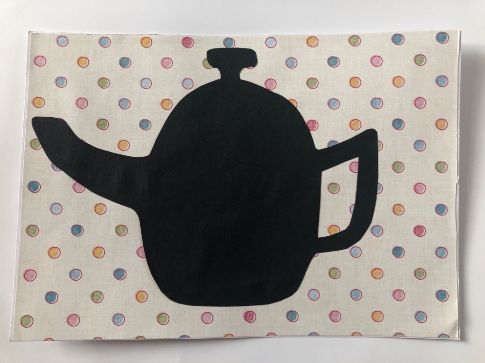
I used black cartridge paper to cut out a block silhouette of my kettle and teapot in order to get a better idea of the shapes and to simplify them to see if they were more interesting in this way than colour. I worked straight onto packing paper of A3 size.

Teapot in black cartridge paper with brown packing paper as the background.
I was pleased with the look of the teapot when compared to the kettle.

I liked working with flat plain paper upon a textured background as it made the image as a whole more interesting. With this in mind I tried again with a colourful background. working in A5 for a change. I found this collage to be more fun and the spotty background reminded me of a tablecloth.
I wanted to experiment with soft edges as I would have far less control over the paper than when drawing with scissors. I chose to use torn plain paper sections to make a teapot and cupcake, working directly onto A2 plain cartridge paper.

I liked this collage as it was very different from anything I had tried before but I did not feel the cupcake was a success, out of the two I much preferred the teapot as I liked the almost 3D effect with the handle and spout being added separately and on top of the collage.
For my next attempt I chose my cafetiere as I felt it had more complex lines and may be more of a challenge. I used black cartridge paper and some Christmas kraft wrapping paper. I tried to think of the object as a series of shapes rather than just the whole so I could assemble it like a jigsaw. My first mistake was buying Pritt Extra strong glue as once it was stuck down it would not allow any movement at all, so I used a regular glue stick so I could move pieces more if necessary.
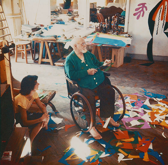
I could see why Matisse used pins to hold sections of his cut outs in place and allow changes to be made, It did make me realise why collages take so long as it was not just a case of cutting and sticking. I found it frustrating at times as I worked out the positioning of parts of the collage, photographed it so I had it as a visual plan and then it would never look right when glued.

I was happier with this collage then with the kettle ones, I felt there was more to it and although it was abstract I thought I was getting a little more confident. I was trying not to make it look perfect and an accurate representation of the object and to ‘go with the flow’.
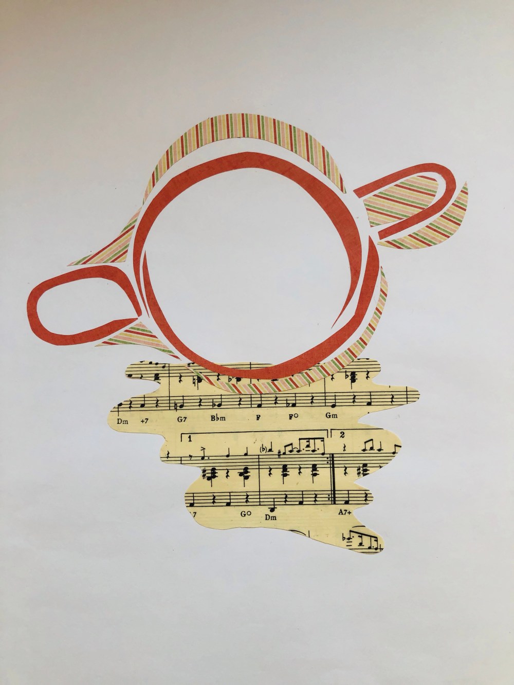
I decided it was time to return to a more familiar object from Assignment 1 and so it was time for my Nan’s teapot to take centre stage again.
This time I wanted to try something different and I used old book pages and simply cut with scissors into the shape that I wanted. I worked with a bigger piece of paper for the main shape of the teapot and kept trimming until I was happy with the shape and then made the spout and lid. I really liked the teapot and added details and the handle in black paper.
I didn’t know what would work for a background and I had a look at the teapot presented on brown packing paper and it looked dull, so I took plain coloured paper and ripped it up to create soft edges and used this as the background and finally I was pleased with the result. 
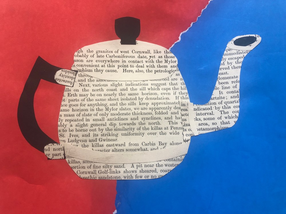
Little teapot made with old book paper.
The photographs are not great due to bad lighting and I think I may have to invest in some LED lights to get a better record for my work as I don’t want it to be badly portrayed at degree level. I was proud of my little teapot and felt I was getting better on this learning curve.
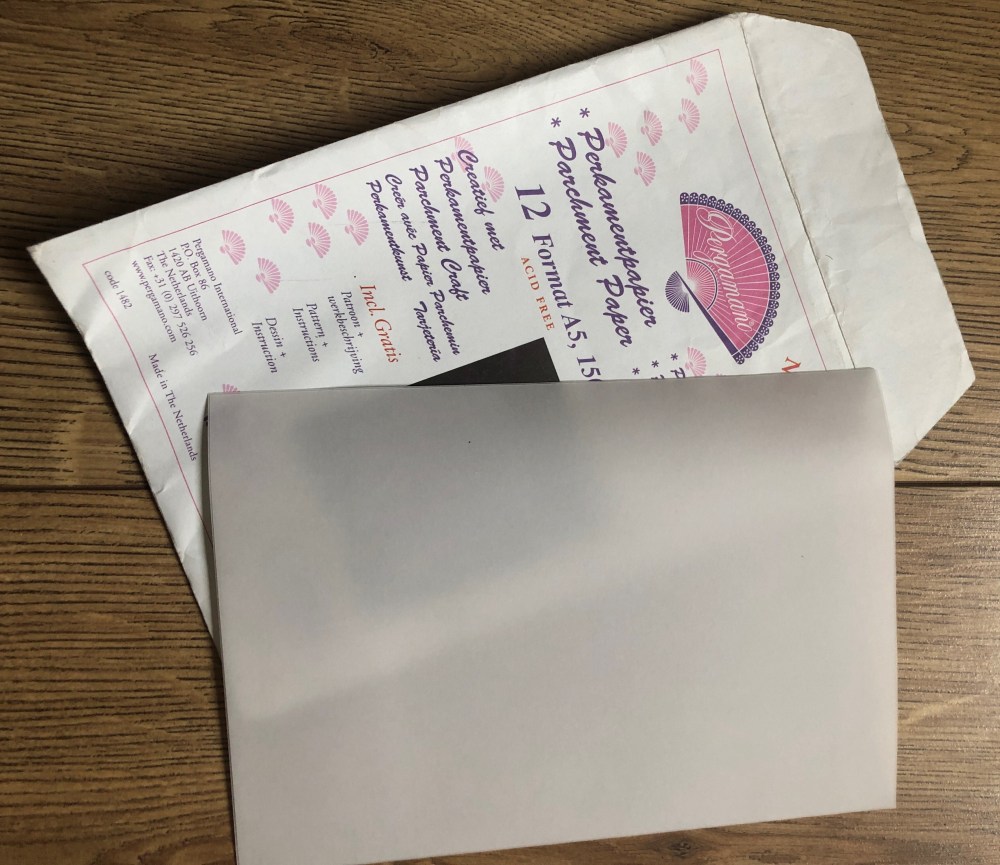
I had some parchment paper in my hoard and I don’t think I had ever known what to do with it so after some preliminary sketches I had a better idea about construction of my cafetiere collage.
I wanted to try and get a better idea of the shapes the cafetiere created and so I drew it on A3 paper and also decided to try drawing with masking fluid on a patterned background and also with black ink and a brush on A3 paper.
I loved experimenting with this.

Right hand drawing.

Black ink with a brush painted onto A3 paper.
I wanted to use packing paper for the background as I needed a more textured feel to the collage, so with this in mind I began cutting. I pasted tinfoil onto cartridge paper and carefully cut out the shape of the chrome section and also the steel inner separately. I embossed with a pencil the workings of the inner press which would be seen through the parchment. Upon putting the parchment over the press I found it turned it white which I was not pleased about but I carried on.
I had done a test of parchment paper and found that glue distorted the image and left visible marks and so I had to construct this collage by gluing only sections which would be non visible when completed. At this point I did think that my attention to detail was too much!

Layered parchment, tinfoil, black cartridge paper on a background of brown packing paper.
I was really pleased how the whole collage turned out and thought the background paper gave more depth when the collage was so flat plus the soft edges complimented the straight edges of the cafetiere. I enjoyed building up the layers with this collage and it made me think about how layers can be important.
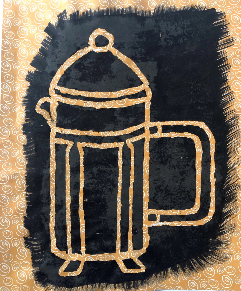
I then looked at the painted line drawing I had done of the cafetiere and had an idea. I took a risk and ripped it into pieces and screwed the pieces into balls.

I wanted to try something completely different with this collage and for it to have texture and depth, so I then opened the sections and glued them like a jigsaw onto red plain paper. It reminded me of the Japanese Kintsugi way of mending broken crockery where liquid gold is used to mend the piece and then it becomes even more lovely than before.

I chose the red background as it would really show off the cracks of this collage and make them into a feature and I was happy with how it looked, especially as it was so far removed from the way I would normally think of making a collage and was very imperfect for a change.
For my next collage I chose a china teapot that was given to me as a wedding present. It was colourful and patterned and I thought this could be an example of something more complex. My tutor had advised me to practice drawing and so I did a sketch of the teapot in pencil and also a continuous line drawing in pen so I could look at the most important aspects of the teapot to try and represent it. I really wanted to show detail and worked directly onto the A2 sheet of cartridge paper.
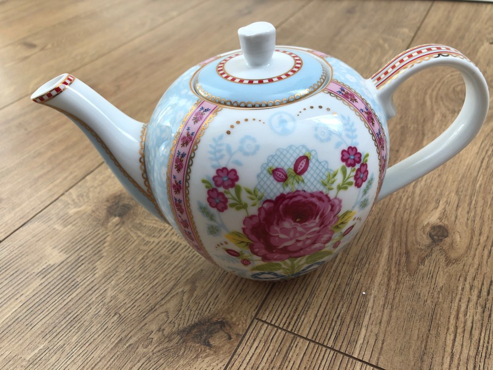
I wished to capture a different angle of the teapot and so did a side view and a view from above. I used map paper, music paper, patterned paper and a postcard of a bar in Prague (where my husband had been!).


The side view of the teapot in pen.
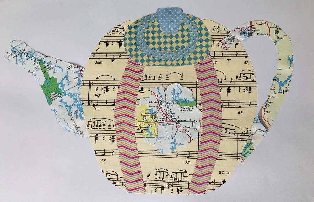
I tried to replicate the shape and details of the teapot in this collage and to use a mix of paper.

I went into much more detail here and made zig zag edges by cutting flower patterned paper with pinking shears, I was happy with this collage and felt it was accurate in representing the item.
Whilst on this part of Exercise 2.2 I found I wanted to try a couple of collages which did not fit the brief totally. I thought of the collages I had researched and how the artists used the collages to send a message and so I chose to try a couple of images inspired by the work of Hannah Hoch. I was trying to listen to my tutor’s advice on taking risks with Part 2 of this course.
Working onto A2 green paper, I created a teapot and saucer collage entitled “Prescription”. I wanted to raise awareness of one of the challenges of mental health as a combination of the phrase “a cup of tea solves everything” along with the harsh reality of the medication someone is prescribed actually being the way that a person may be able to attain mental wellness. All too often in Great Britain we reach for the kettle as a panacea, we see it in culture such as on soap operas where a person in crisis would be offered a cup of tea and we see it on mugs and posters which depict “Keep calm and have a cup of tea”.

I collected found papers related to medication and a paper bag for the teapot.
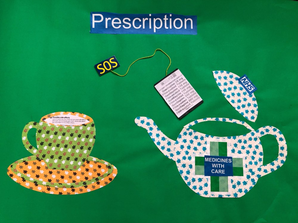
This was the full collage after I had spent time on cutting and arranging the pieces.
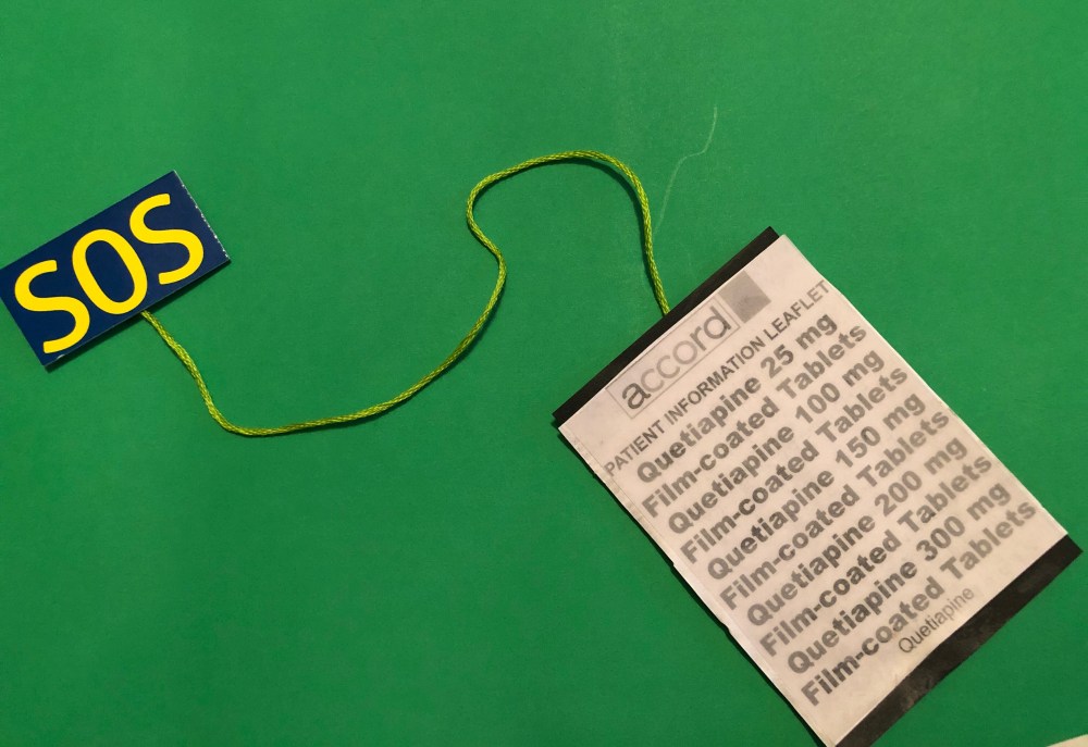
This collage however shows the crisis “SOS” in the form of a teabag, the teabag itself is made from an patient information sheet which are readily found in packets of medication. The teabag is about to be put into the teapot which is gaping open like a mouth, so giving the idea that the tablets themselves will help that person. The teapot is about to contain the tablets and has NHS on the lid as a marker from where that medication has come from and the warning of “medicines with care” underlying that the tablets can affect the person willing to take them, which I used directly from a prescription paper bag.
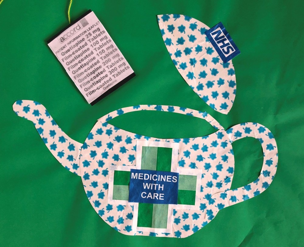
The teapot symbolises NHS mental health services in providing the actual medication laced tea.
The teacup has tea in it, the saucer providing support and the liquid in the teacup is a section from the patient information sheet giving the list of side effects.

The teacup offers a possible solution to mental distress, yet it is a poisoned chalice due to how that person could be affected. Someone could be able to cope with anxiety better but could experience headaches, insomnia and tremors in their hands if they drink the tea. So to sum up this collage, a cup of tea may not solve everything at all.
I then decided to look at another Hoch inspired collage when I was about to throw away the cardboard box from a jar of black ink. I looked at it and wondered if I could use it and thought of the natural history book I had in my stock of found paper. As I looked through the book I thought of Noah’s Ark with all the animals being contained in it and sailing upon the sea. Then I realised what I wanted to make as a collage and so I cut out various animals and coloured them with pens and ink to show the variety of animals through colour also whilst working directly onto an A2 sheet of cartridge paper.
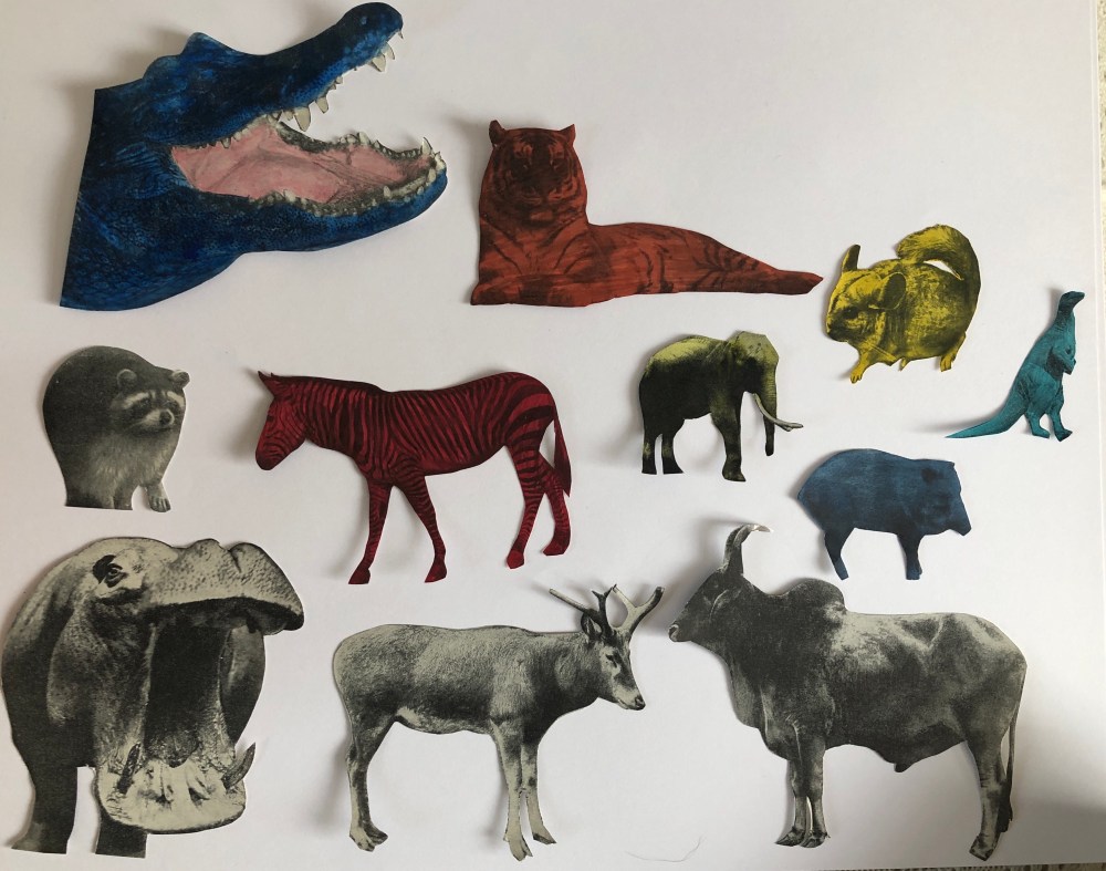
As I coloured the animals I could see how I wanted them to be bursting out of the cardboard ink box, almost like their release from the Ark when the water had finally receded.

I had the insides of envelopes and also blue craft paper and used them to make waves. I mixed the cut out waves with torn paper to create soft edges also, plus I tore the paper to try and represent the crests of the waves to help with the feeling of movement.

Once the whole collage was together I kept looking at it but it didn’t look how I wanted. Then I realised in my opinion that the waves being blue were not right, as the animals were bursting out of the ink box that was depicting black ink. With this in mind I created an overlay using black craft paper and I tore the paper again, making sure with each wave that it had a white edge to break up the blackness and so the pieces could easily be seen as waves.
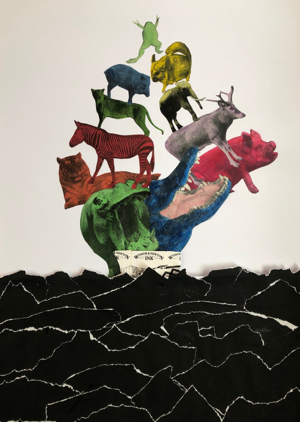
I felt this version worked a lot better and was more fitting to the journey of colour that the animals had when released from the Ark and it also depicts energy, especially the little frog at the top who is leaping up towards the sky.
My next two collages were a bit tongue in cheek as I didn’t quite stick to the brief and felt like bending the rules again. A friend who I have met on the course and who shall remain nameless had got me a bit competitive by collaging a glass of Absinthe and so I tried to raise the stakes a little for two more unusual objects. I chose my e-cigarette and a can of lager, not strictly a kitchen object per se but can often be found in a kitchen.
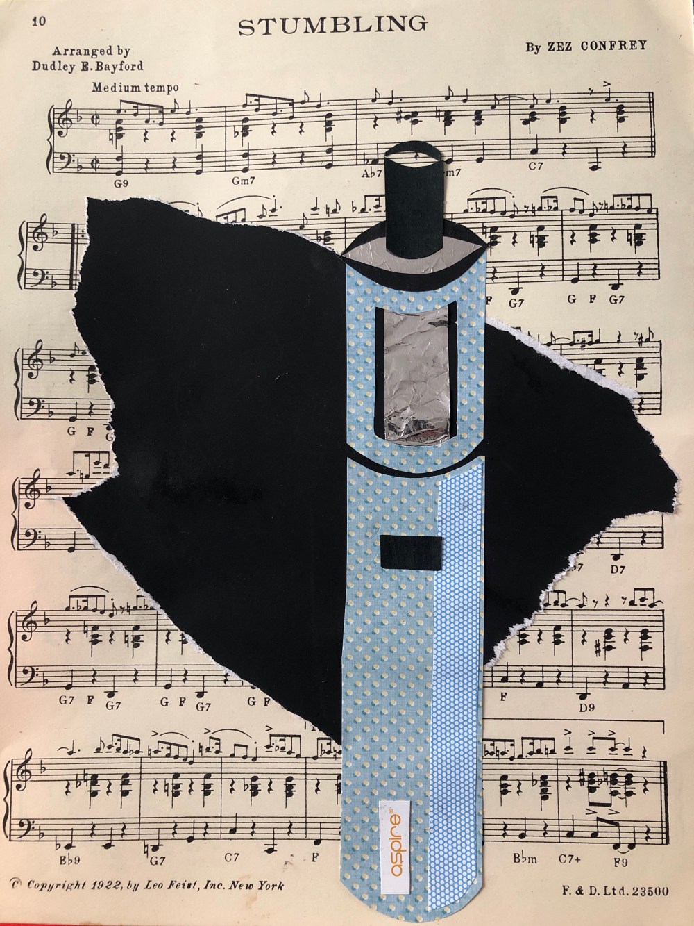
Working directly onto an A4 piece of old music paper, possibly aptly named (!) I used patterned paper, foil and inner envelope paper to produce this collage. I used the torn black paper to act as a bold background so the inner parts of the collage were not lost in the sheet music and it also worked well as I assembled the inner coil using the background black paper to frame that part of the e-cigarette. I felt this was my best collage work as I liked the light and shadow which the mix and positioning of papers created.
My next risk taking collage was the can of lager and I tried to do a unique take on it. 
I wanted my sense of humour to shine through on this one and as my friend and I celebrated with a cheeky “tinnie” when we finished Part 1 of this course, then I needed this to represent it also. I replicated it in A4 size using plain craft paper, a monkey cut from my natural history book and foil which I had glued onto card which I then cut into shapes. I even made the ring pull separately so it had a bit more detail.

A bit of fun!
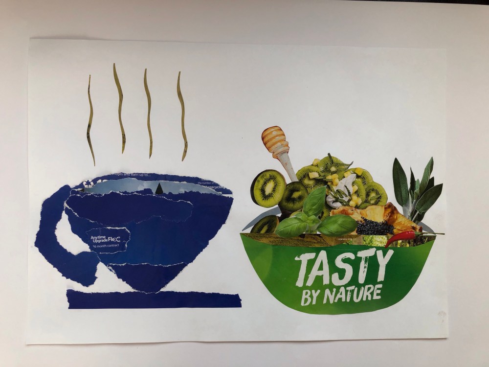
I added one last couple of collages as I couldn’t decide the criteria they would fit in and I thought they possibly fitted in best with block silhouette. I had an old copy of a supermarket magazine and was flicking through it and had a couple of ideas. I worked directly onto A3 paper.
Using a mix of shades of deep blue torn from different food adverts I constructed a soft edge collage of a cup and saucer and then tried a Hoch inspired collage after reading another magazine advert for “Tasty by Nature”. I cut a bowl shape out of the advert ensuring the words were kept and then selected varying herbs and vegetables to put in my bowl. I wanted a balanced effect and the arrangement took some time but I thought the whole bowl and contents worked well, the images were delicate and hard to cut to get the detail but I enjoyed doing this.
I had the idea of a wine bottle block collage and so made this on A3 paper but I couldn’t decide on what would go with it so I thought of Matisse and so chose to add an unusual twist to the collage with different coloured and patterned blocks. I’m not sure if it worked but it was something different and I enjoy experimenting, I’m finding that I learn so much more this way.

Having exhausted my mental supply of ideas, I felt it was an appropriate time to begin the next section.
Exercise 2.3 Line
As I had never worked with line in collage before, I wanted to stick to shapes which I was more familiar with. I was struck straight away by how difficult it was when doing larger shapes in one go. I think I went wrong at times as I was almost trying to peel the apple in one go and a couple of collages went very wrong and had to be rejected. I found it easier to “anchor” parts of the line with a spot of glue whilst trying not to twist the remaining line into the wrong shape.
I began with the kettle again to see how I could replicate it and was surprised how long the positioning of the cut out lines were. The slightest mistake changed the look of the entire drawing!

I had this collage carefully planned working directly onto A3 cartridge paper joined with another piece to give a full A2 pieced and was really unhappy with the top section of this collage as it came out so crowded. I wanted it as more abstract but to me it was not as good as I hoped. The cut out lines were so delicate and my fingers were caked in glue and so lines were too fragile to be moved.
I tried again with my cafetiere next to the kettle working directly on A3 paper and found this to have the similar issue of the top section being crowded. If I tried again then I would try with working from the bottom upwards where the less complex sections of the drawing could act as a guide for the rest.

One discovery I did make was that pieces in the trash pile were often the most useful, particularly regarding curved lines. But the spout on this item was not correctly positioned and so I felt this aspect meant the cafetiere looked disjointed and not fluid like I had hoped.
The brief then asked for an A4 study and an A5 study, I was unsure working on a smaller scale but firstly tried with the A4 and chose a bright yellow background for a change from white cartridge paper.
For this collage I wanted a study of a half full glass of water with a straw. I really liked planning this one and I used black cartridge paper for the lines, blue craft paper for the straw and patterned paper for the liquid within. I wanted this to be simple but effective and to try and work with different shapes to give an overall effect. 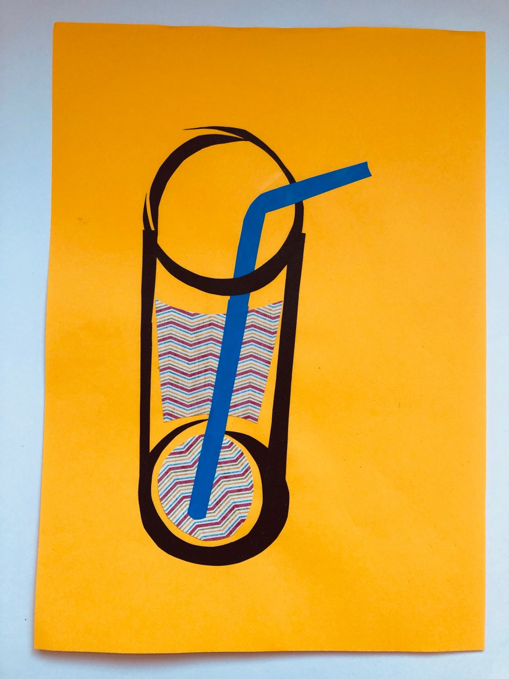
I spent time working on the placement of the contents of the glass and where the straw should sit. I decided that the water within would be transparent and so the straw placement should reflect this. I glued the patterned paper first and then the straw and practiced where the lines needed to be, taking photos on my iPhone to act as a visual aid.
This time I started at the bottom of the glass and worked upwards but yet again despite me being careful, the top was overcrowded and not what I wanted to achieve. I was now fully aware of my mistakes and that much more practice was needed. I did feel the collage was a semi success as it was still a line drawing of a glass but just not how I wanted it to turn out.
I moved on to an A5 study and worked out how big the collage needed to be. I decided to try something with more fluid lines and a different way of creating it. I chose to draw a cupcake on a patterned background. This time I cut out the block silhouette of a cupcake to begin with and then cut into the cupcake to create outlines without breaking the frame of the cupcake. Although this could possibly be deemed cheating, it was interesting how different it looked when placed on patterned paper as one solid outline rather than lots of lines arranged near one another. I liked this one best of all the line drawings so far.

The brief asked for my thoughts on the different approaches of line and backgrounds. I have to say that I was going to partially sit on the fence with this one as since doing Part 1 Line, I have found that I really have a passion for negative mark making and working in just black and white. Certainly the black line on white paper did make the exact details of the drawing stand out more but the patterned paper almost “filled in the blanks” and gave the whole drawing a different dimension, I particularly found this in the cupcake drawing and I really thought that although it was the simplest of all the line drawings I had done, that it stood out more than the others.
From the questions in the course materials I evaluated my work in Exercise 2.3 and found I had chosen to work with line mostly from a forward facing angle as I found this easier but I could see that I needed to try working from a more experimental angle. I think this had a lot to do with low confidence in trying something new. I found curves would work better if I used thicker paper or card as it was so difficult to glue down thin paper lines without them getting twisted. The drawing of my kettle would have looked better in a darker colour or a change of background as I felt the white background was too harsh and didn’t help define the lines and the mood of the collage looked boring overall. If I redid this collage then I would have torn strips of patterned paper as a background and used black paper for the lines.
The lines of all my collages in 2.3 are all sharp but the curves do help soften the edges a little, I had difficulty with torn paper soft edges in block silhouette and I didn’t think I could have done line collages with torn edges but this could be something I need to consider for the future. I did like working in negative with my A5 cupcake study and I felt this was successful but again I am trying to be too neat and careful.
I could not see a particular era in my line drawings and I found this question in the course materials an unusual one. To me I think it would depend on the subject chosen to make a collage of as most of my kitchen related appliances are modern. One question I would like to see in the course materials would be a timed collage where I may have 30 minutes to make the line drawing as I spent so long trying to get details that a faster approach may have had interesting results.
Exercise 2.4 Collage Studies
For this part of the exercise I had to work with both block silhouette and line, I was uncertain as to how this would work to begin with and so began with an idea inspired from the questions from the previous exercise about the differences in approaches.
As previously mentioned, I really do enjoy working with black and white and with this in mind, I revisited the line drawing of a glass of water. Working on an A4 sheet of card, I tore black craft paper to act as a background and then did a negative line drawing of the water, using a red straw made of red craft paper and the water from the inside of a large envelope. I spent more time than before on the lines of this collage as I knew what I wanted it to look like and did not want to rush it and get it wrong. I kept measuring and checking the lines were further apart to ensure the glass did not look closed in.

This time I felt I got it right as the lines were evenly matched and the outline could be seen through the water (blue envelope paper) which gave it a more realistic feel than just cutting two ends of white paper and sticking them on. I thought the red straw was eyecatching and effective in its simplicity. Again, it reminded me that less is more and that negative studies can actually say more than black lines on white paper.

My next collage was to be of this china gravy boat that I had picked up some time ago in a charity shop. I liked the lines of it and thought it was quite complex, so gave it a try. Working on A3 paper, I used green as the colour for the lines to make them stand out and to try something different than using black lines in a drawing. I was trying to get out of my comfort zone more.
The construction of the lines took time and then I added detail using painted paper from my collection of found papers and I worked at trying to replicate the lines I saw both outside the collage and inside which were picked out in gold on the china boat. I didn’t want this collage to be perfect but to flow more. I also chose colours which complimented one another.

I used brown parcel paper to try and depict the curves and shadows of the gravy boat, next to the lines to outline the shape. The painted paper acted as the patterned band of the gravy boat and all together I found that this collage had worked well. I was interested in how the colours and pieces interacted with one another and found this pleasing.
My next collage was something I had wanted to try having found a small milk jug in my china cabinet that I hadn’t paid attention to before. 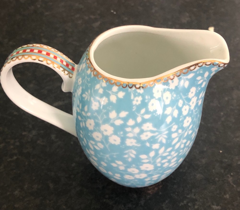
I wanted to convey movement again here and so decided to have a different approach with the milk jug having fallen over, spilling its contents. I used a mix of plain and patterned paper here to try and express the curves of the jug and I used music paper for the “milk”. I coated the music paper with PVA glue so it would have a slightly glazed appearance like the spilt milk. This collage was much more difficult as I was thinking outside the box more as how to show the curves and circles of the jug but felt the overall outcome was acceptable.
I did find that trying to work with both block silhouette and line was difficult as I was trying to get the line right first before adding the additional details and I am not sure that the colour combination here was right as the body of the milk jug lying in the milk was almost lost in it. You would have to study it quite closely to see this section and I think varying shades of blue for the jug itself would have made it stand out more than the beige and brown colours I had chosen.
When putting crockery away in my kitchen I noticed how bowls do not stack straight and so thought I could make a collage in a similar way. I cut out bowl shapes from patterned paper and also had a matching outer rim cut out so it would show the viewer that the bowls were sitting in one another. I chose a fairly neutral background as I wanted to try a mix of line and block collage and so made two of the bowls just cut out line so they would pick up the background as a feature.

It took a while to assemble the collage as I had to almost plait the bowls in a line, so the outer rims gave the idea that the bowls were sitting in the middle of the bowl underneath. I kept the background plain but interesting with torn edges of kraft paper and some packing paper that I had used under a painting I was doing. I used some of the stripy paper from the bottom bowl to add detail to the line cut out bowls and tried to keep the whole collage as minimalist as possible. There was a lot of overlap involved and I did have to plan out the collage and keep taking photos of the process to refer to as I glued them down.
I don’t feel this collage worked as there are too many bowls and some of the bowls are too heavily patterned. Three bowls would have been better than a whole stack and I would have chosen two block collage and one line drawing for the smaller stack of bowls. I liked the background as it showed up the bowls well and fitted in with the colour palette. I should have stuck to ‘less is more’ with this collage.
I had one final collage for this section and chose the Japanese Kintsugi concept from looking again at my torn up painted line collage. Working on A3 paper I took a piece of white card and cut a block silhouette of a bowl on it and then tore it into large pieces. I began by thinking that I wanted the bowl to be white to symbolise purity as I coloured the edges red to look like they were bleeding. I had a section of gold foil from an Easter egg which I used for the Kintsugi gold flowing between the broken sections of the bowl. The background was a reproduction page of a newspaper about the Second World War and how this affected the city of Lichfield where I was born. I had found it and kept it and decided it would be the ideal background to show the pain and suffering caused by the war and how a broken Britain was mended and healed after some time.

I spent some time looking at the bowl in white and it looked too spartan and simple and so I painted a pattern on it with blue watercolour paints. I felt it made the collage more interesting and it had more impact, plus I was able to capture the fragility of the bowl with the pattern I painted as I tried to make the pattern feathery and delicate. I was much happier with the end result and decided not to add the opposite edge of the rim of the bowl as I wanted the viewer to be able to read the information on the newspaper page as much as possible. I like the overall effect but I think the bowl could have been better in black with the gold showing through alongside the red effect. The white card looks too clinical even with the blue flecks on it and white paper would have been better than card, the shape of the bowl is too spiky.
I found with collages that I perhaps paid too much attention to the outline and it could have been interesting to see if I could collage the inside of an subject like my kettle to see if it would still resemble a kettle but I may have needed a more complex subject which to draw. I was observing the shadow a lot and with my spilt milk collage I think I had the colours I used the wrong way round as the details sort of melted into the white background. This would have looked a lot better on a black background and I should have tried having the outline of the milk jug in white and the outer detail in red or another bold colour.
Exercise 2.5 Stripes and Spots
The course materials here intrigued me as I was not sure if I needed to do a kitchen object collage set or something completely different. Having thought about it and actually used my sketchbook to draw some ideas out, I could see a clear theme coming though and decided to ‘go with the flow’.

My chosen theme was going to be stripes and spots but I wanted to base this on punctuation marks. The other aspect I wanted to try was collages in black and white as I saw on some of my sketches that you can either see the white or the black as the main shape, almost like the pictures that were popular in the 1990s which looked like a pattern until you were able to make out that in the pattern was a ship or an animal.

I like angular shapes and buildings, I got married at Titanic Belfast which is a museum of Titanic as well as a centre for events and I remember being fascinated with the building as it was so modern. It was designed to reflect the stern of the Titanic and the texture on the outside of the building is to represent waves. Amongst the waves are slotted windows which are the lifeboats full of survivors found on the sea after Titanic sank. I recently went back to Belfast and since beginning this course, it is like seeing things with new eyes. I looked at the building and took this photograph of part of the main atrium and I imagined if I could ever manage to create a collage like this photograph.

The Titanic exhibition has sections on walls of the Morse code used when the wireless operators were sending distress messages and on the walls they were both poignant and effective. So with this in mind, I began the exercise with a more simple form of communication, the comma. I was unsure if this was too basic and so tried both ways with the commas.

I thought the commas on the black background worked better out of the two and used a red base behind the white background commas to show up better on the photograph. I liked how the backgrounds of both collages could also be the focal point.
My next collage was worked in black and white and I wanted more angular definition so I chose an exclamation mark. I cut out the black line and circles for the dots and it was only when I was arranging them that I saw something interesting.

The black lines stood out well against the white background, but it was hard to tell if the background was white or black with a white overlay as the pattern looked geometric to me and reminded me of 1960s style wallpaper. I wasn’t sure if adding the dots would be as good but I gave it a go.

This looks like steps at second glance.
I really was happy with this collage but preferred the first version as this version looked too crowded although the pattern repeated well. I wanted to try another of my designs from my sketchbook which again was angular and cut up strips of white paper and arranged them in a crosshatch fashion on a black card background.

I was wanting this collage to also have depth and not be ‘flat’ and I added very thin strips of black paper on some of the white strips.
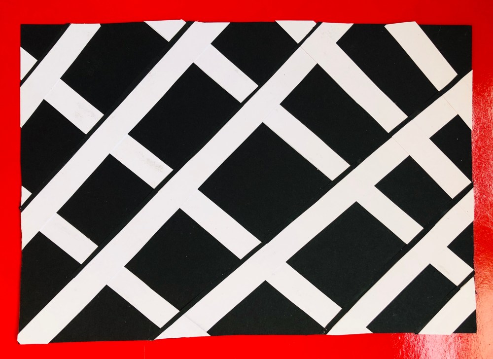
This was my most favourite collage yet of this theme and I felt the most successful. It made me think that there was so much more to learn and to test, plus I was going back to my sketchbook for ideas which could be reworked or used as a springboard for other ideas, reinforcing that I have to use my sketchbook for every part of the exercise. I also bought a small field notes book to have with me if out and about.
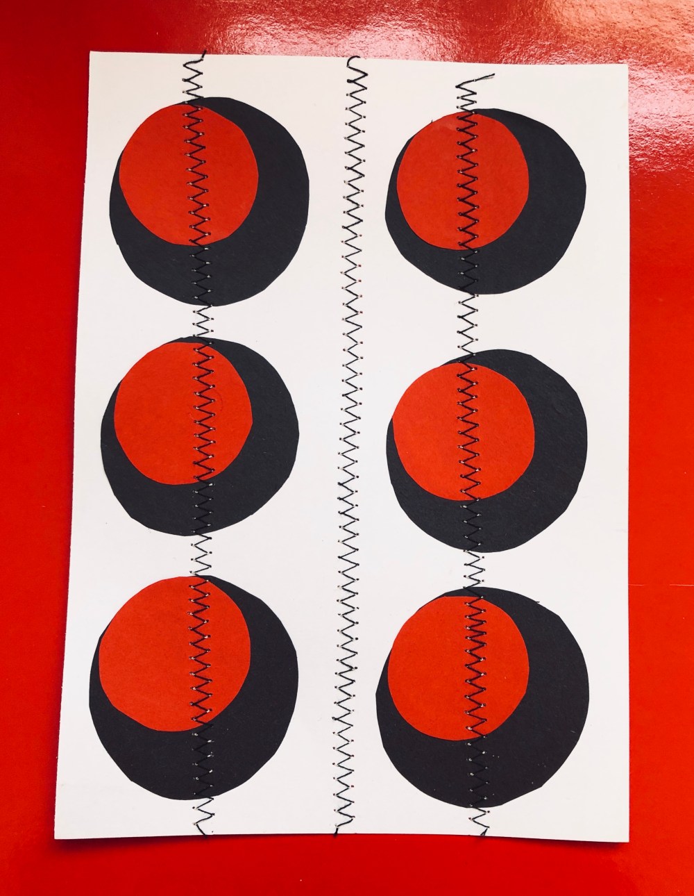
I wanted to then try full stops but I didn’t want just circles on paper, I again wanted to add definition. Using a white card background I cut larger circles of black card and smaller circles of red card. I tried various ways of positioning the red circles until I saw the right place and again I thought it had a 3D element to it. I’ve just begun practising sewing not just on fabric and so I sewed zig zags on the collage to break it up a little. When I looked at the finished image it reminded me a bit of a Lego brick or a masonry brick as the dots are almost holes.
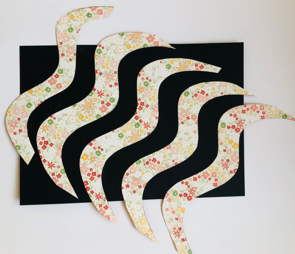
For my next collage I wanted to try something completely different and very simple, I chose a ~ symbol which according to Google means ‘approximately’. I cut wavy lines from patterned paper and arranged them on black A5 card. I didn’t trim the edges off as it would have not distinguished them as the ~ symbol. I liked the black lines in between but found this collage dull overall.
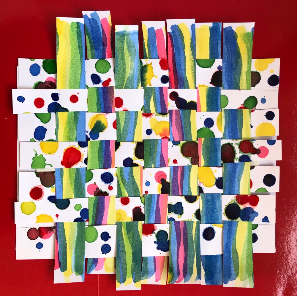
I was about to put my collage papers away when I happened to see a scrap of paper with an ink blot on it and I wondered if I could incorporate ink blots into a collage. My tutor encouraged me to be “messy” and although it was on a small scale I did.
I took my coloured inks and made stripes on one piece of A5 white card and with another piece of A5 card I made ink blots in rainbow colours. I loved being messy!

When fully dry, I cut the cards into strips lengthways and then wove them into a basket style collage which was fiddly but the overall effect was befitting to the exercise title as I had stripes and spots.

I tried a red background also to see how it would make the collage stand out.
Conclusion
I did really enjoy this part of the course and again I could certainly see a development in terms of improving my work as I went along. I revisited some themes of Assignment 1 with the mark making and my favourite collages were again the black and white in negative. I found that the simpler collages were the better ones in my opinion and I was not as successful with line drawings with long lengths of paper. I was learning more about using backgrounds which I had not paid attention to as much at the beginning of the assignment. One aspect that I really liked was being environmentally conscious as the course materials encouraged the use of found paper and not necessarily bought. I had a lot of patterned paper from craft magazines which I had kept and I tried to incorporate as much used and found paper as I could.
I liked the pattern repeat exercise most of all as it was good to work on a smaller scale and it made me see things that I had not expected that I could do, such as the “Lego brick” pattern repeat which did look three dimensional which was a complete accident. It made me realise that I need to spend more time looking at the positioning of paper and how this interacts with the rest of the collage.
I did find the assignment hard to understand at times due to lack of direction from course materials and I was concerned about going down the wrong path as there was not enough information or clear steps and I know I was not the only student who felt this way. I also found the theme of kitchen items repetitive having already done this in Assignment 1 but I recognise that kitchen paraphernalia is something that every student will have in their home so is therefore an ideal subject choice. I did want to test out other themes of collage which could be wrong as my “Noah’s Ark” and “Prescription” collages do not fit the brief but were done on impulse when seeing the related found papers.
I have certainly been taken out of my comfort zone with Line and Collage and I am very much looking forward to Part three Materials as I’m hoping I will have a lot of ideas to try and also to make notes on in my sketchbook!