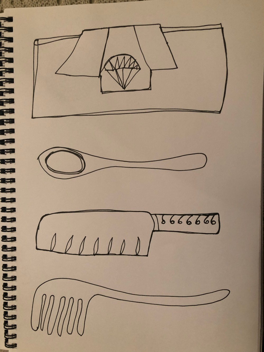
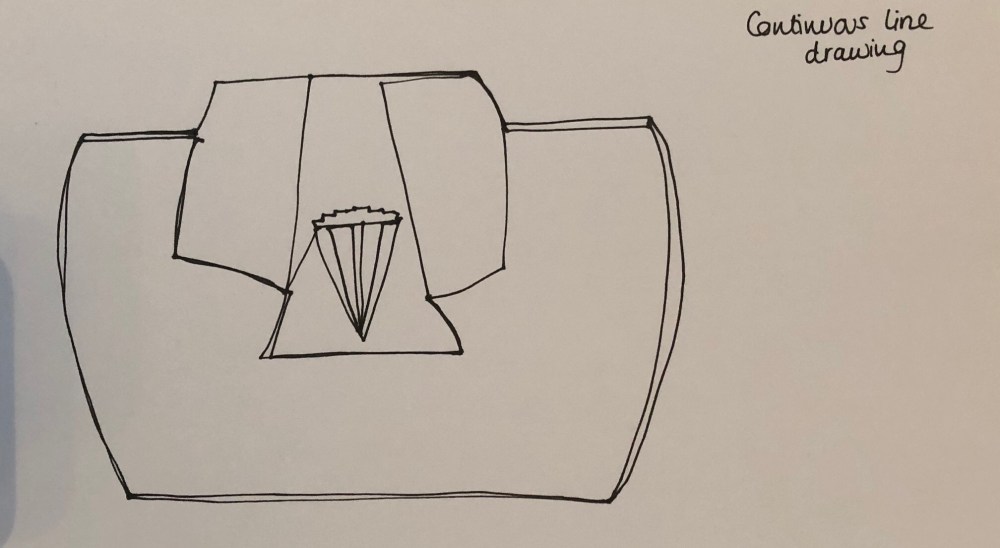
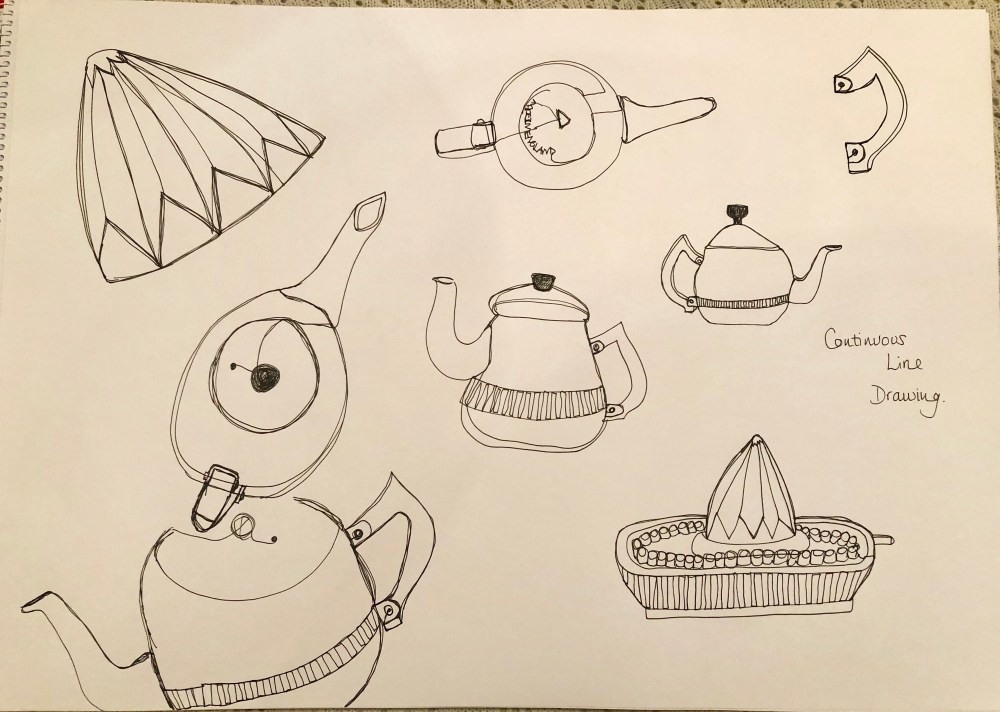
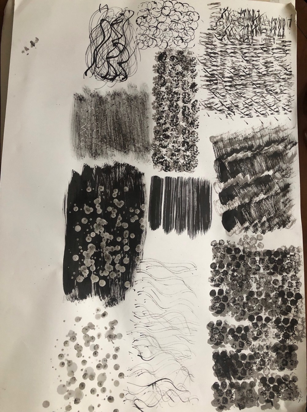
Beginning with mark making

Exercise 0.1 Marks with conventional tools

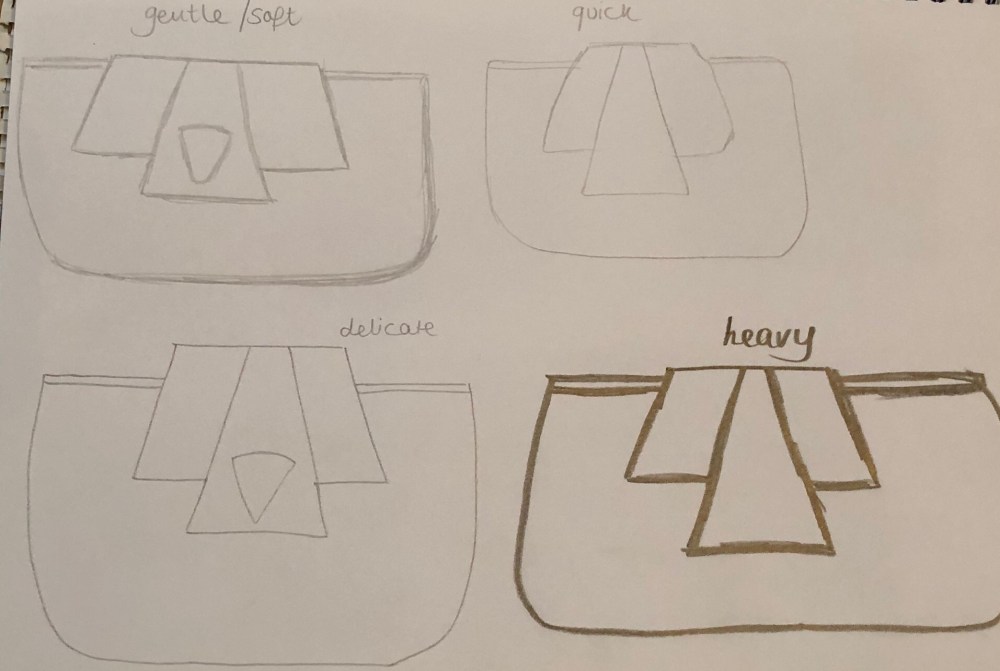
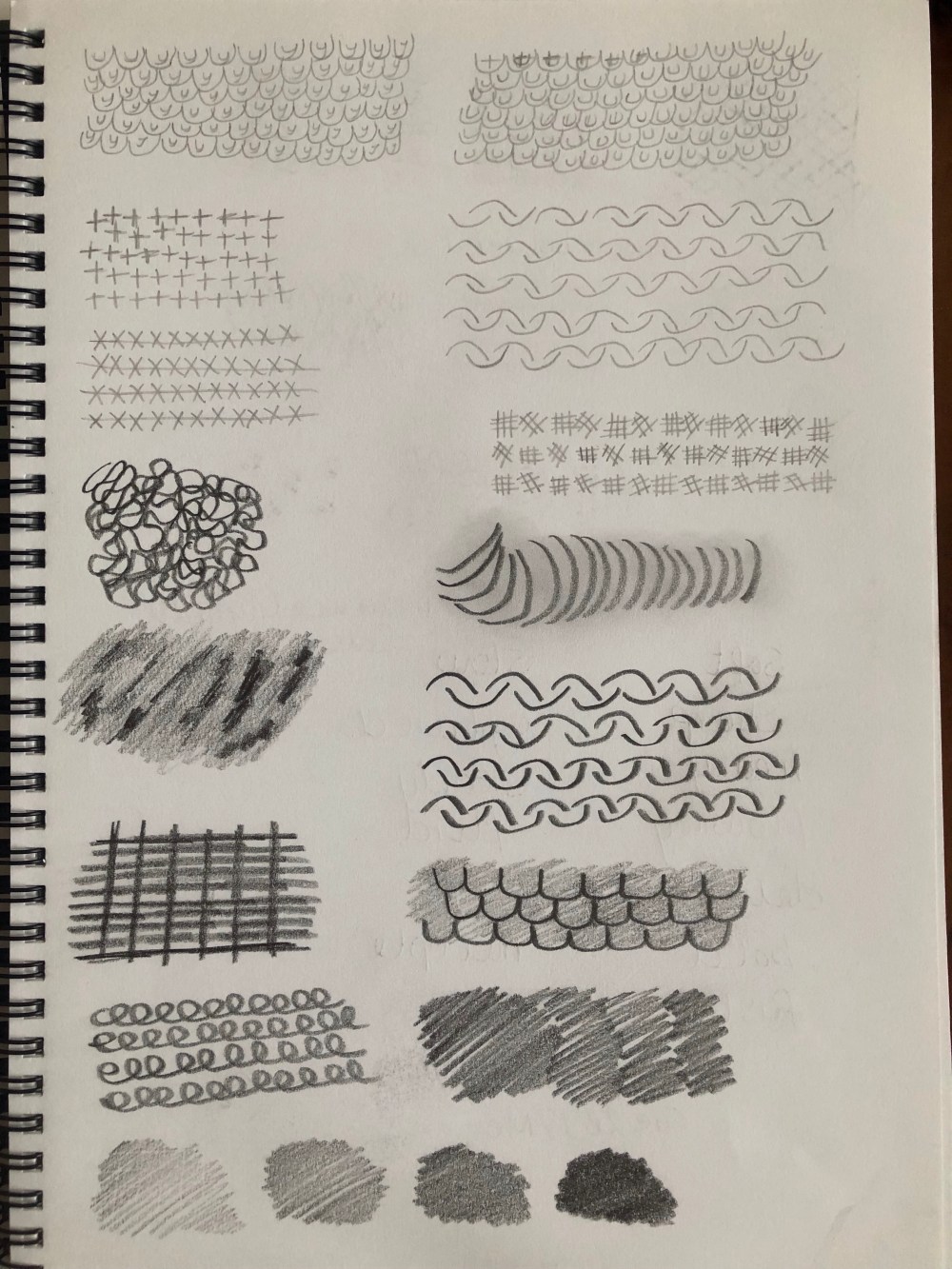
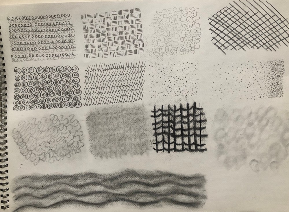
Having read the beginning of the OCA textile design foundation course, I began by making marks in an A4 sketchbook using different grades of pencils. I followed the descriptive words to channel the marks and help me experiment more.

I found that I liked the bolder softer lines more and they were easier to make marks. I filled several pages of the sketchbook to test out the marks before using large cartridge paper to design my favourites and try them out in a larger format.

I began by getting used to the grades of pencils and tried to see how they would interact with the descriptive words.

I loved the shading and blending as it created different effects.

I moved onto my bigger sheets of paper and began seeing how the marks changed when larger. I know I was supposed to start on the larger paper to begin with but my sketchbook worked better for me. I found I preferred holding the pencil as I would if writing as it gave me better control but liked the squiggles I made when holding the pencil right at the end. By holding the pencil right near the tip I could make very bold and heavy marks.

I enjoyed making marks on a bigger scale and using charcoal and pens.

I like making patterns and trying different shapes to try and convey texture and movement in a drawing.

Mark making with pens and ink

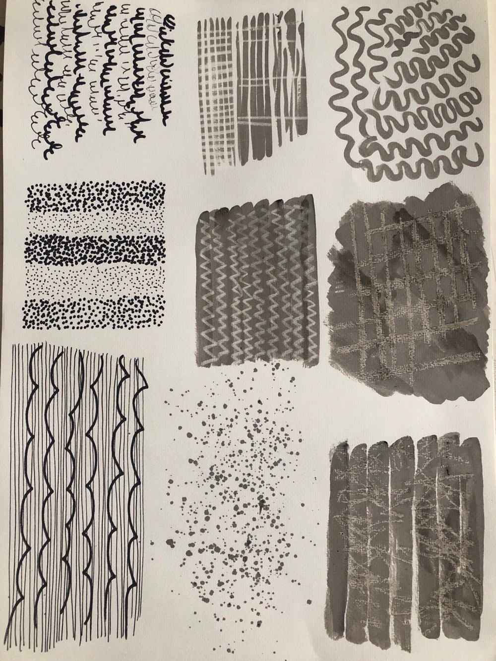
Exercise 0.2 Making tools

Having experimented with different pens, pencils and conventional media, I moved on to creating unconventional mark making tools. I wanted to use found objects but as natural as possible to see what kind of marks they could make. So I collected a pine cone, a cork, a stick, old string, acorn cups, a piece of bubble wrap, a wooden toothbrush and a mascara brush. I used the stick to try and make a stamp with the bubblewrap and the acorn cups, using surgical tape. I started with a bottle of black ink that I had had for some time and unfortunately it had lost its pigment and I was left with brown marks when it had dried.
Having got a new pot of black ink I decided to go over the marks I had already made and actually was really pleased with the results as I saw negative marks as well, even though I cheated somewhat. It gave a different depth to the marks, especially where I had tied string around some plastic pipe and rolled it in the ink and then on the paper. I need to remember this for a future project or assignment as it reminded me of tree bark.
I really enjoyed this part of the assignment and it was fascinating to see what the different tools could do.
I also used a candle to make negative marks and also marks using the sooty candle wax to darken the wax and I saw several of the descriptive words. String dipped in ink gave flowing marks, the mascara brush made agitated marks and the bubblewrap gave bold marks.

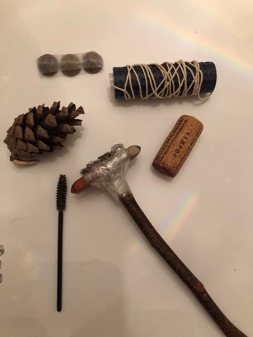
I found that using the bubblewrap stamp and acorn cup stamp limited the marks I could make but did make an interesting pattern. The string dipped in ink gave a good flowing line but I couldn’t have drawn anything complex with it as it was messy to use and the lines were too fluid. The cork also restricted line drawing but it did give me ideas for tools I would use to fill in areas of a collage or drawing as it gave a nice textured imprint.

The best unconventional tools of the set I made were certainly the mascara brush, the end of the toothbrush and I found a thin wooden coffee stirrer which gave more accurate lines when used with black ink.

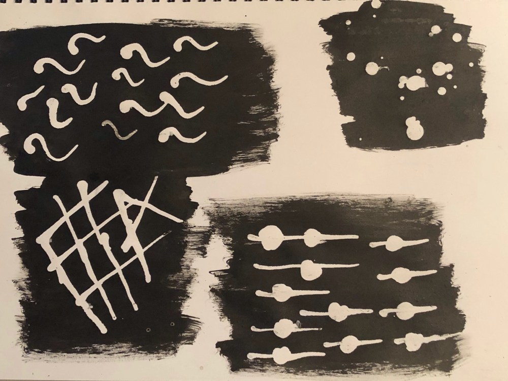
Exercise 0.3 Negative marks

I used some of the unconventional tools to make marks on A3 paper and found the masking fluid needed to be applied thickly rather than a light wash. The stick and end of a paintbrush worked well to distribute the masking fluid, the opposite end of the mascara brush was good as it was smaller and I could draw with it. My first attempt with the masking fluid did not work as I hadn’t left the ink wash long enough to dry and the paper tore. My second attempt was much better and I enjoyed making patterns with the masking fluid and upon removing the dried fluid I liked the way the negative mark looked so white against the black ink. The spots of white did not look as good as the actual lines and shapes as the bigger the shape or pattern, the more effective the colours seemed to look together.

When I was a young child my parents took me to the Tate Modern in London. There was art on canvas and paper as well as installations and I recall looking at one giant canvas which on first glance appeared to be just painted black. However, upon concentrating and looking deeper into the painting I could work out that there were rectangles and other shapes under the top layer of black paint and once I could see them then I could not unsee them. It made me understand depth and to try and look at the layers involved and to break down sections rather than just evaluate the image as a whole.

I decided to try using masking tape as it is a particular favourite of mine, I tore up sections of masking tape and covered an A2 sheet with tape before then going over the sheet with pencil strokes, graphite stick, pen and charcoal. I tried gentler pencil marks and then harder and upon removing the tape, I was really interested in the results.

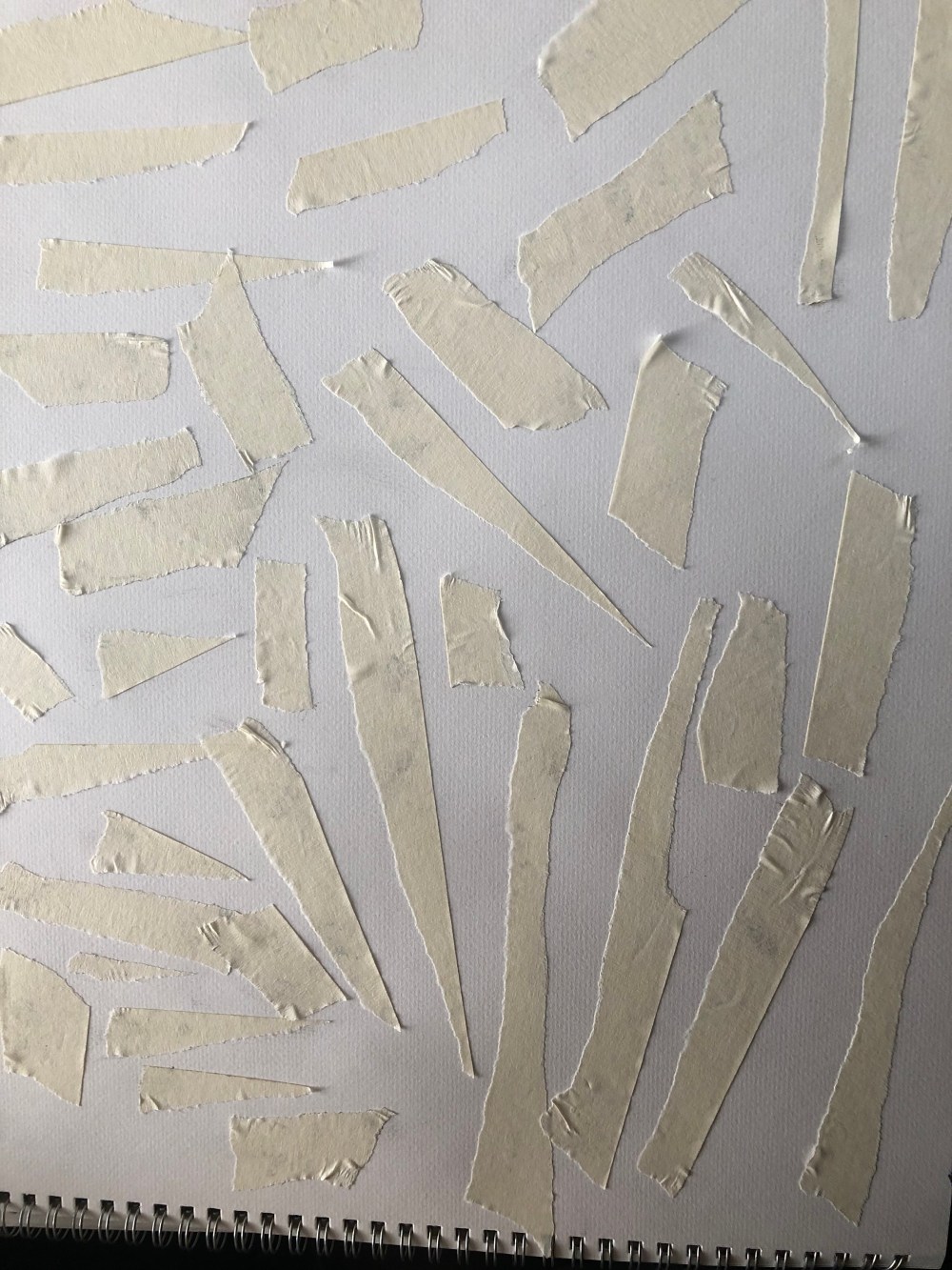
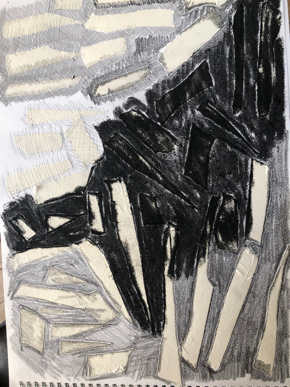
I spent time going over the masking tape using different media before removing the tape.

By going around the edges of some of the tape, a bolder outline was created which interested me. I had used watercolour paper and I liked this as a base as it made the negatives look more three dimensional.

I decided to try another sheet and used masking tape and surgical tape and then did a black ink wash over the top. Once the ink had dried I removed the tape and I loved the starkness of the white against the black and the neat edges. The surgical tape is different as it usually tears in straight lines and has pores so there are tiny black dots in the white areas. This reminded me of pop art comic style where the tiny dots make up the bigger picture.

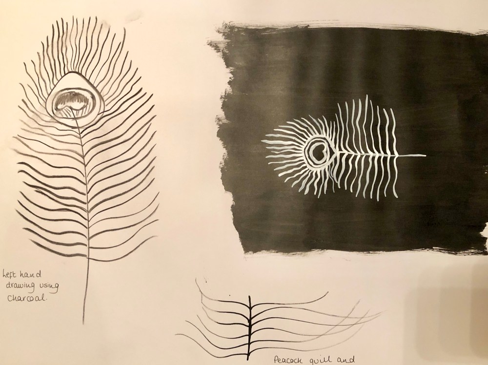
I then tried a black ink wash on paper and when it had dried I tried drawing on it with white ink. I did not expect the white ink to show up as well as it did and I enjoyed using conventional and unconventional tools to make marks. Using the ink meant that I could create more flowing marks and a variety of styles. Using candle wax also interested me but I found it to make more of a texture and gentler effect than some of the other media I had used.

I have learnt that there are a great many variations of black and white and using different tools and ways of thinking can produce textures and a variety of designs. I would like to develop this further, perhaps as part of a collage and to use the masking fluid on patterned paper and then follow up with a black ink wash to create a kind of negative stained window effect. I definitely want to draw with a black ink wash and white ink as I found that fascinating.

I think using the mark making techniques will help me with drawing and will add depth to work when I’m in the planning and research stage. Having completed the warm up exercises, I am now ready to begin the next part of the course.

Read More

Part one Line

Exercise 1.1 Right hand, left hand

Stage 1

Having read the line drawing brief I collected some items to begin drawing. I selected a utensil pot, knife, fish slice, pasta server, mini teapot, glass lemon squeezer and a handbag to use to practise drawing with. I’m not confident with drawing at all and I was concerned that my efforts would be embarrassing but after a telephone call with my tutor Lizzie Levy I felt a bit more rational about drawing.

img_3456

First go at drawing and I tried making the subjects solid to see if I could get an accurate result.

I began to feel a bit more comfortable and relaxed so drew a few more from my selection of items, I tried to convey what I was seeing and not all were successful but I persevered.

My Nan’s glass lemon squeezer (circa 1940s)

I tried to look at the objects from different angles and draw those to see if I could capture them better.

The handbag was a very basic outline that I felt more able to draw and it had minimal detail on it.

Stage 2

I started trying to draw with my left hand and I was unsure if I could even draw a single line, let alone a whole object but I was quite surprised with the outcomes.

I found that although I had less control with the pencil I was able to make coherent marks.

I also found that I had less control of the pencil on larger and less complex drawings but did better with smaller details and that the work did slowly improve, but I didn’t expect to enjoy drawing with my left hand as much as I did and that I could actually draw the object rather than make a mess of pencil. I’ve tried to write with my left hand in the past and it had always ended badly so I felt I had learned something about myself by doing this exercise.

Stage 3

For stage 3 I chose to draw the lemon squeezer on A2 paper and I spent around 45 minutes to try and show the detail of the object. I also looked through the glass to see behind the middle and the shape it made from the front view. I enjoyed the challenge of this and although it is somewhat basic, I did think that I was improving.

Stage 4

For stage 4 I decided to draw the lemon squeezer again using a pot of black ink and a wooden lollipop stick as my unconventional tool. I found this very difficult as the ink was hard to work with and the lollipop stick did not distribute the ink evenly at all. I liked the flowing strokes of the tool but did not like the lack of control for the more detailed areas. It was a striking image when completed and it did give an entirely different perspective, I think I’m too governed by wanting accuracy!

Exercise 1.2 Continuous line drawing

Stage 1

For this exercise I wanted to have a bold outline rather than pencil so the lines were easier to see. I chose an ink pen and began and was surprised by the end result. Initially I thought it was a ‘spiky’ drawing but then I tried a few more and found that I really liked the pace and style that the continuous line gave.

It looked so different and not what I expected at all.

A selection of continuous line drawings.

Stage 2

I tried using some of the words from the warm up stage but I really struggled with this one. I had attempted to use the descriptive words in previous drawings but I felt these drawings were unsuccessful and I didn’t think they were of a good standard.

I felt that using pencil did not look as good as the ink pen as it was hard to see the continuous lines and I liked the bolder effect as the image leapt off the page more and was easier and more interesting to look at.

Exercise 1.3 Drawing blind and from memory.

Stage 1

Using A2 paper I attempted drawing blind by using kitchen utensils as subject matter. I could understand how this would give complete freedom with drawing but I did not feel this was a style that I would choose for formal work.

I tried again with the handbag but drawing ‘blind’ made me feel awkward and frustrated as none of the drawings resembled the object. This is just my personal experience and opinions as I’m sure many people use this technique to see the object from another way.

Stage 2

For drawing from memory I chose to draw something completely different as I was becoming too used to the shapes of objects previously drawn. I chose to draw a tin opener and drew from memory from different angles.

I didn’t feel these drawings were very good as despite looking at the tin opener for one minute, I had difficulty recalling the details of it and there was only one drawing that I felt reflected the object in accuracy. It did make me think that I’m better drawing an object that is in front of me, so in a way it did build my confidence a little as I think other work I’ve done was of a higher standard than this, although I have a lot of room for improvement.

Out of the two stages, I did prefer drawing from memory as it did feel that I was representing the object more on paper. Drawing blind simply annoyed me and I didn’t feel it had any relevance to what I was trying to produce and I couldn’t see how this would work or help with future projects. At least with drawing from memory, I could assess the importance of the lines which I had drawn and what was missing and needed adding.

Exercise 1.4 Final drawing selection

Having looked through my previous drawings from mark making and line drawing I saw a definite progression of learning and confidence, along with the need to practice drawing as often as possible. There were stages that I felt I wanted to revisit in order to try and improve and also experiment further.

I decided to attempt to draw something more complex to see if I could and chose to draw a peacock feather. I chose the feather as when I looked at it, it was a succession of lines of varying sizes.

I tried to add as much detail as possible using only lines to try and keep to the assignment brief and I was pleased with the result.

It was difficult to capture the frond like spears at the top but I concentrated on the barbs lower down to try and add texture.

As I enjoyed continuous line drawing so much, I thought I would draw the peacock feather again using a fine line pen. This would mean less formal detail but more interpretation.

When I compared the drawings side by side I realised that I preferred the continuous line drawing as it looked more interesting and drew my eye to that section of the page more. I don’t know if this was because it was bolder than the pencil but I liked it, it reminded me a little of a stem of bracken from my walks in the woods.

I also wanted to try negative mark making again and used masking fluid and the opposite end of a paintbrush to draw out the shapes of the lemon squeezer and the teapot again.

I found it much easier to have a fixed purpose in mind rather than randomly distributing the masking fluid and that I needed to relax more and use the unconventional tool more slowly. I was able to get much cleaner lines and felt I would get a much clearer image after removing the dried masking fluid. After a thick coating of black ink, I removed the masking fluid and was happy with the finished images.

I did still ponder about how using coloured pastels under the masking fluid and then black ink as the topcoat could really give a thought provoking effect and I intend to try this out but due to having now run out of ink, I will try this in my sketchbook with black acrylic paint.

I wanted one final set of drawings and chose to draw the peacock feather again using my left hand and using an unconventional tool which was a thin stick of charcoal. The charcoal was really difficult to hold as it was so light and fragile and I did not feel the drawing was successful. I then tried the peacock quill to test out a few lines and it was really awkward. Although the general look of the peacock feather was rich in colour and soft, I’ve no idea how people centuries ago managed to write with a quill as it would not carry ink and was scratchy to use. As a result I abandoned the attempt and tried negative mark making of drawing the feather with white ink and a conventional tool which was a paintbrush.

To sum up my first part of the Foundation Textile Design course, I feel I have learned a great deal about drawing, how to produce different effects using a mix of tools and I have certainly discovered what I do and do not like. I’ve also found my areas of weakness and that I need to practice drawing more.

If I were to repeat this whole section of the course, I would make more time and make more effort. I don’t feel that I produced enough work and so I want to improve on this on assignment 2.

I have found it difficult at times to try and understand what the course materials are asking me to do and so I’m not sure I’ve always got this right. It was sometimes awkward drawing on A2 but I realise this is also where I need to practice more on working on a bigger scale.