Part 5 Textile solutions
Reflections on tutor feedback
My tutor had made some very positive feedback for Part 4 which I was really pleased and motivated by. She highlighted strengths and weaknesses and especially my need for perfection which is certainly an issue of weakness but it was satisfying to read that I had done well in choosing Ty Twombly as a challenging piece and that I had finally taken a risk. It is so difficult for me and I do often look at some of my work and feel frustrated by it as it doesn’t match up to work that I have seen on other students learning logs. I know we all have our own particular style but other students work is so flowing and artistic and mine often isn’t, at least that it is how I view it. It is getting better than when I started Foundation Textiles but I think I have a long way to go and I hope in Part 5 that I can show improvements in this area. I was happy that my tutor thought that I have built upon skills that will be an asset to me beginning the degree in Textiles although I will not be applying until next year when I may be able to devote more time to the degree. But I can continue sketchbook work as a means of practising and developing skills which I need to be able to use for the degree. My tutor advised “that you narrow your field to enable a tighter, more cohesive body of work, where pieces sit as a collection. Currently it feels that you are wanting to cover so much, showing so many skills, methods and applications”.
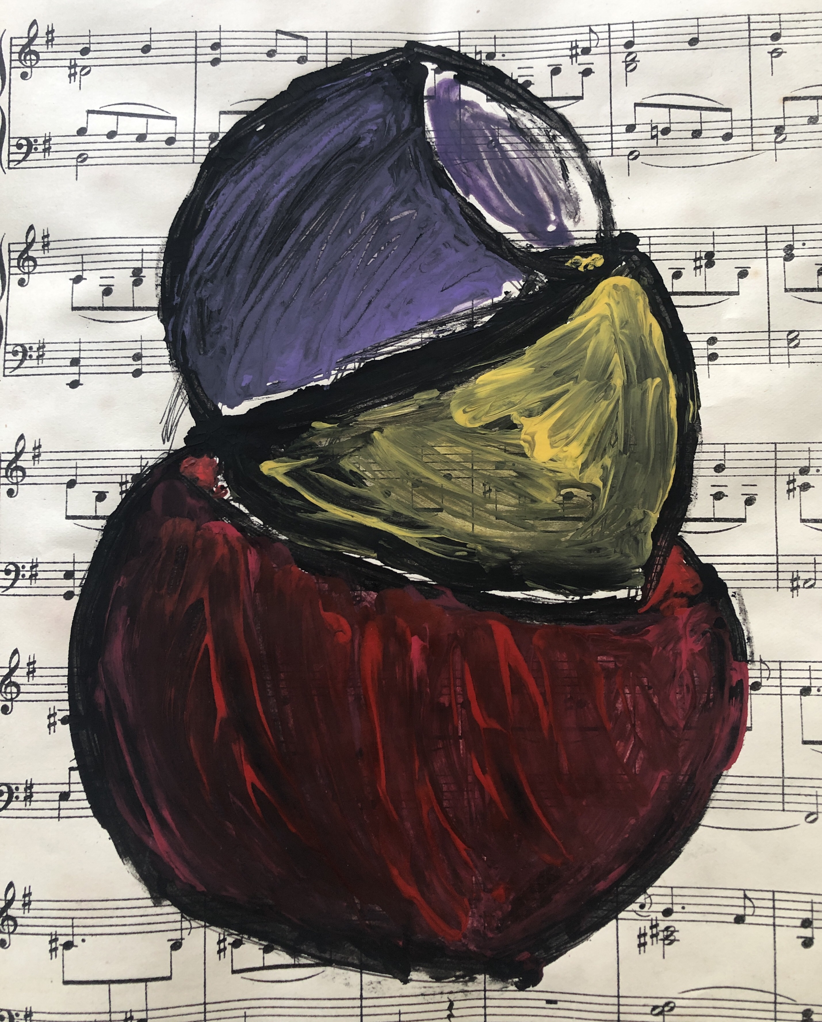
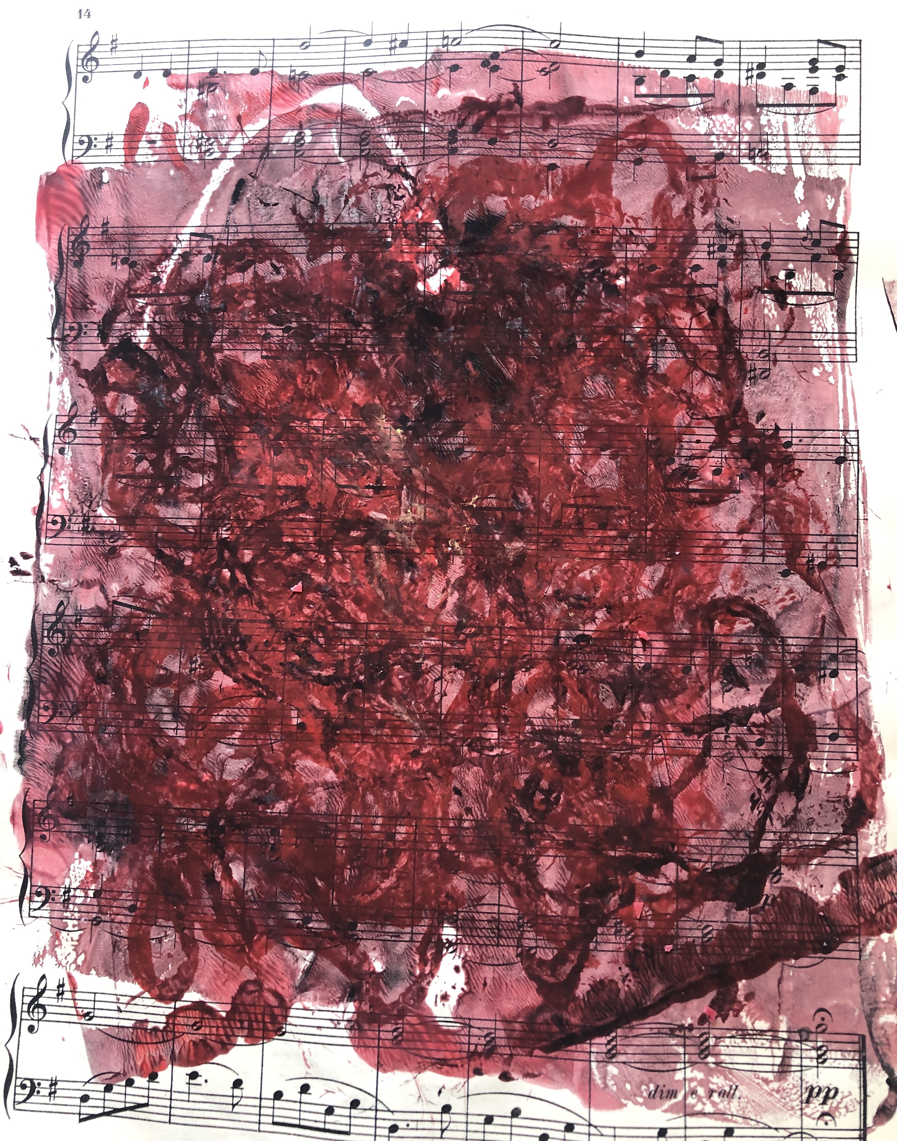
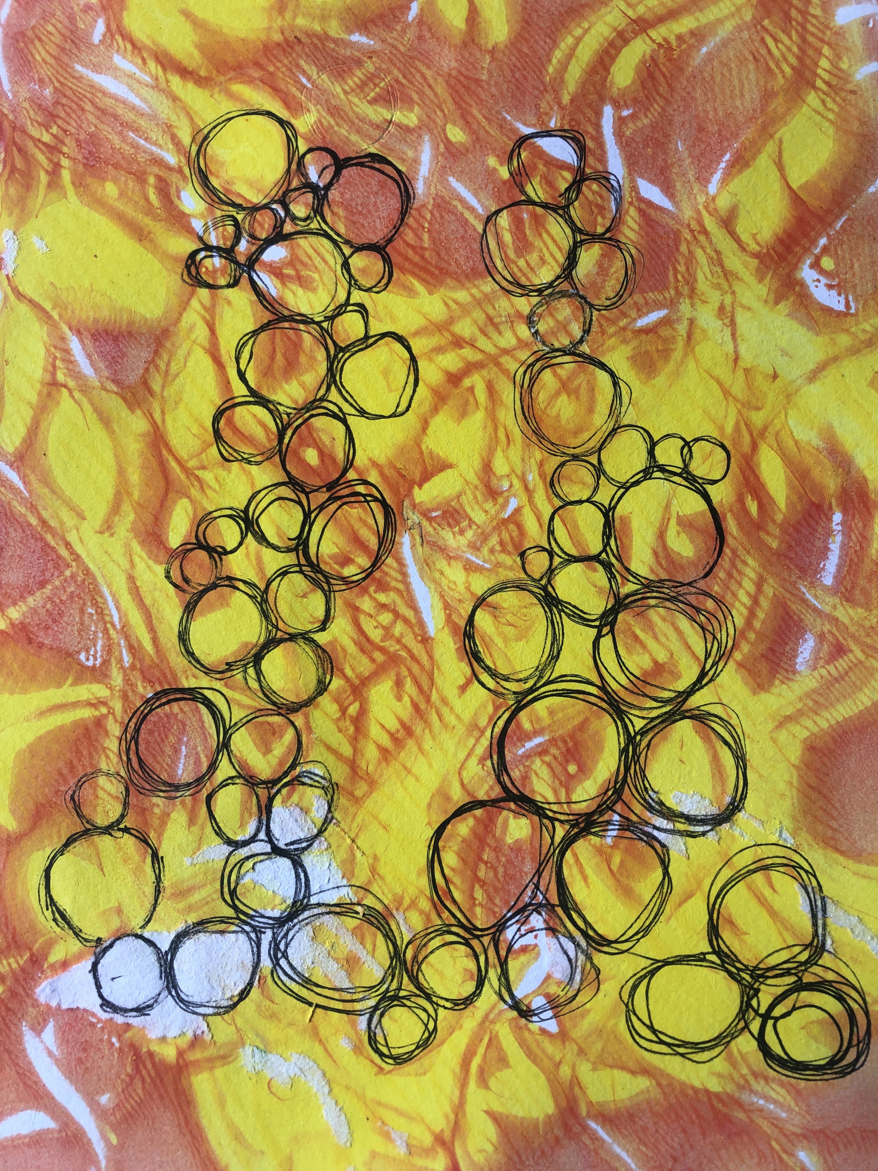
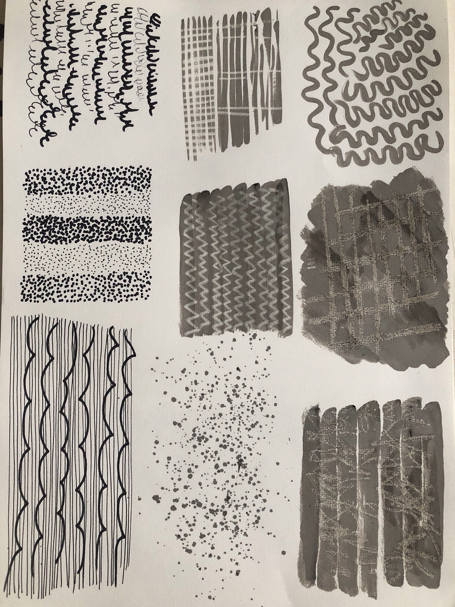
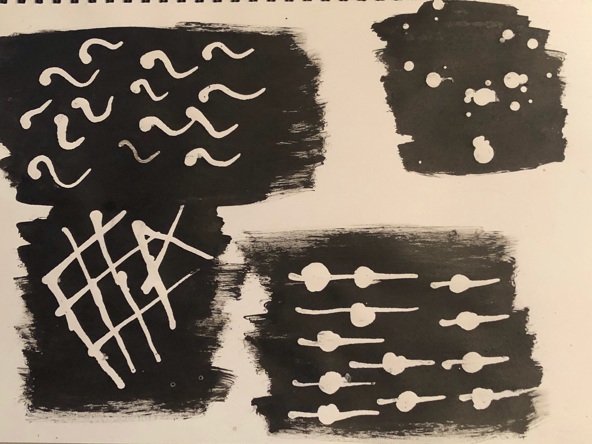
This was when the penny finally dropped about how to complete work. This weakness could rest on my upbringing as I had been raised to work as hard as possible and to endeavour to be better than anyone else, it is a Green family trait! When I was doing an Open University course in Health and Social Care a few years ago, I did not consider any essays to be good unless I had a mark of 80% or more. On one essay I scored 90% and my tutor had telephoned me to congratulate me but he said if I had mentioned one specific area, I would have scored 96% so naturally I was cross that I had failed to do that. It is genuinely hard to get out of that mindset and when I received the tutor feedback for Part 4 I was unhappy that some of the work that I had completed that I had felt was really good my tutor had not talked about but that some of the work I had hated and actually did not want to put in my learning log, my tutor had really liked. This all relates back to the perfectionism and lack of free expression that is preventing me from really letting go as my tutor advised me to “explore; being more; playful, splatter, tear, crush, splash, scrape, etc. to document essences of your journey – rather than being too literal”.
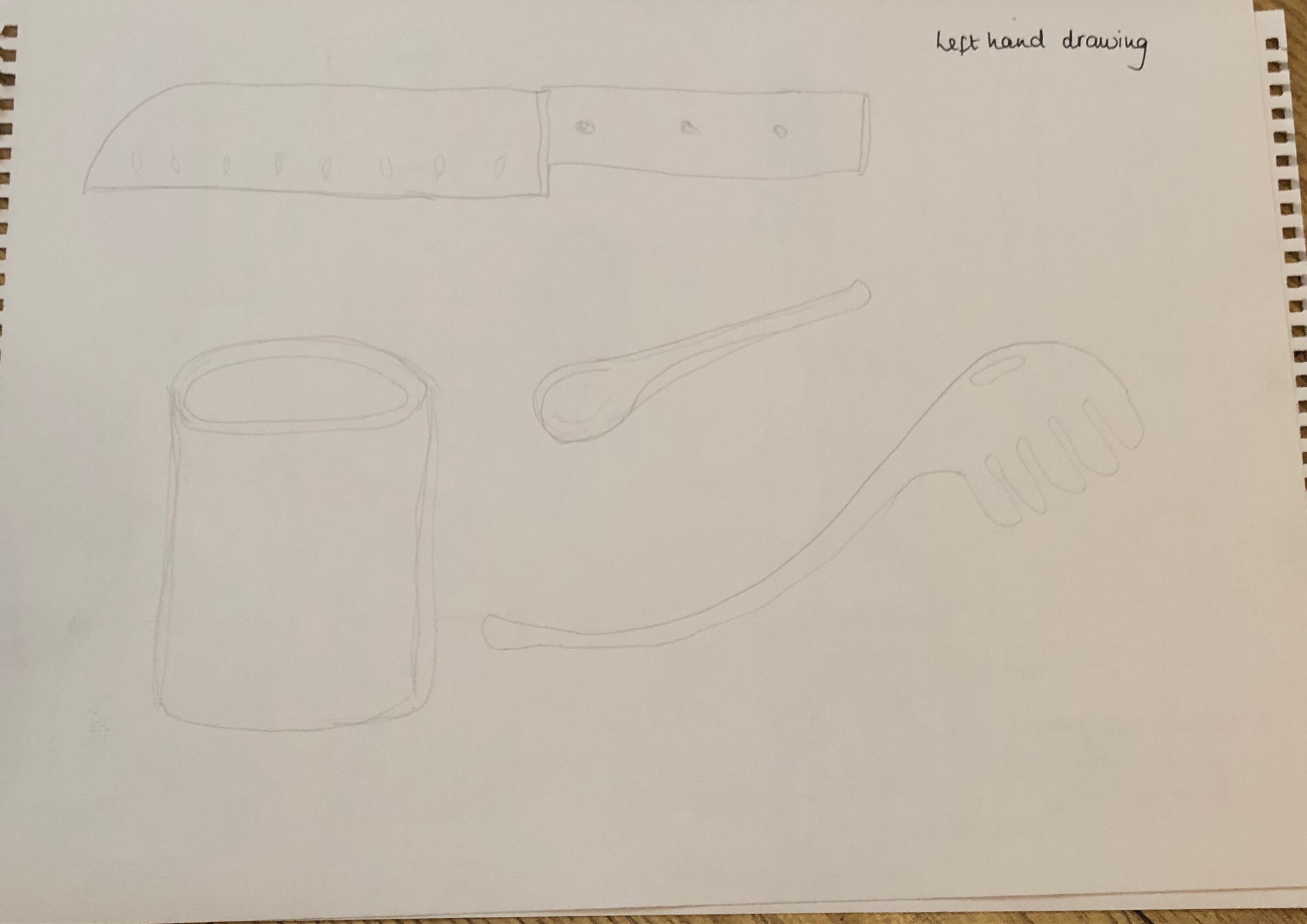
Now I have completed the previous 4 parts of Foundation Textiles I can reflect on what I have learned. I have been able to research and critically examine well known textile artists which I have found fascinating. I have also learned about mark making techniques, using a sketchbook more effectively and most of all I have found skills which I did not know I have, such as that I can draw with my left hand and actually paint better with my left hand too. I have loved being able to use natural dyes on fabrics and also how to use my sewing machine to make marks. I have found out what I liked and disliked within my own work, my strengths and weaknesses and areas which require further development. I will be continuing to produce samples and ideas after this course and I want to keep on learning and to practice wherever I can. I really do want to do the full degree course in Textiles and I do need to organise my time better in order for me to achieve this.
Option 3: Large-scale material manipulation
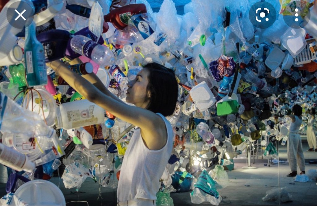
What I do want to do for Part 5 is to produce a piece which reflects something which I am very passionate about and that is the environment and in particular the pollution of our oceans. During the current pandemic I joined a local volunteer litter picking group and it shocked me to see how bad the litter was in our local area and how much could be collected. My 5 year old son has joined me in this and also was in our local newspaper with a large article about how much he endeavours to make a difference and why he helps with collecting the litter. I find the most rewarding part is fishing old plastic bottles and cans out of the local lakes and I was interested in how they were decayed. I have often walked along a beach in the past and have seen the tideline of plastic and rubbish lying amongst the seaweed at the tideline and it has always saddened me. Plastic does not decay, it accumulates and has a far reaching global impact, particularly regarding marine life. Seeing animals caught up in netting or other human created materials gives me a sense of despair so I hope to be able to reflect this in my final assignment.
The downside of litter collecting in the community is seeing all the various items we gather go to landfill. We do not have the capacity to manually separate glass bottles and aluminium cans and armed with only a bag hoop and a litter picking tool, there is no way to carry home what we should be repurposing.
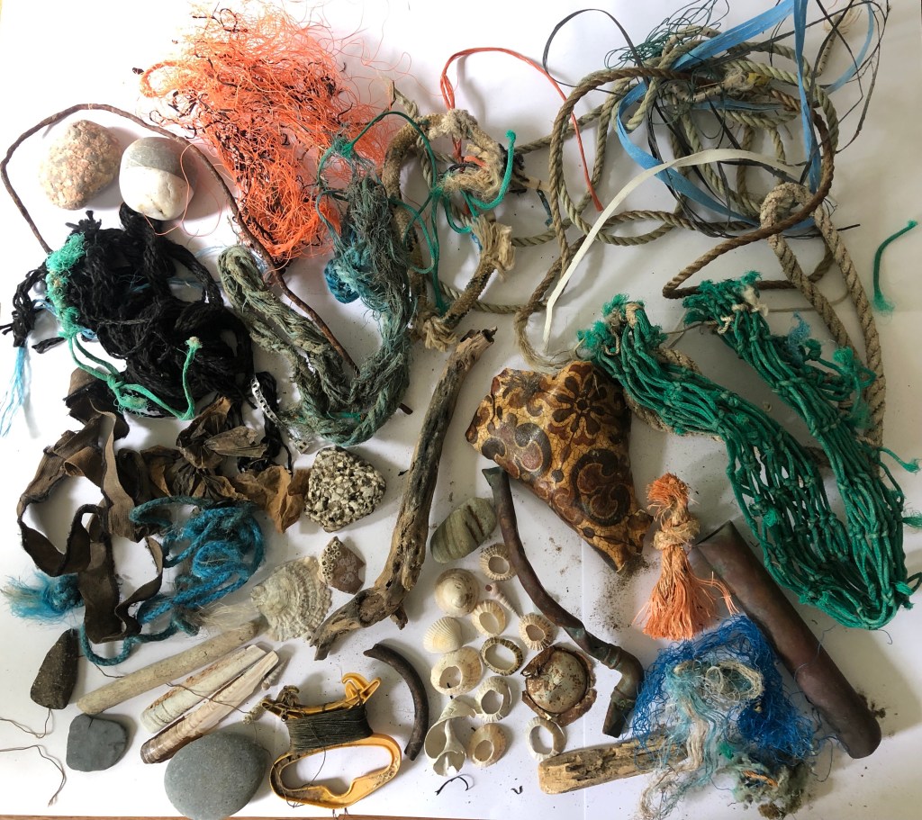
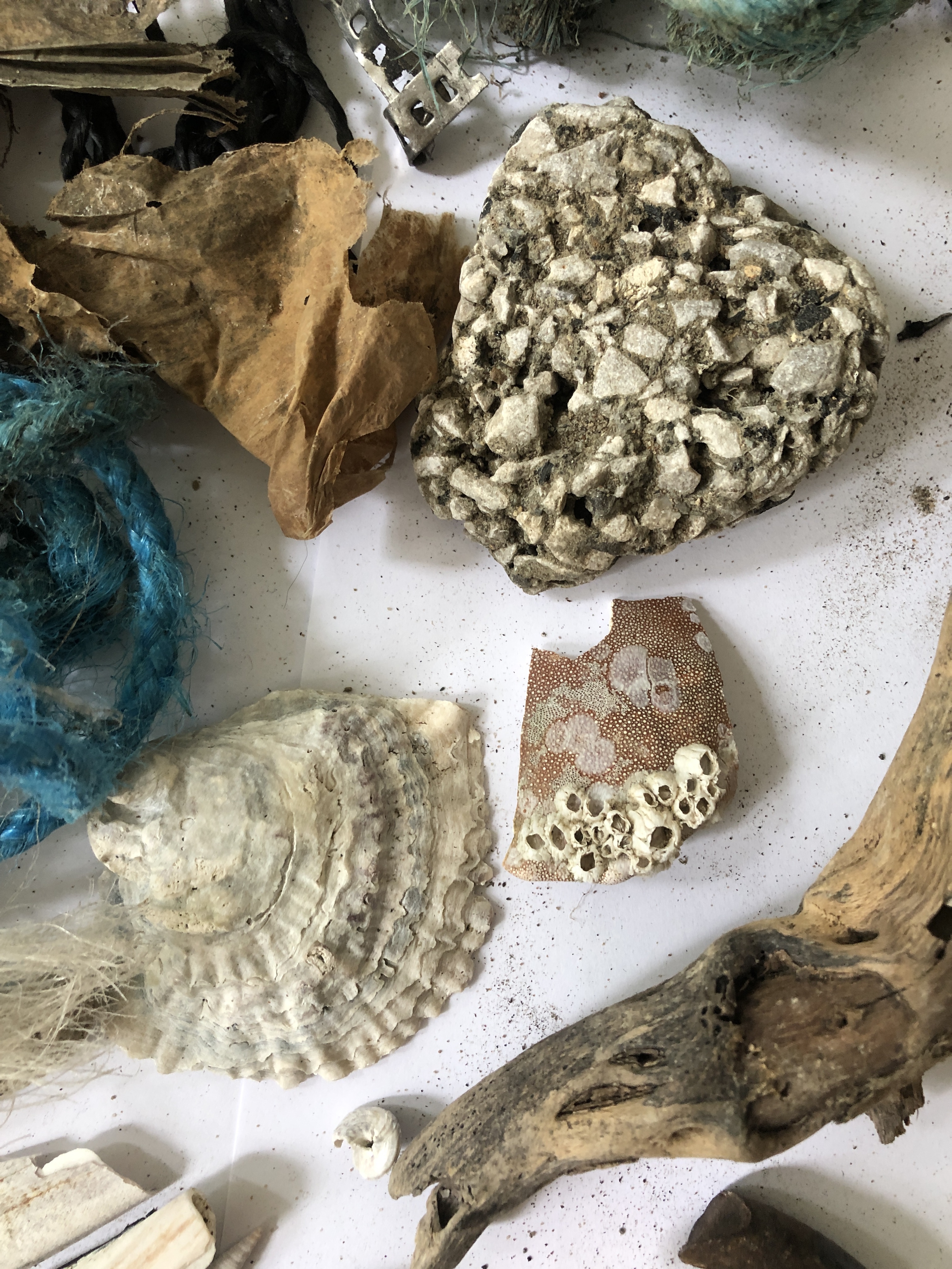
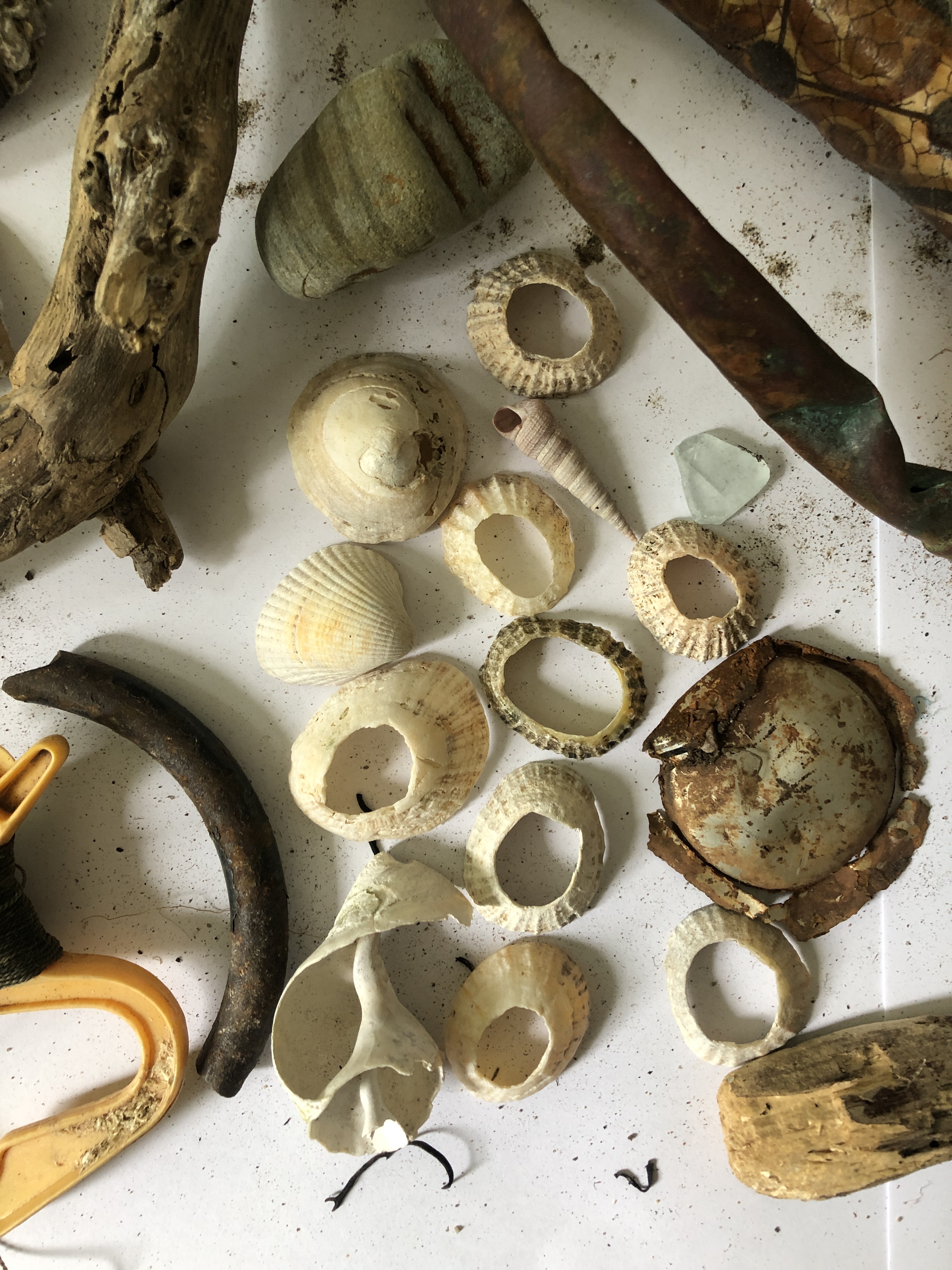
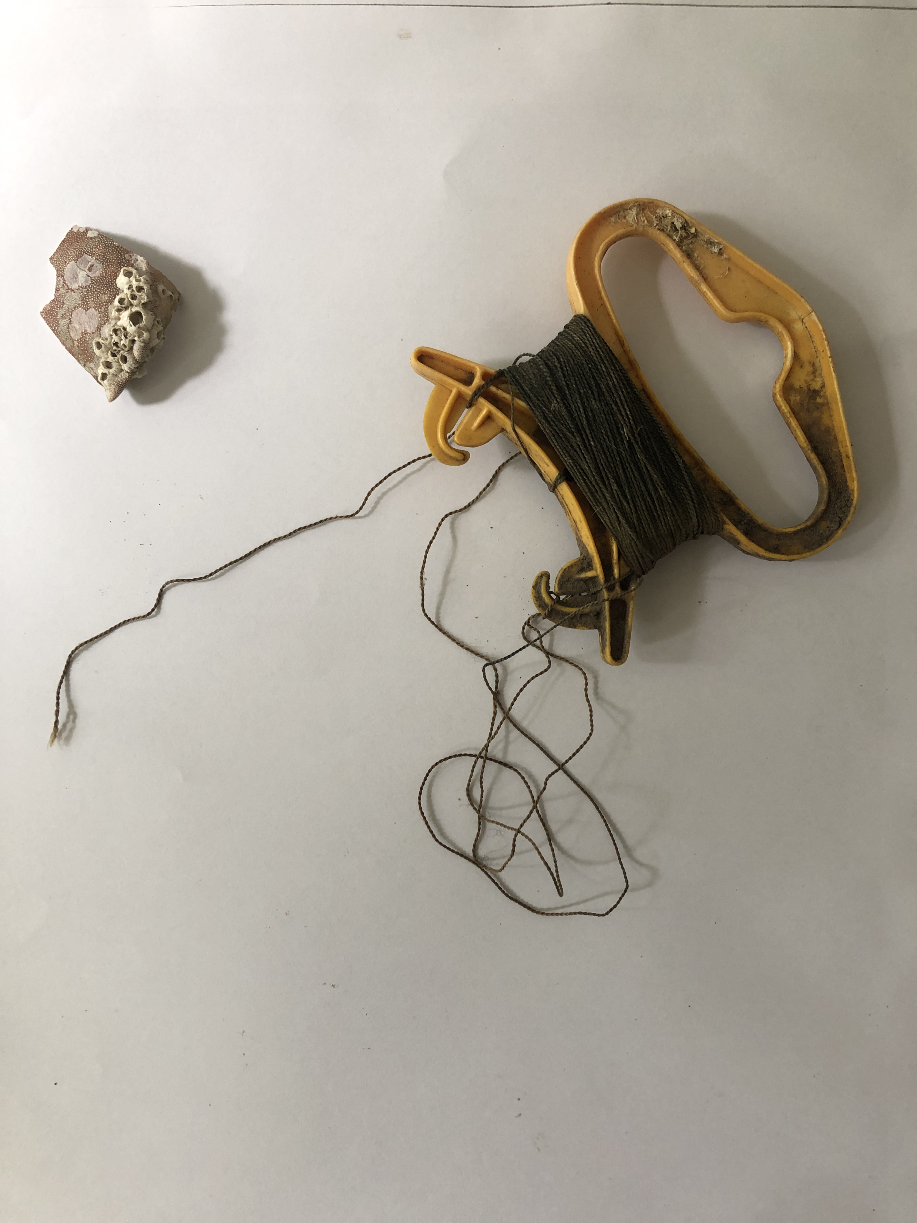
I was able to go on a short holiday to Wales last year in a break between lockdowns and I had the idea of collecting some of the litter I found to use in a piece of work and so I went beachcombing and came home with bagfuls of aged nylon rope, netting, wires and even a piece of copper pipe which I loved due to the way it had aged when exposed to the salt of the sea and also the action of being tossed around against the rocks. I collected shells and in particular some whelk shells which had holes in the top and I saw that I could also weave these into another form.
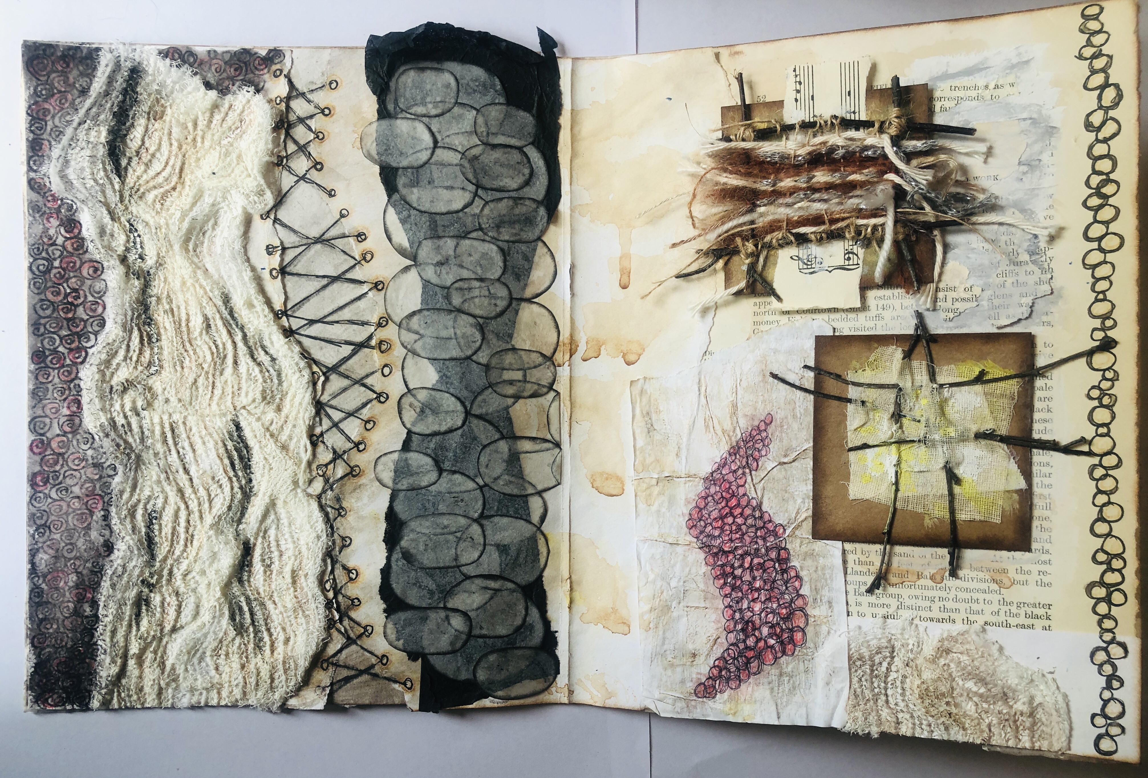
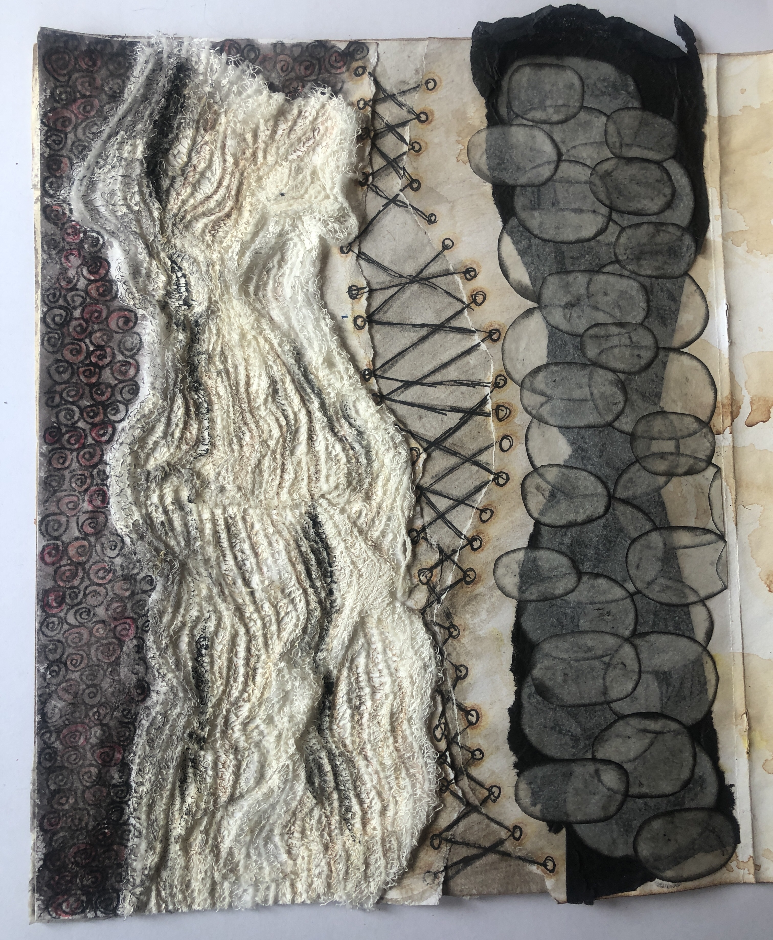
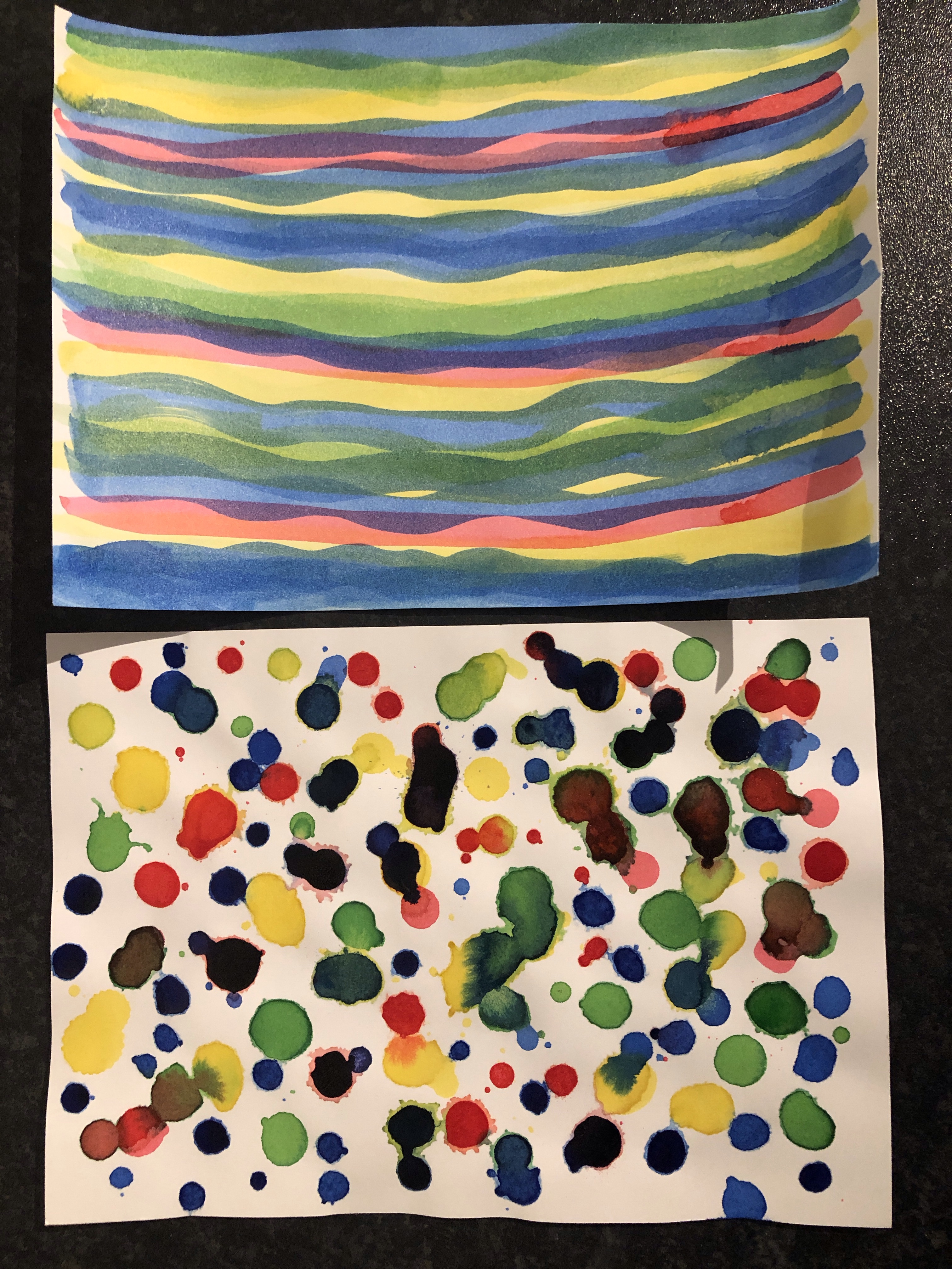
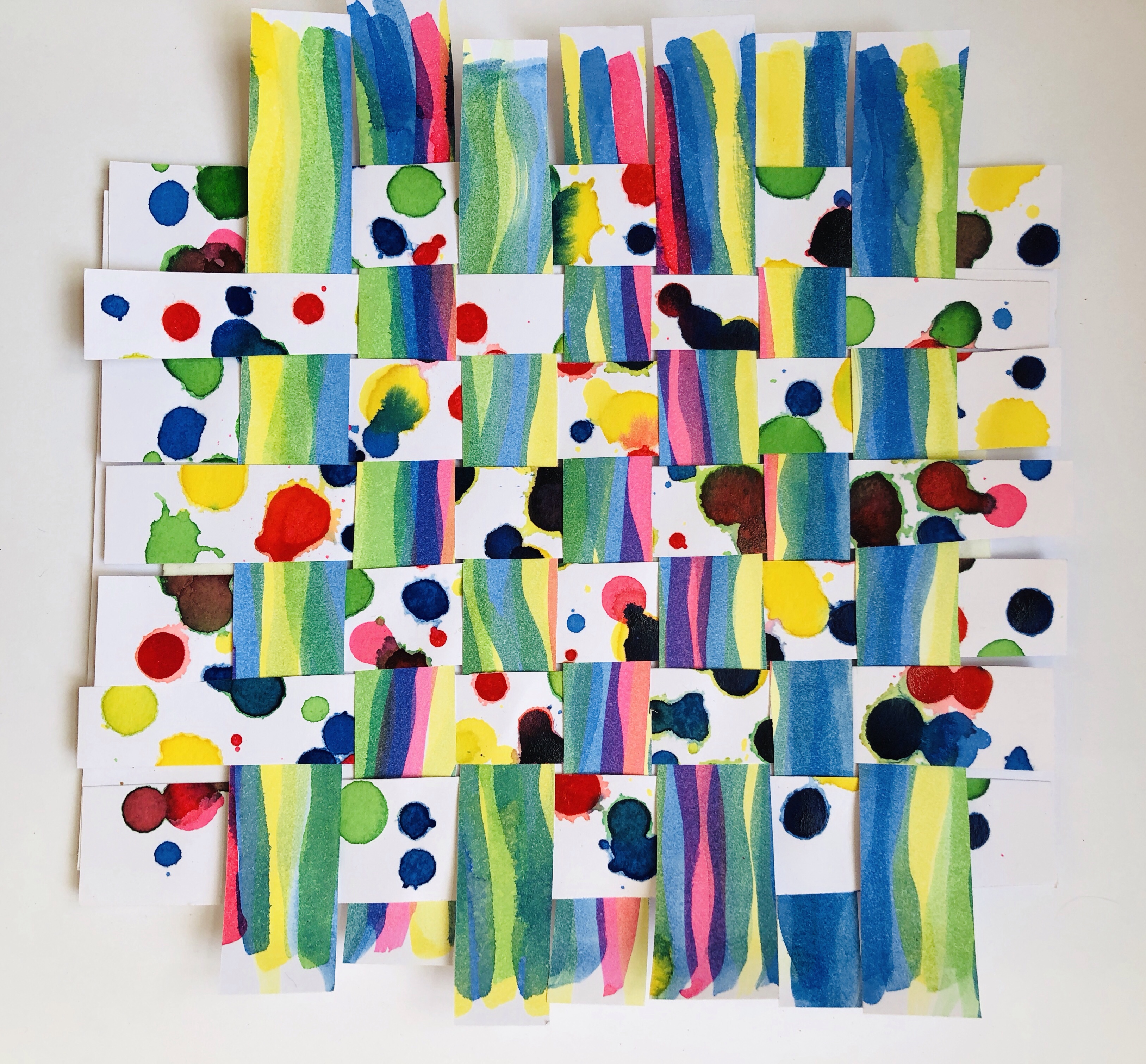
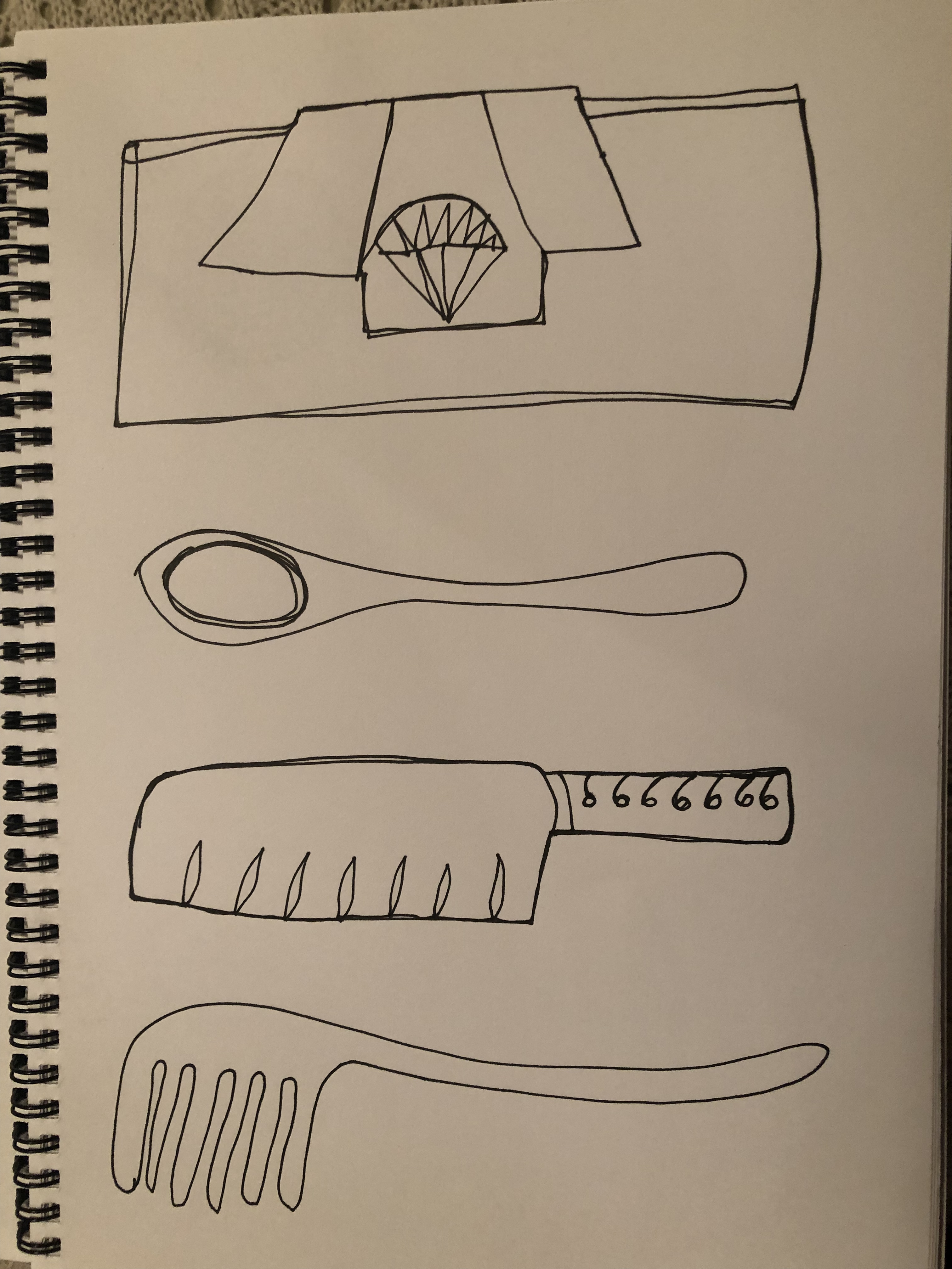
I had found weaving very rewarding during the Foundation Textiles course and had made tiny looms from small twigs, knitted with strips of black plastic dustbin bags and also liked stacked and layered fabrics. I found I loved to create three dimensional samples and out of all the samples I had made, these were my favourites and I felt they were the most successful.


Within my chosen theme I decided I wanted to go for Option 3: Large-scale material manipulation where I will create a 1 metre by 1 metre square panel. I much prefer working on a bigger scale and I am very excited to be able to complete such a piece. I also wanted to choose the option that is the most challenging for me.
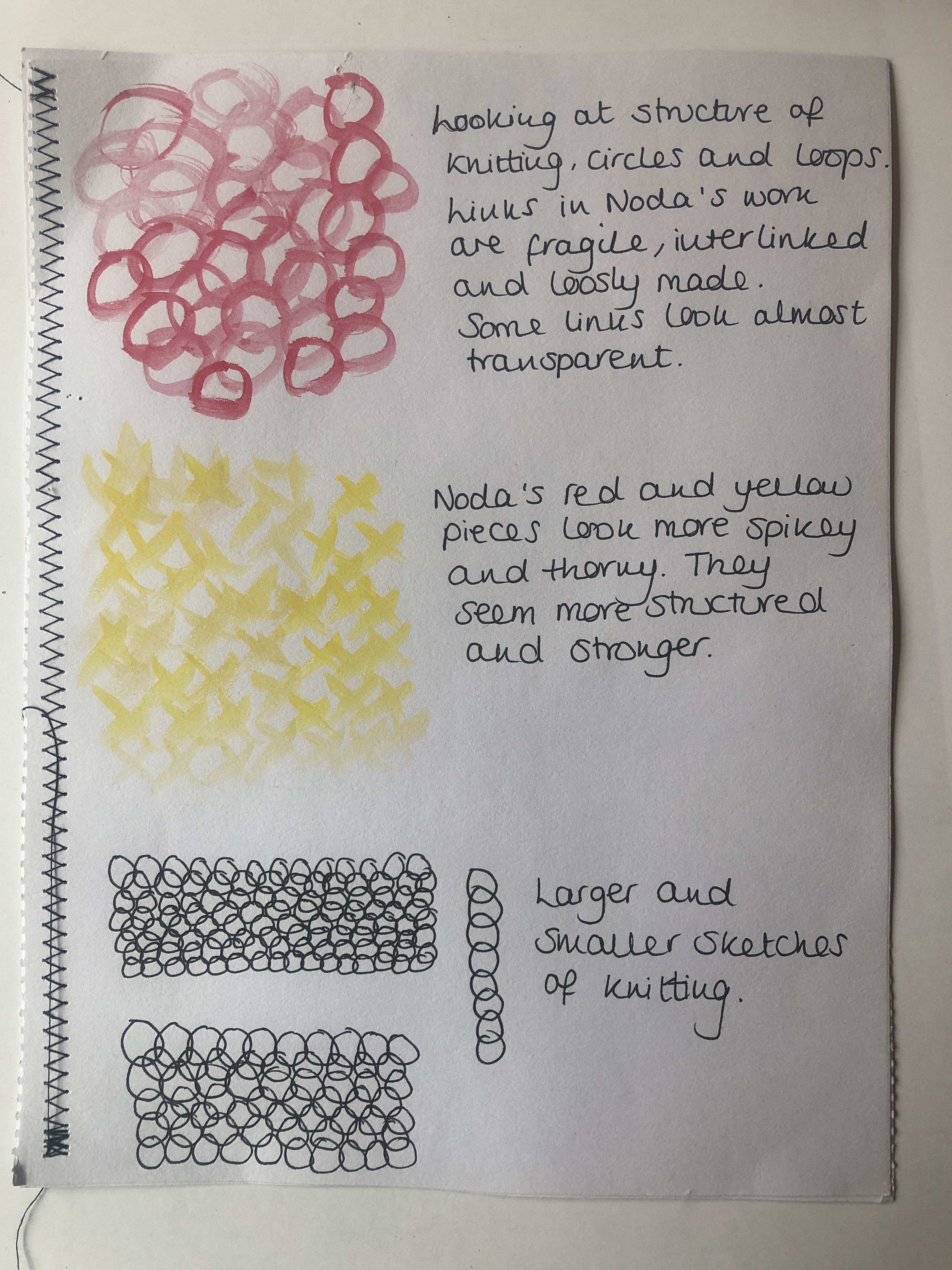
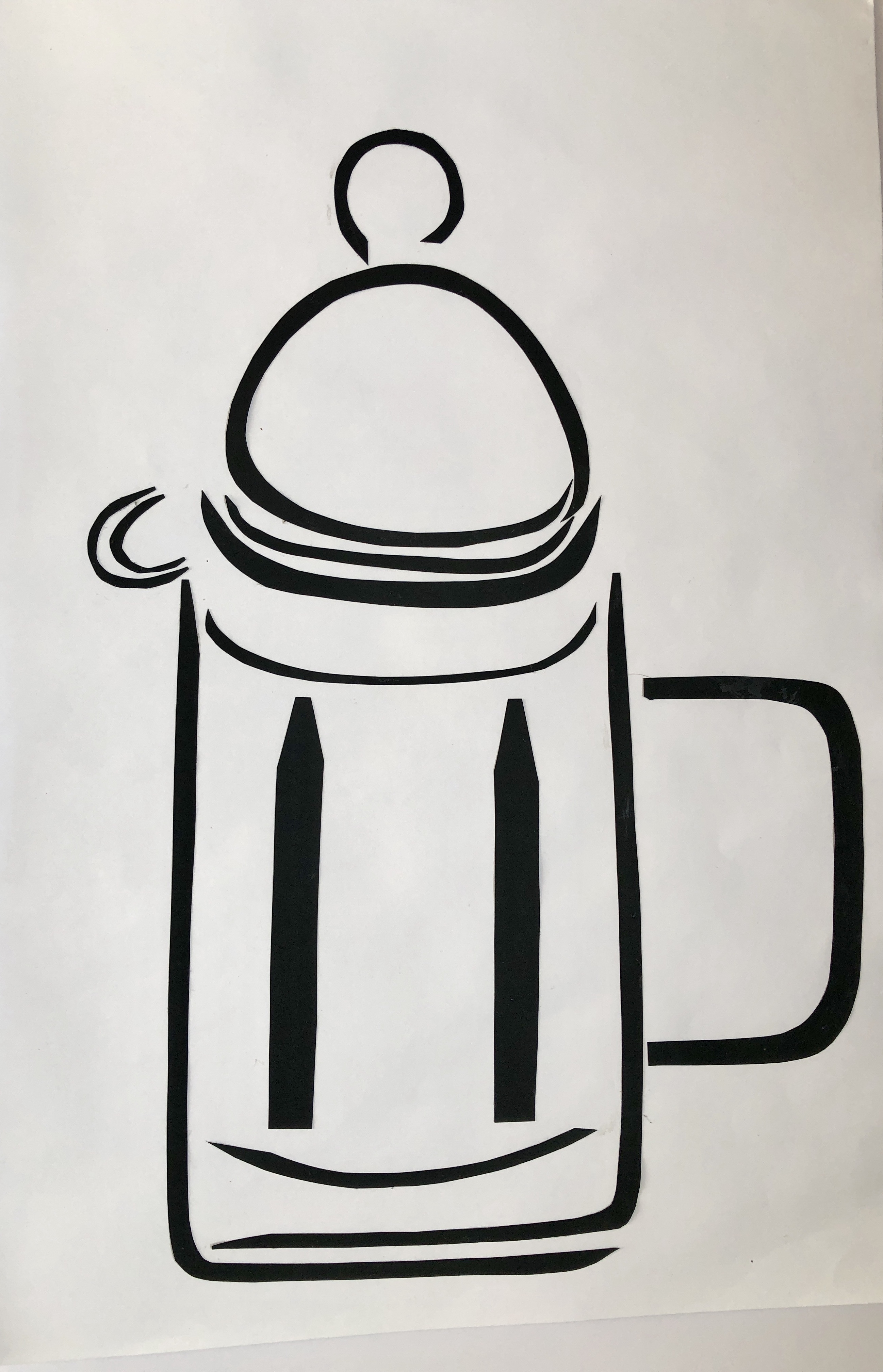
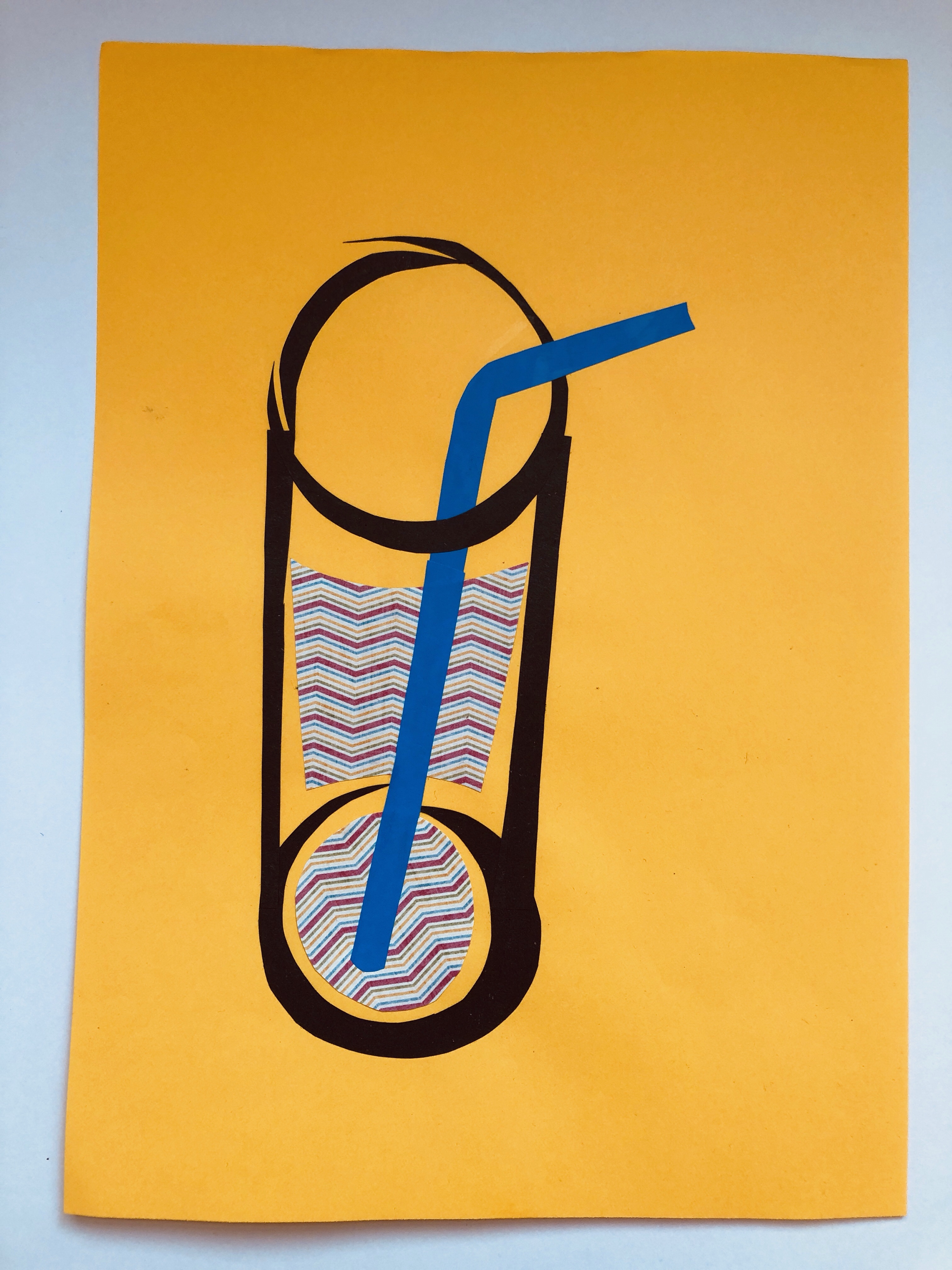
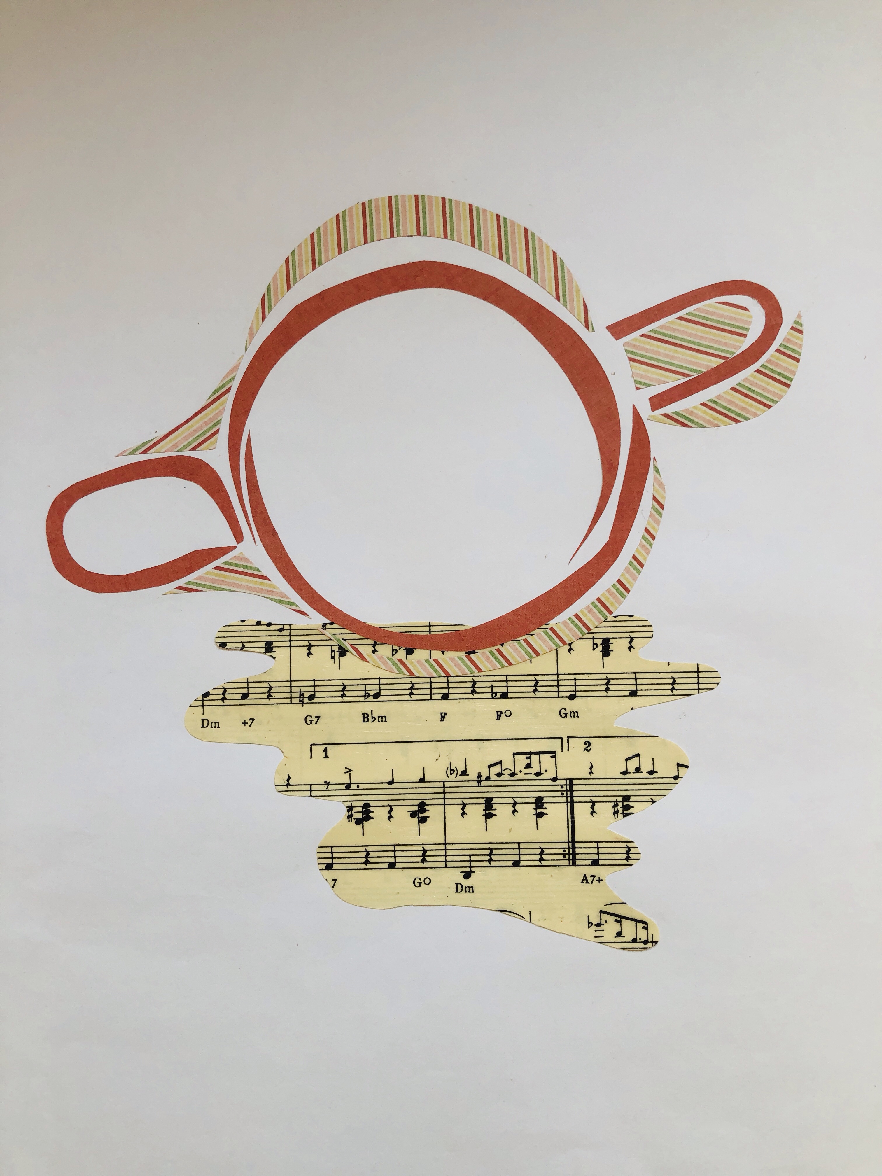
I am beginning by researching textile artists who use beach and ocean related litter in their work and with a focus on environmental damage. I have some textbooks which will also be perfect for this theme that I will be referring to for inspiration. The images below really interested me with the variety of colours and shapes to represent marine life and plant life.

(Source: http://www.pinterest.com) Knitted piece with yarn. Seaweed, shells, coral.
The best website that I found which really encapsulated what I wanted to reflect my theme was http://www.mymodernmet.com as on this website I found many artists who had collected beach litter and created shapes and pieces which was fascinating to look at.

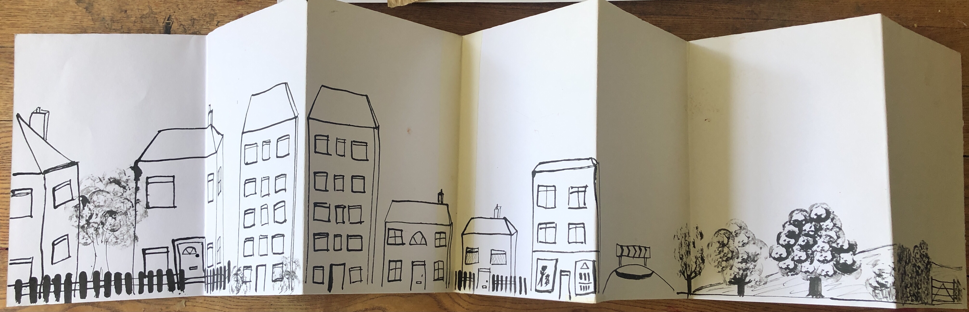
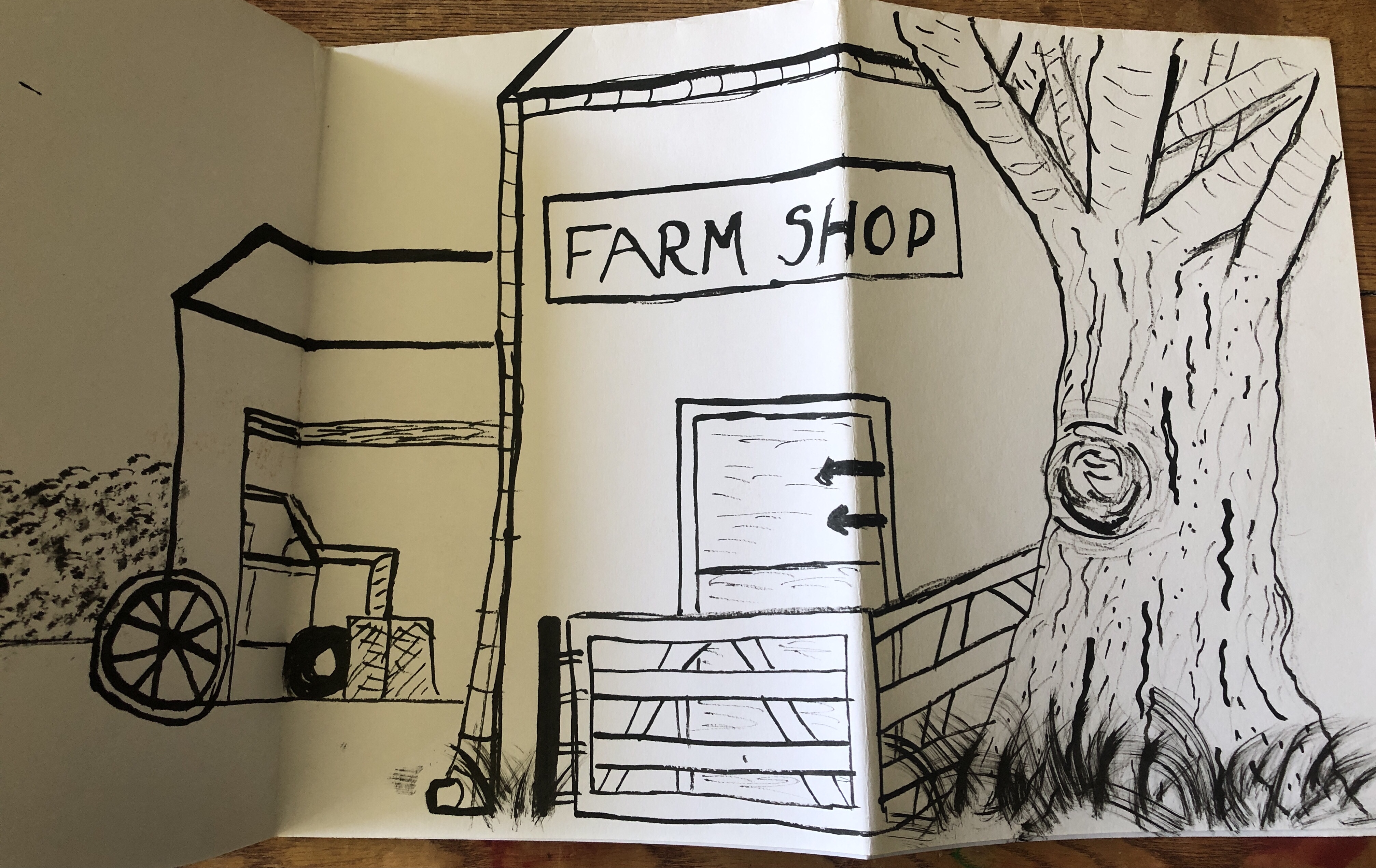
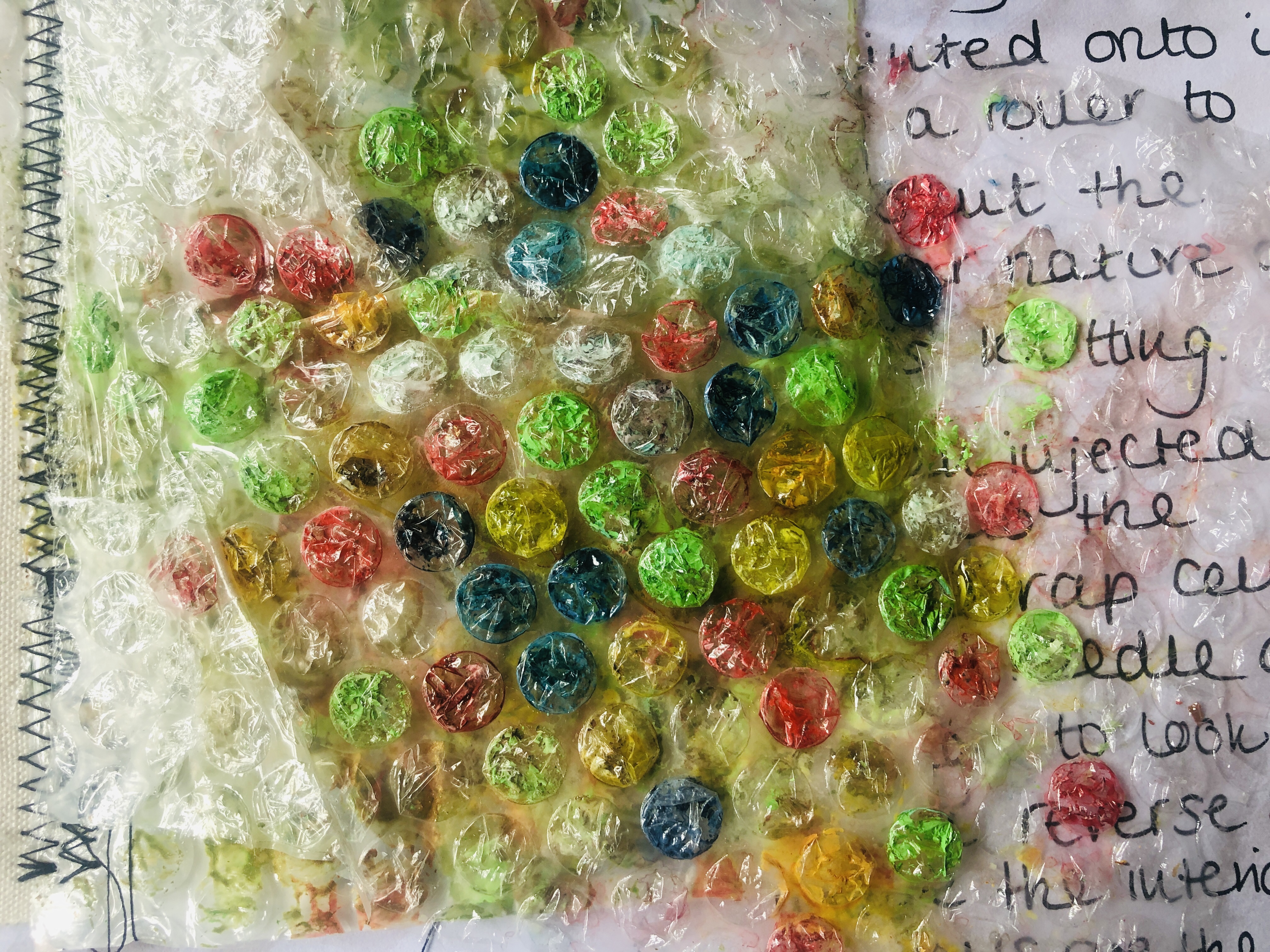
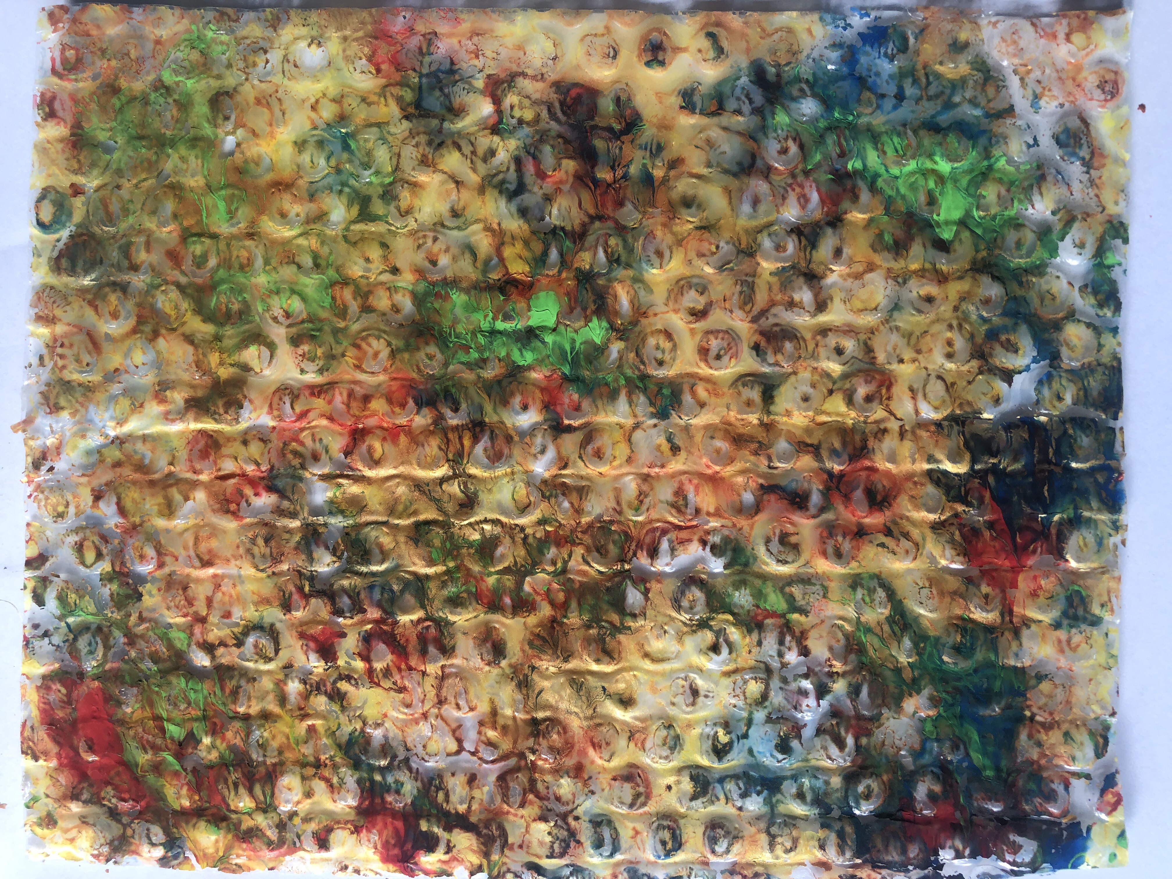
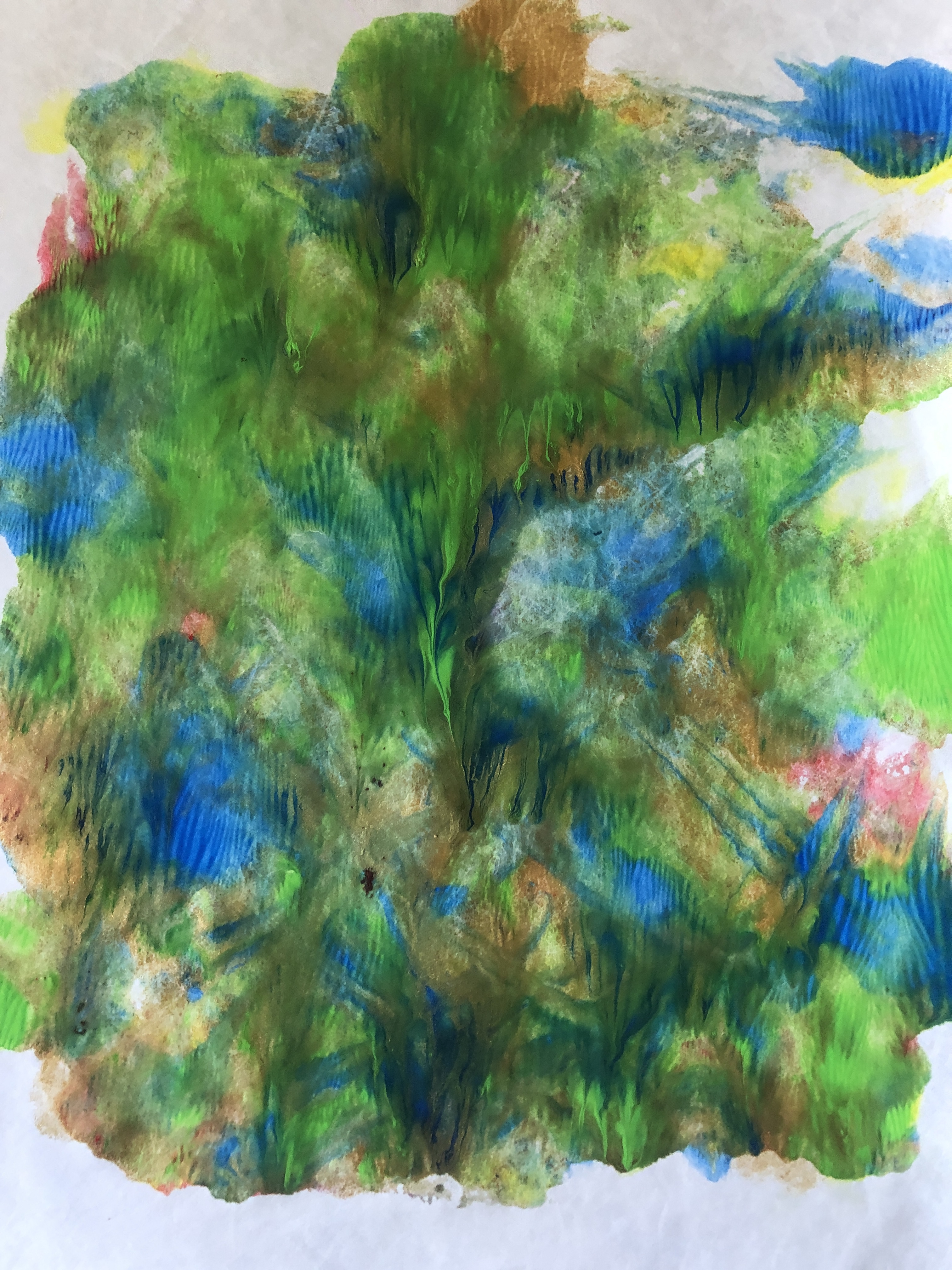
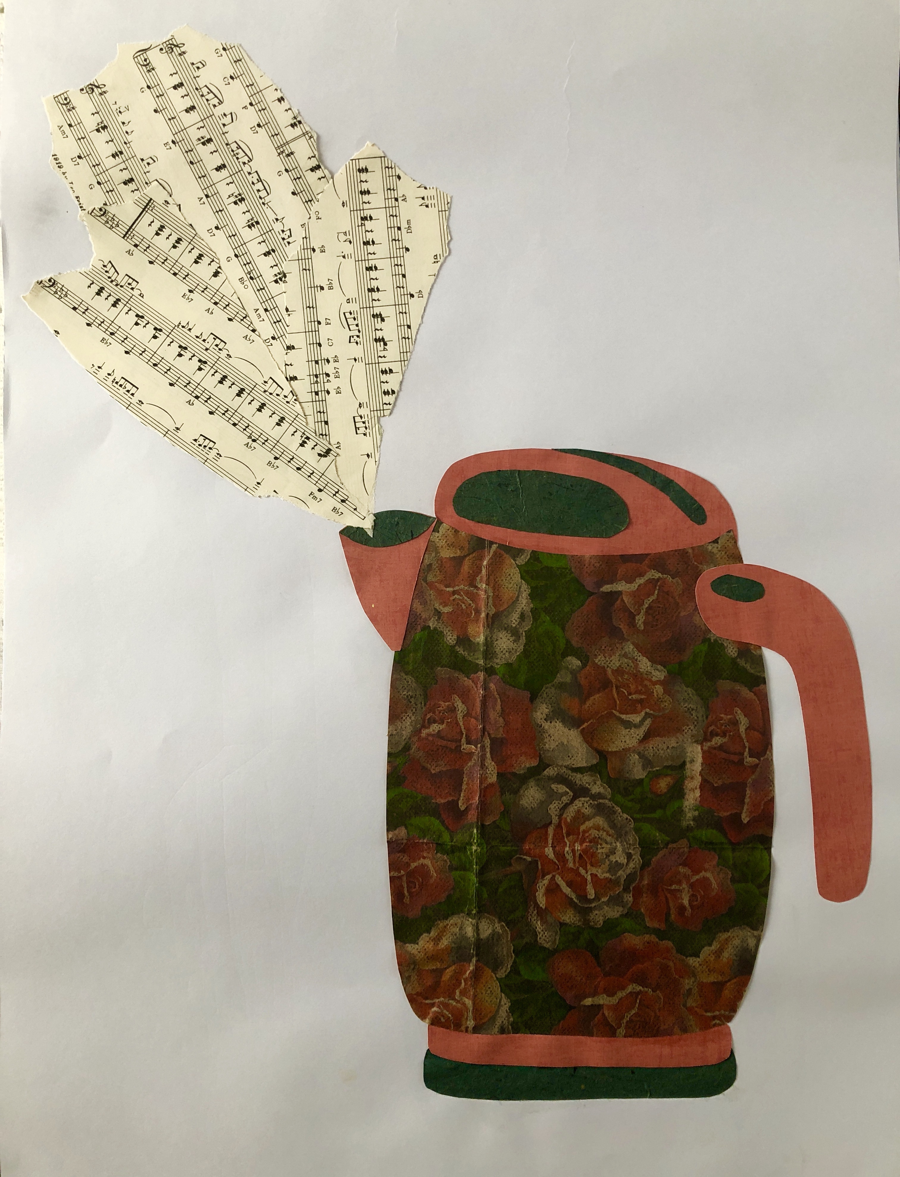
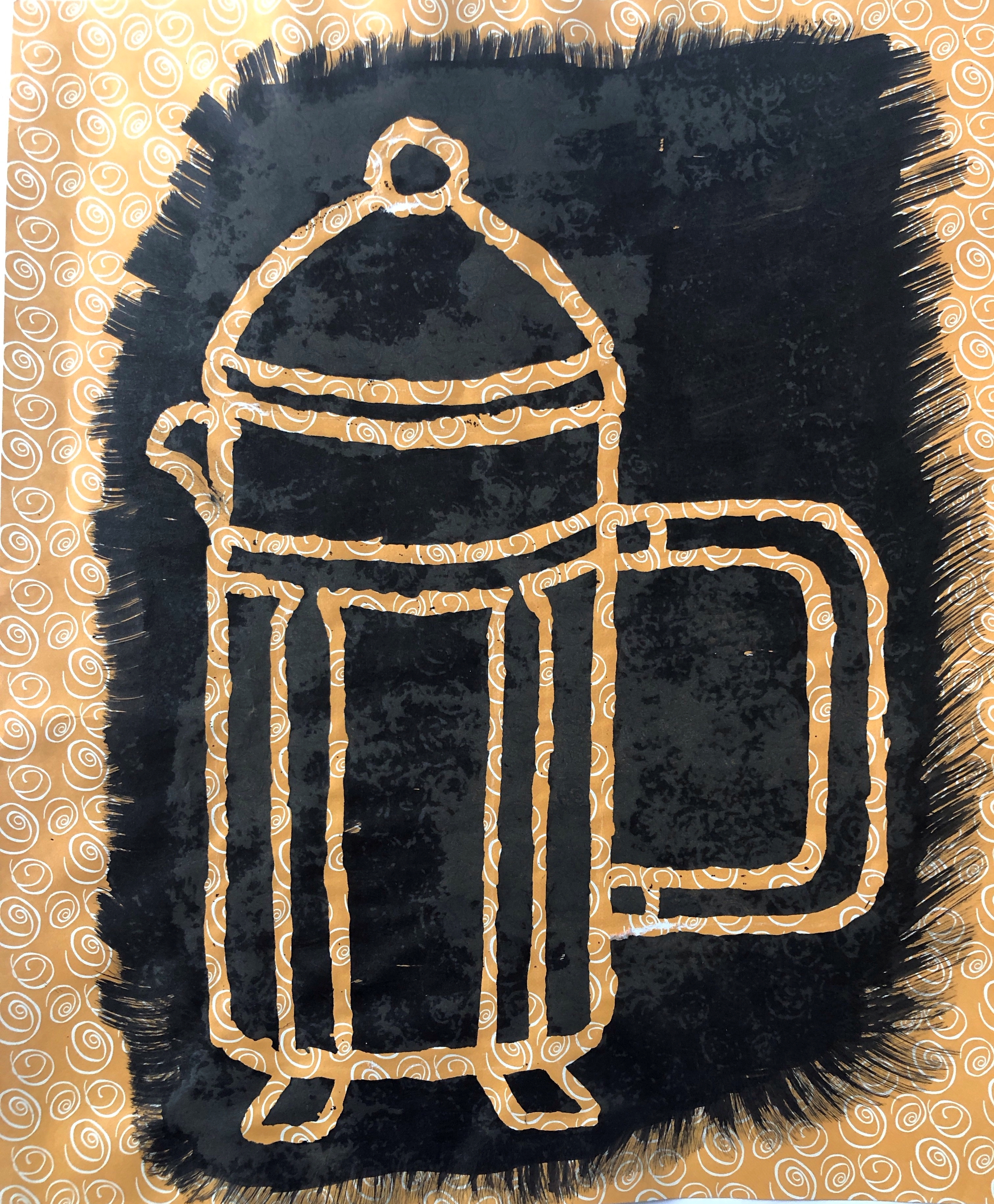
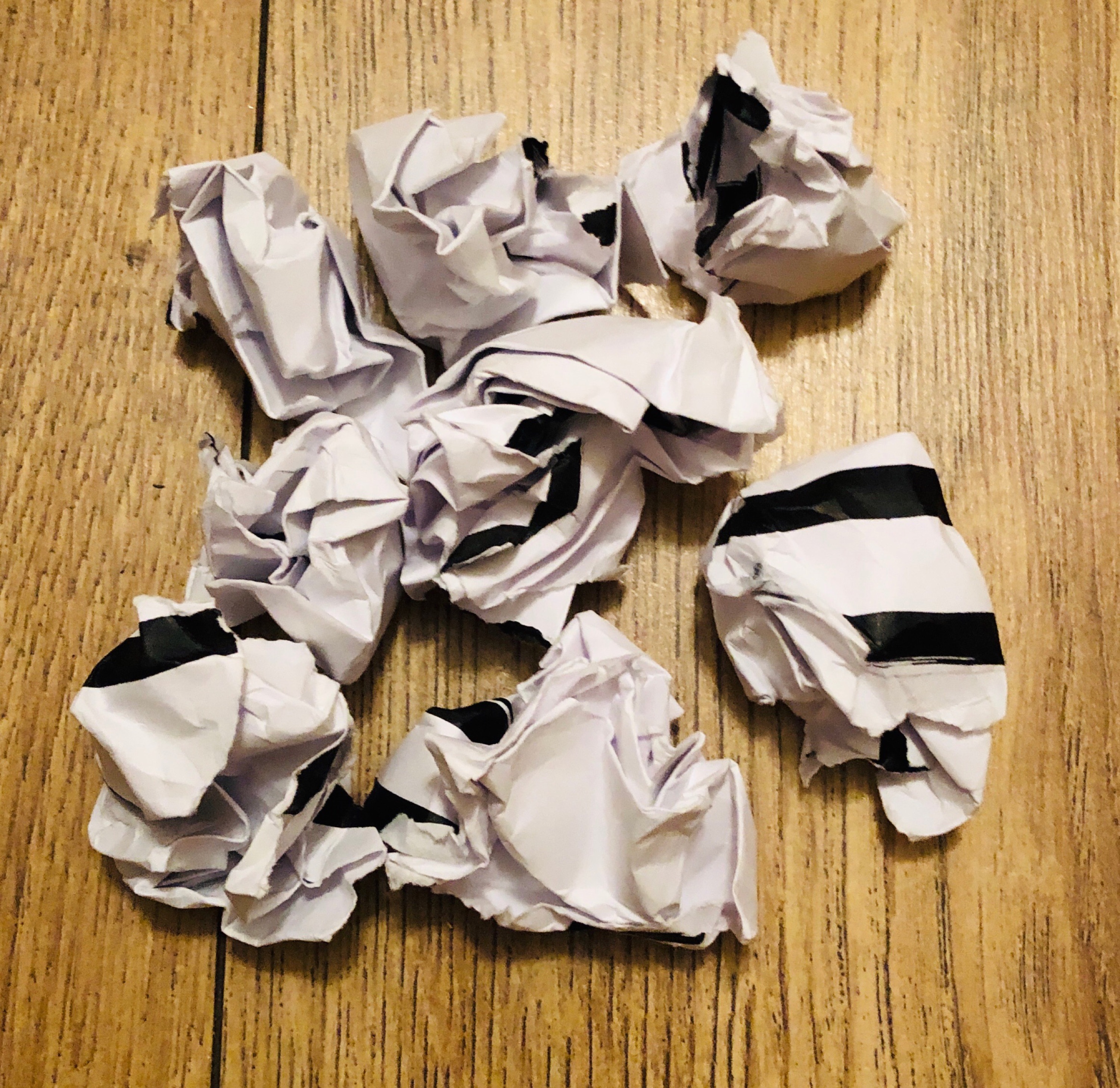
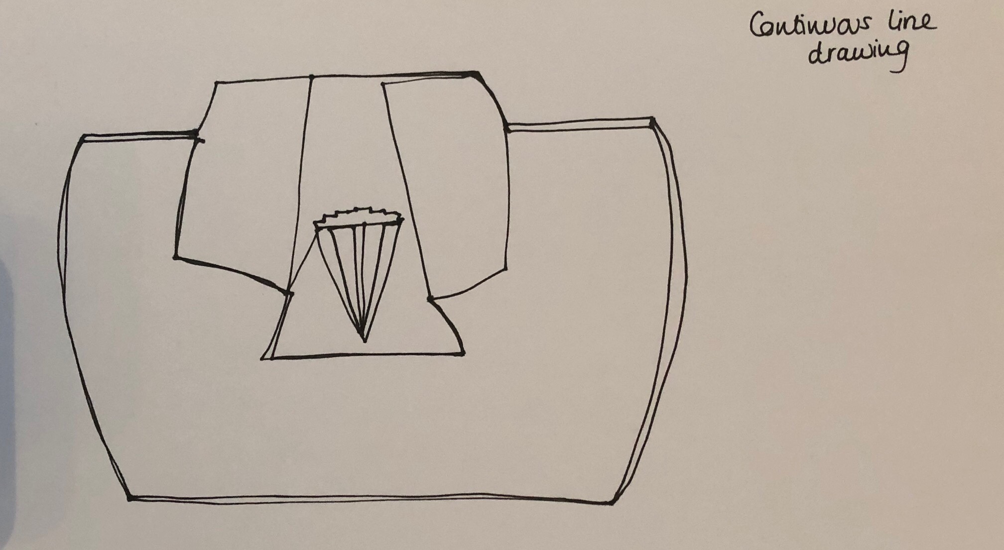
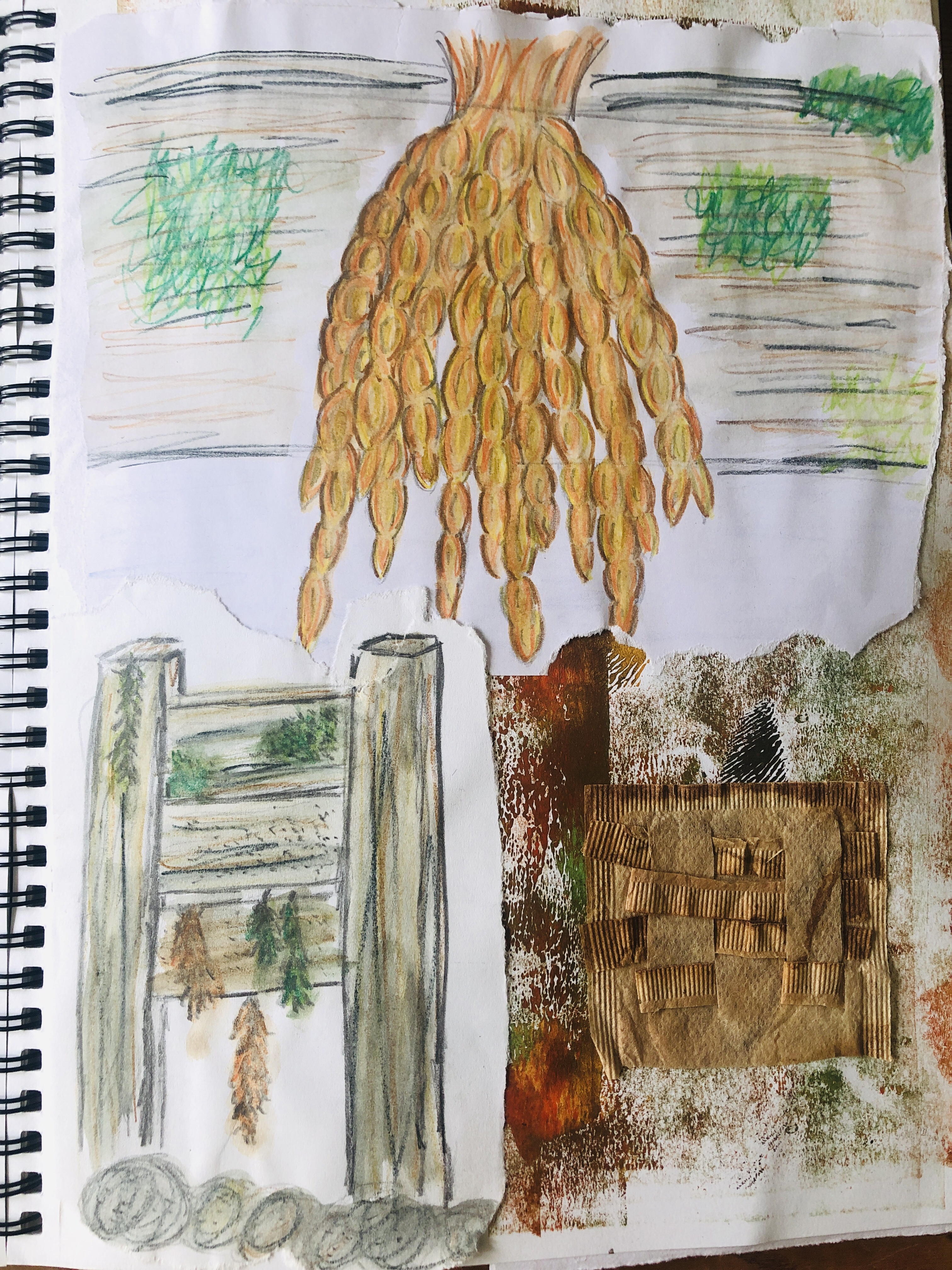
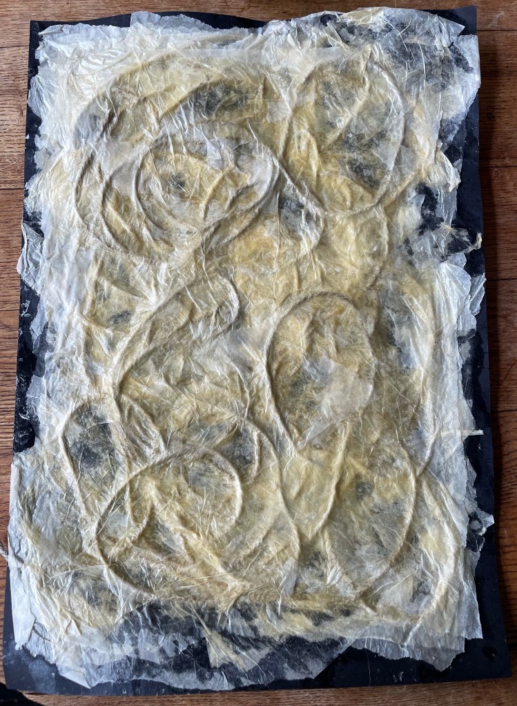
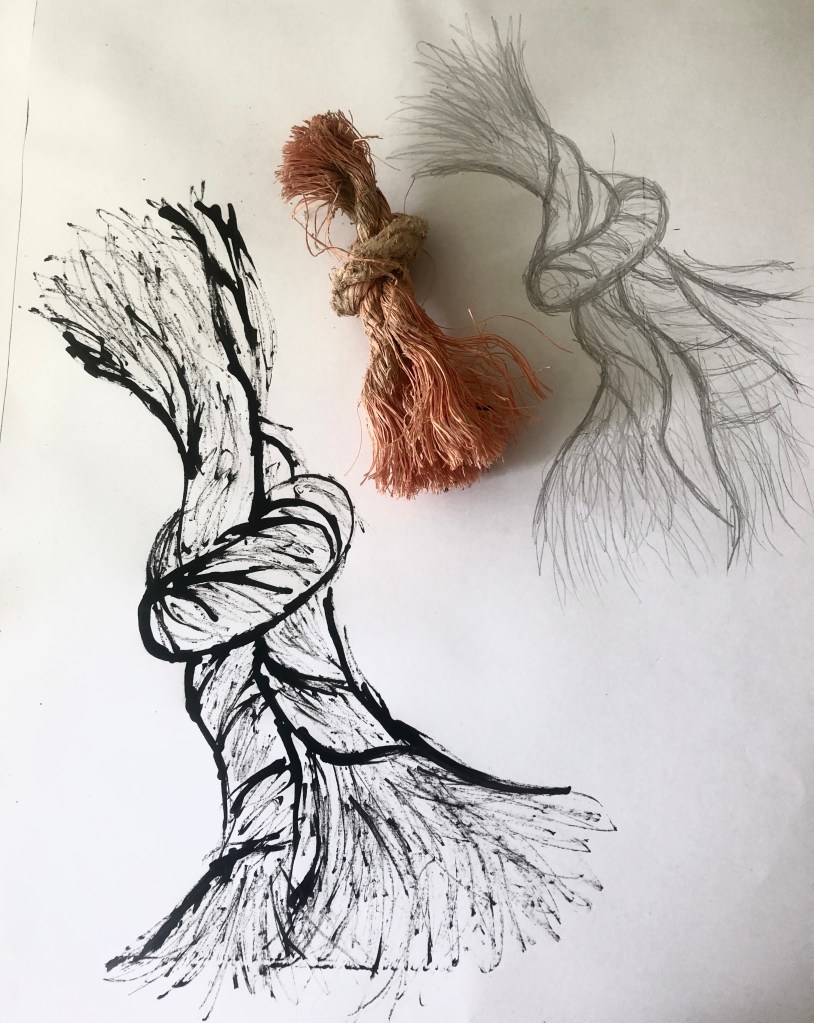
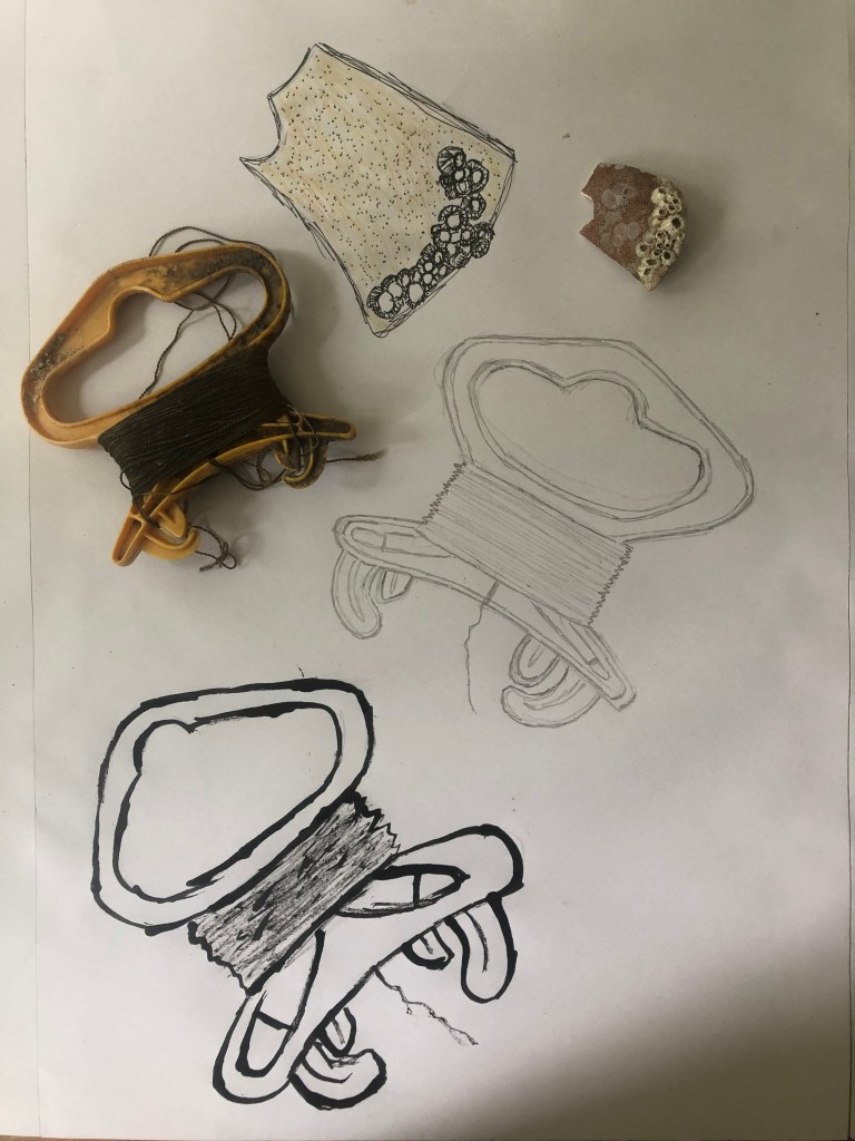
In my sketchbook I made a collage of mixed papers and then using a stick and black ink I drew a basic shape of a rope and then tried using my fir tree needle brush to scrape black gouache paint into it to try and create fibres. This didn’t work very well so I then used a fine black pen to create lines, which I then painted into first with blue watercolour paint and then blue gouache paint. The gouache was used to try and make textured lines rather than flat strokes to see if this would give the impression of thick pieces of nylon bunched together. I felt this was successful but a mixed media sketch of a wooden groyne just did not work well.


I had listened to my tutor and had put the photos I had taken of beach scenes and plastic pollution next to the sketches that I was creating and this certainly helped but I can also see a real need to be able to sketch in the moment.


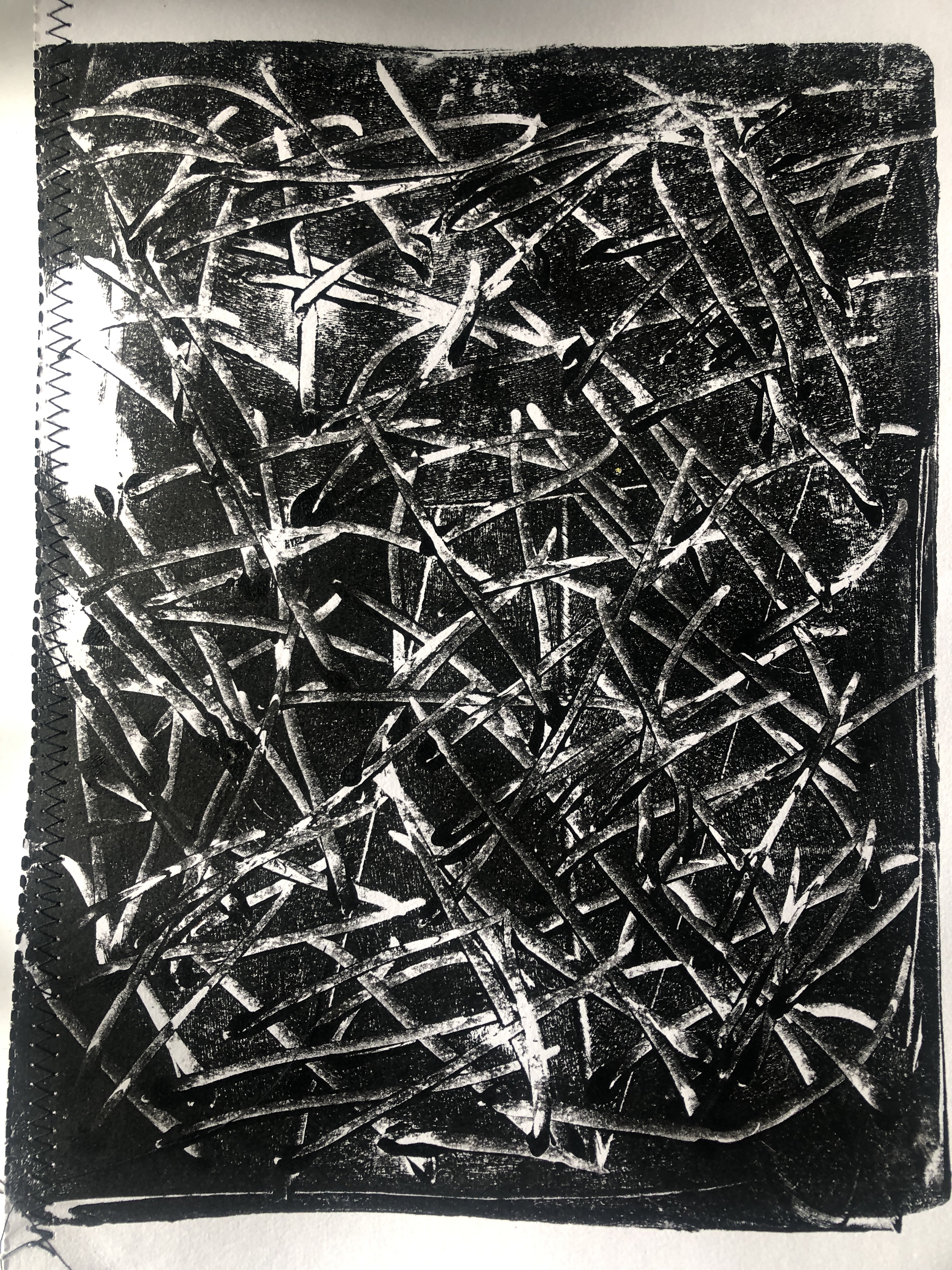
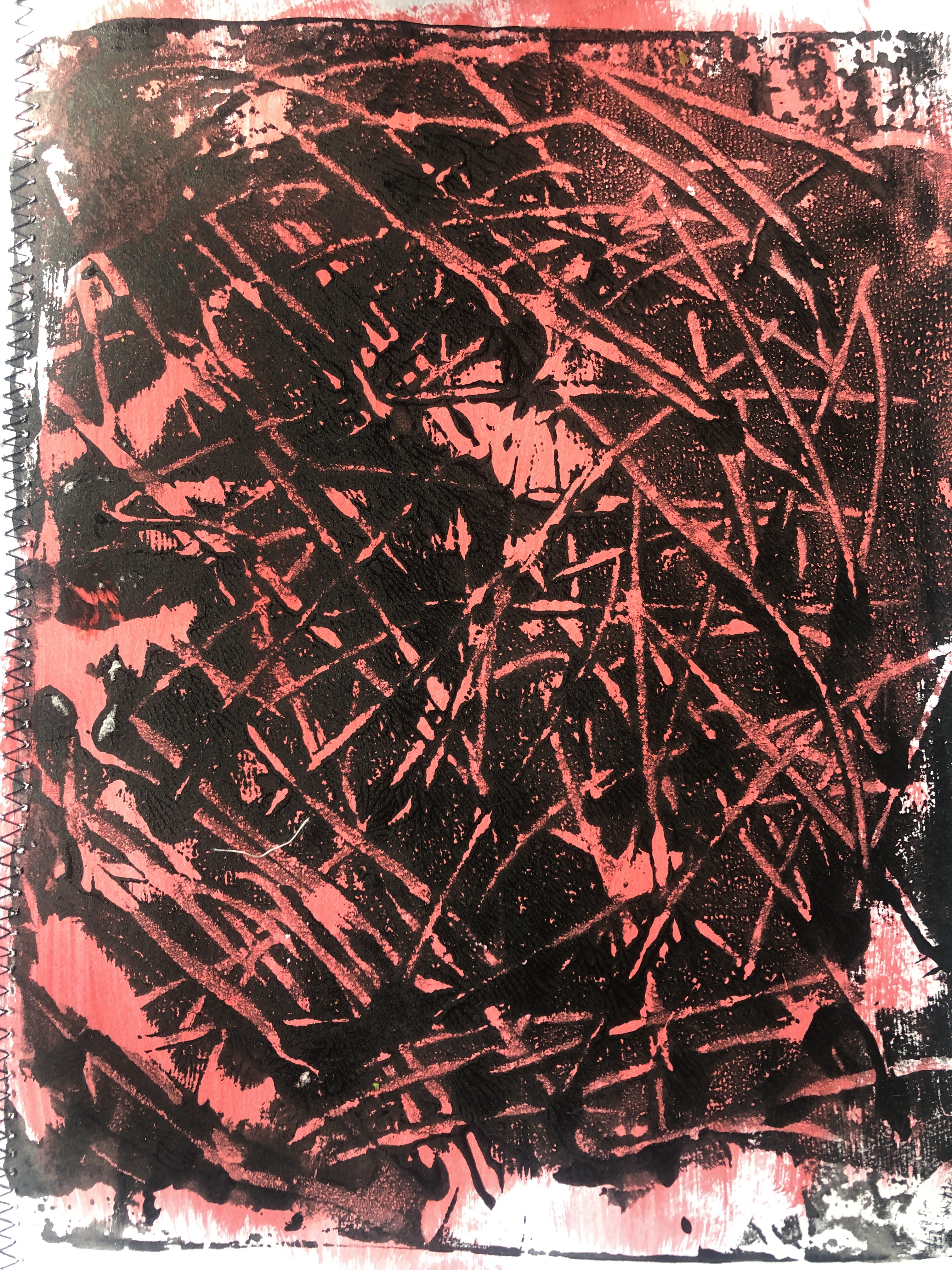
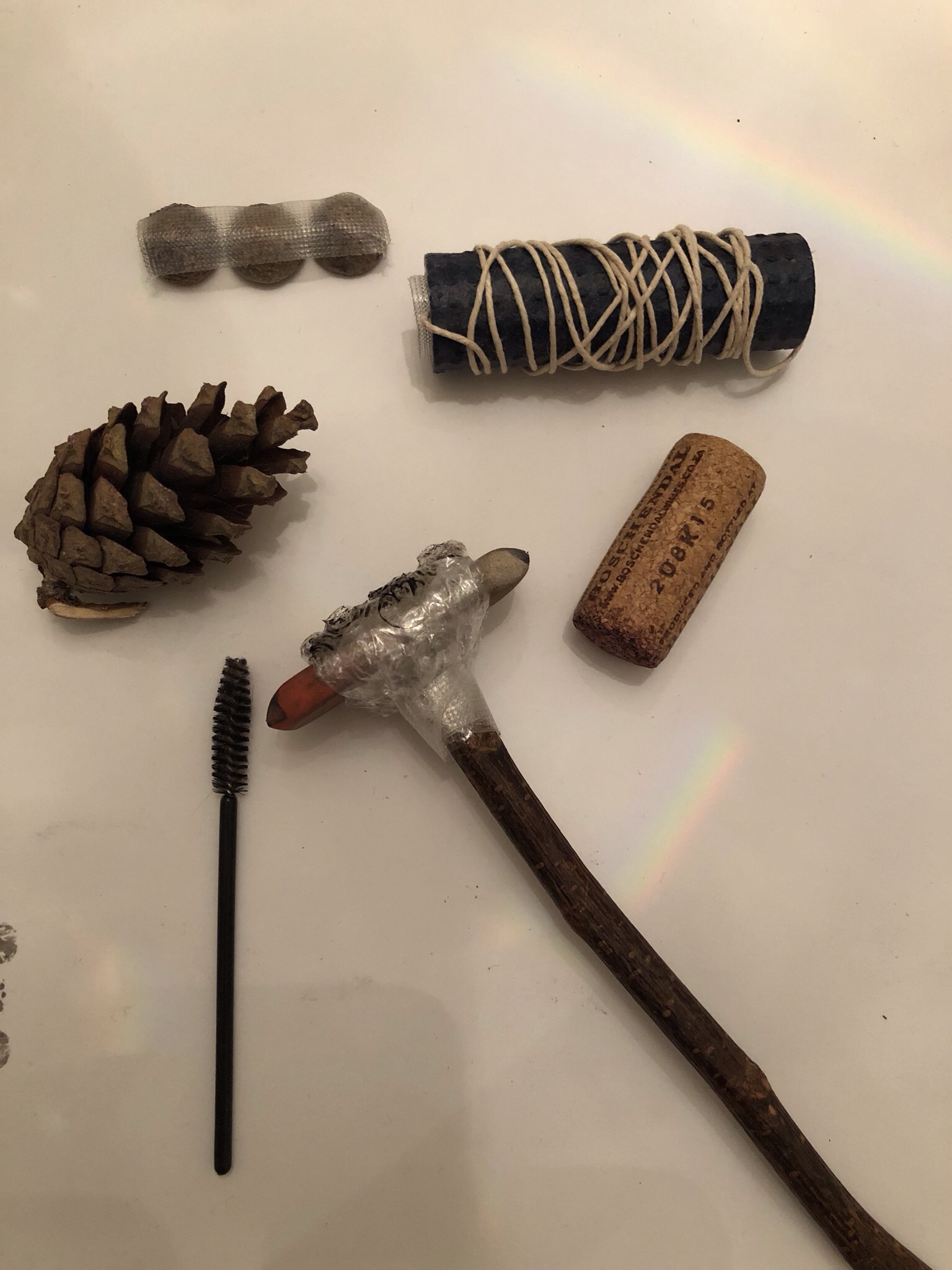
It is so difficult to be able to show the details and effects on a small photo but the mark making with sticks and pine needles have definitely proved to be the best way to portray the rope threads. It really brings the fibres to life better than the black pen.
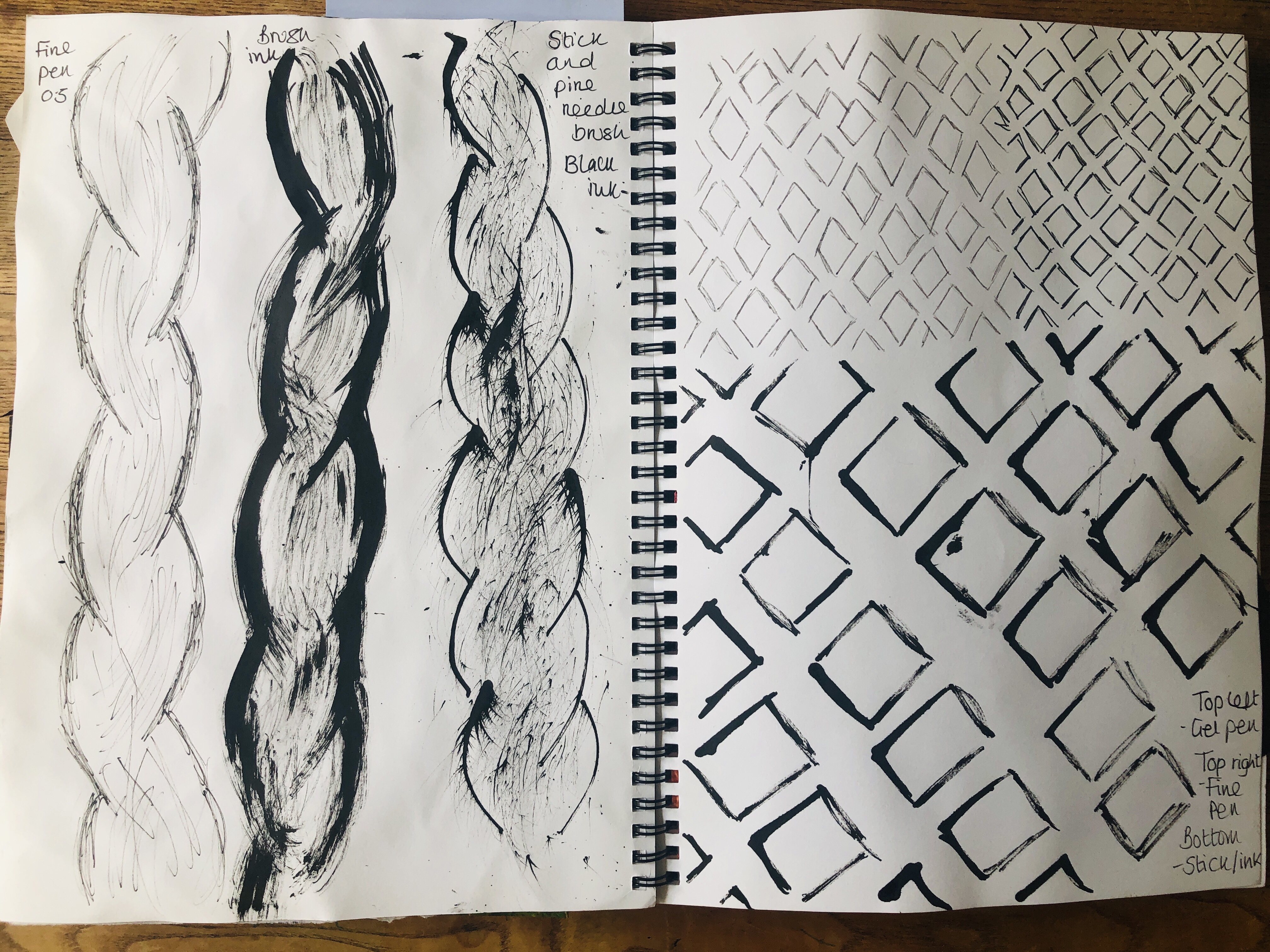


I also really enjoy using black ink out of an ink pot as it gives a much better effect than black paint. As the ink dries very quickly I have to also sketch as fast as possible and spend less time making intricate details, this way of sketching works best for me when drawing subjects such as the rope as I’m finding again that less is more.
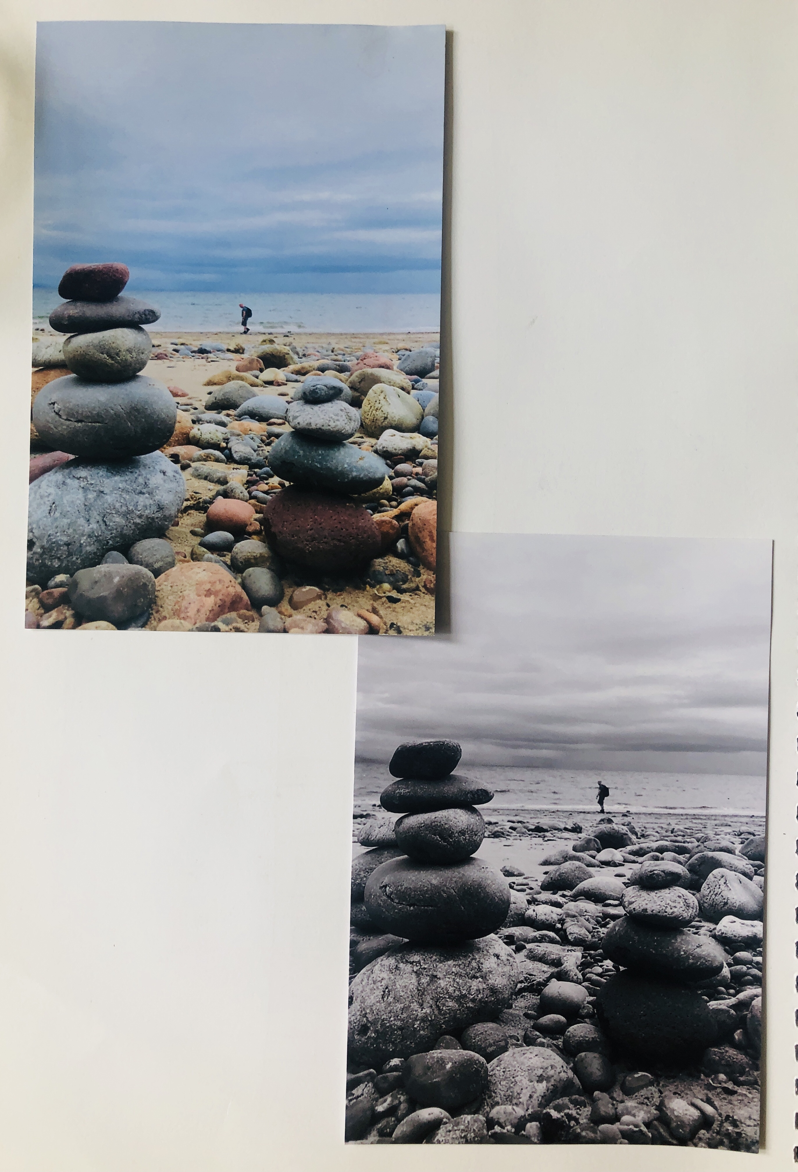


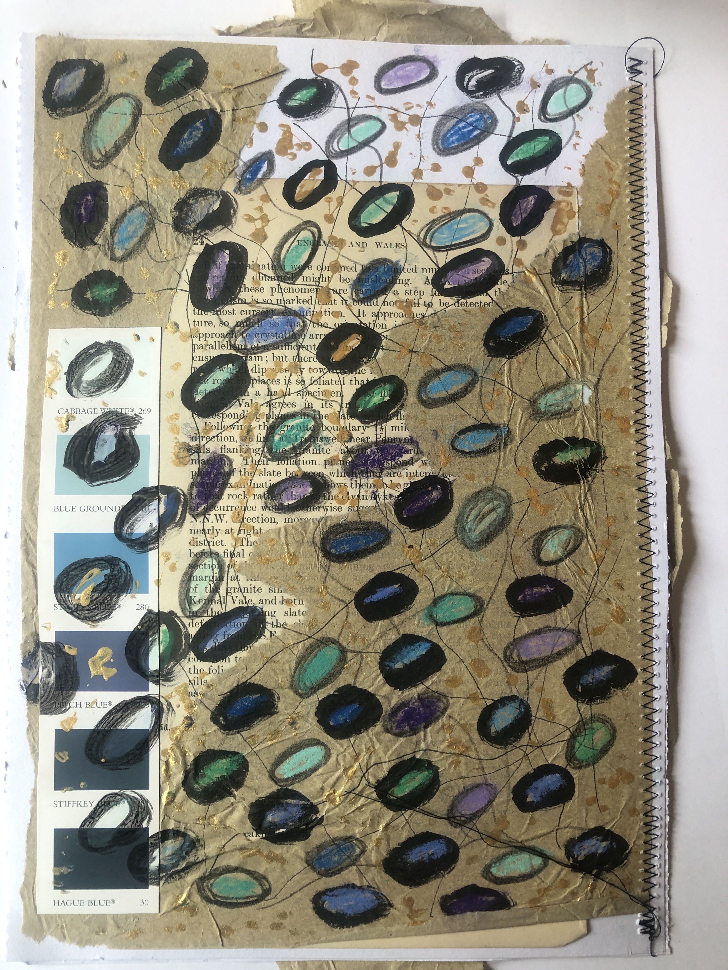
I love stacking pebbles on beaches and have always found the variety of colours of pebbles fascinating to look at. I also am very interested in beach glass and have a huge collection, this element of pollution can also be beautiful when the sea has produced soft opaque rounded pieces of glass in so many colours and shapes.
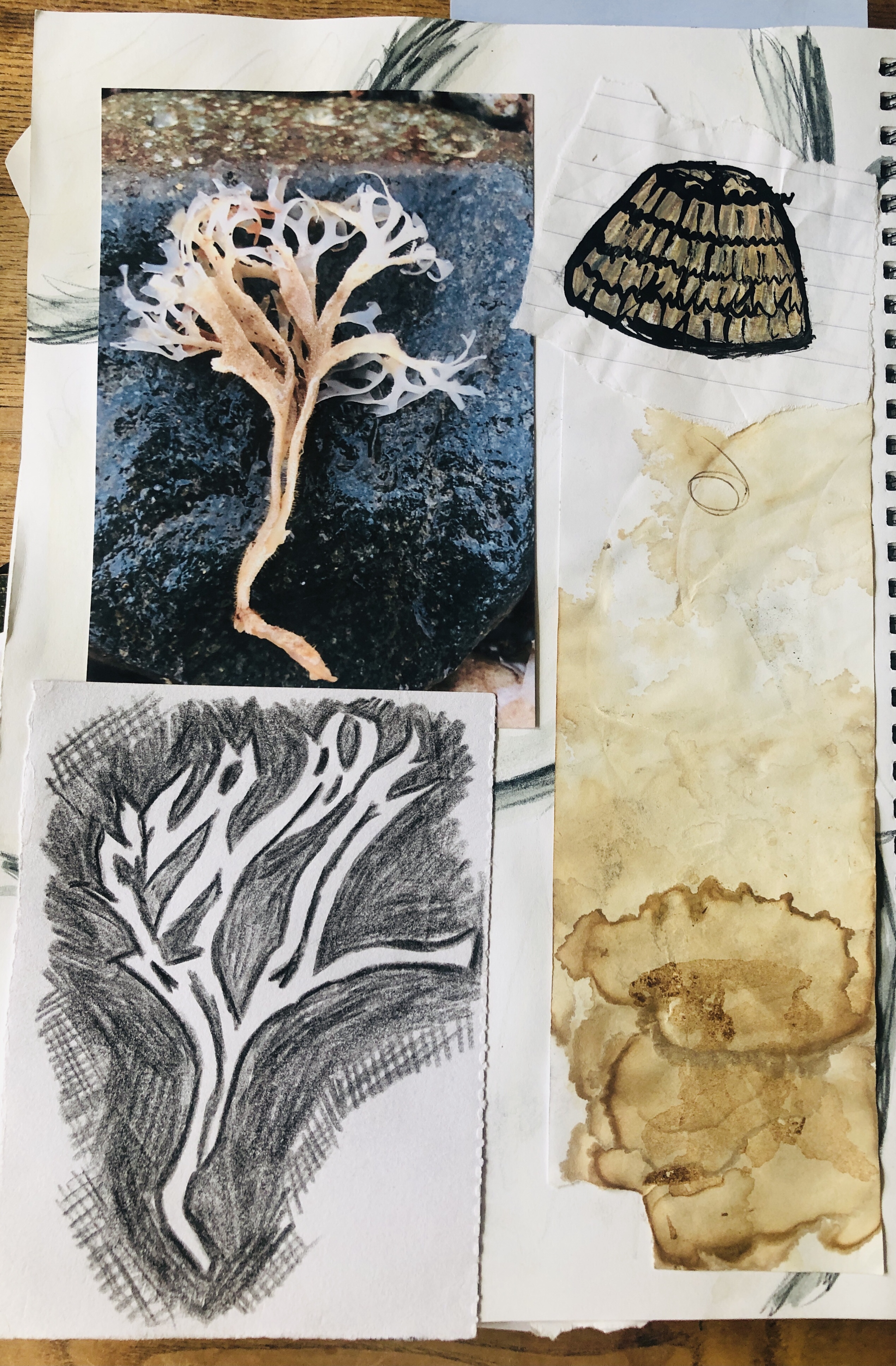


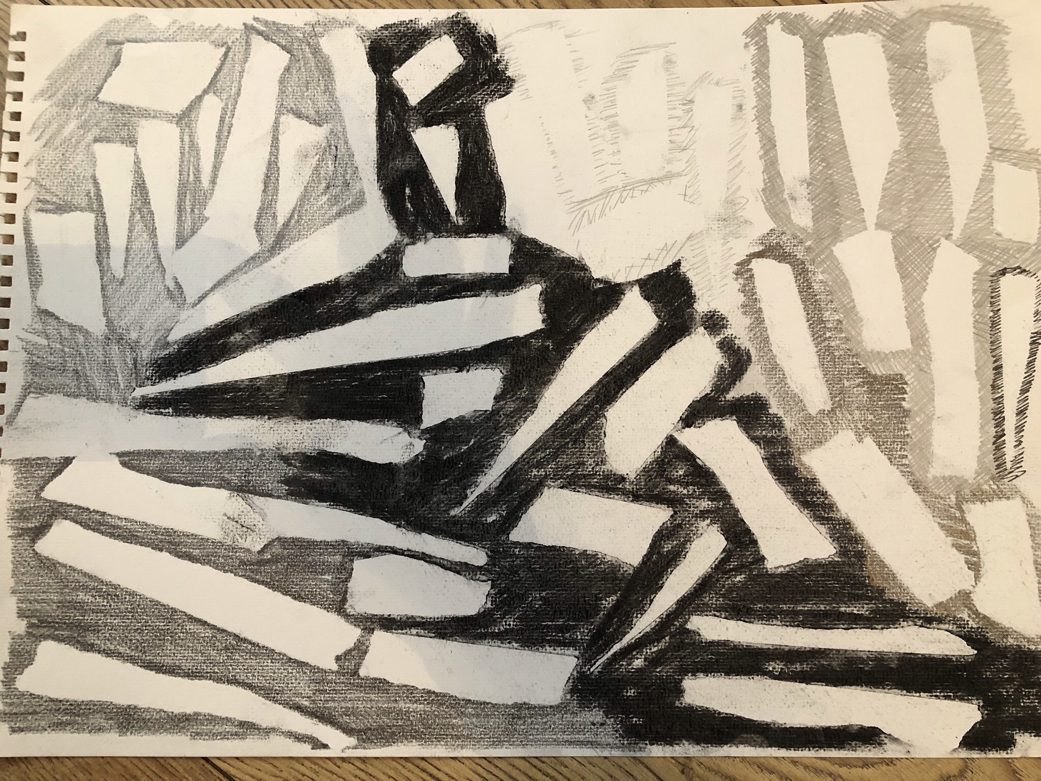
I chose the piece of seaweed to photograph as it was so delicate and reminded me of the Tree of Life, it is fascinating to find such fragile life washed up on the shoreline, especially as I found this the following day after a storm. The reverse monochrome sketch worked very well and I do need to practice this more as it is a very bold image and I found it to be very successful and gave a much more detailed approach than I initially thought it would.

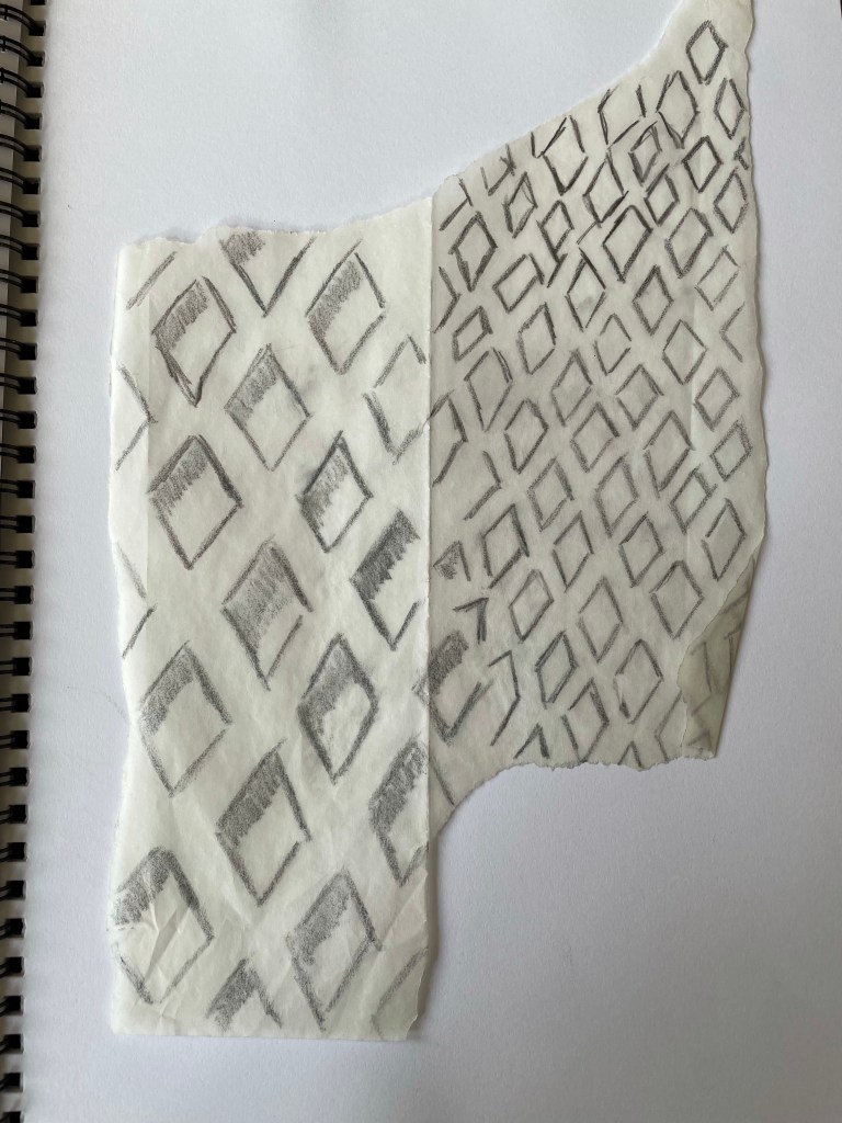
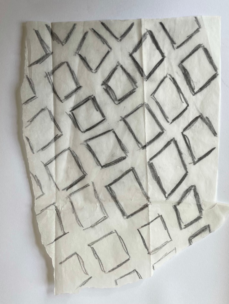
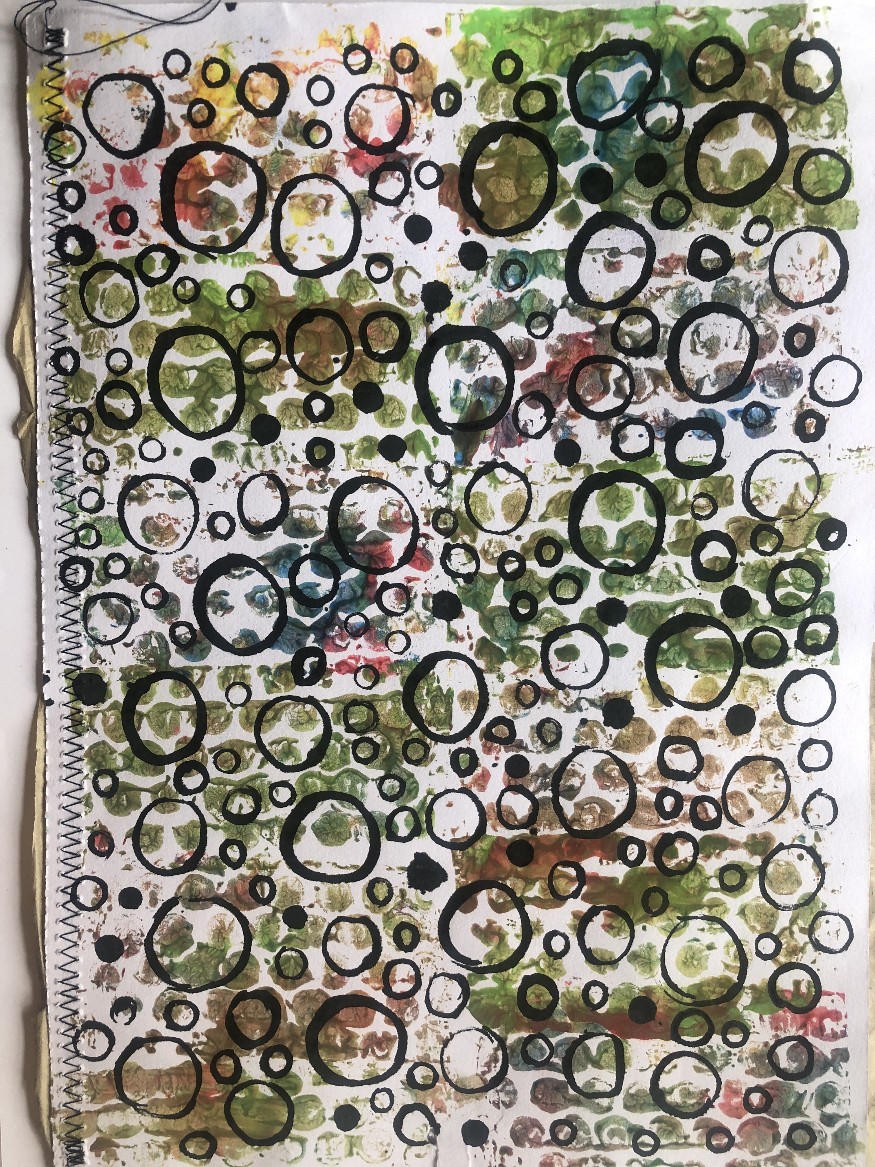
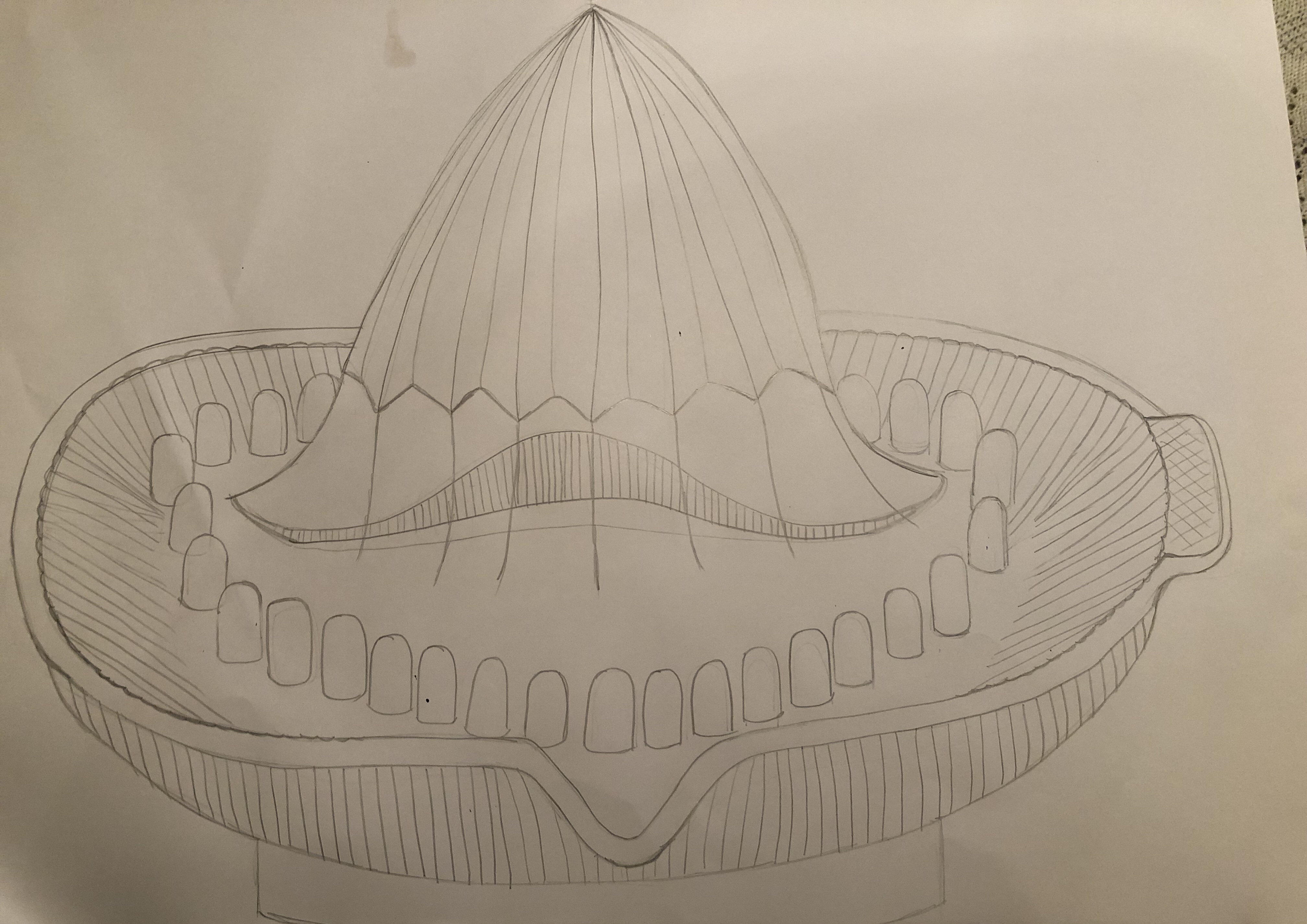
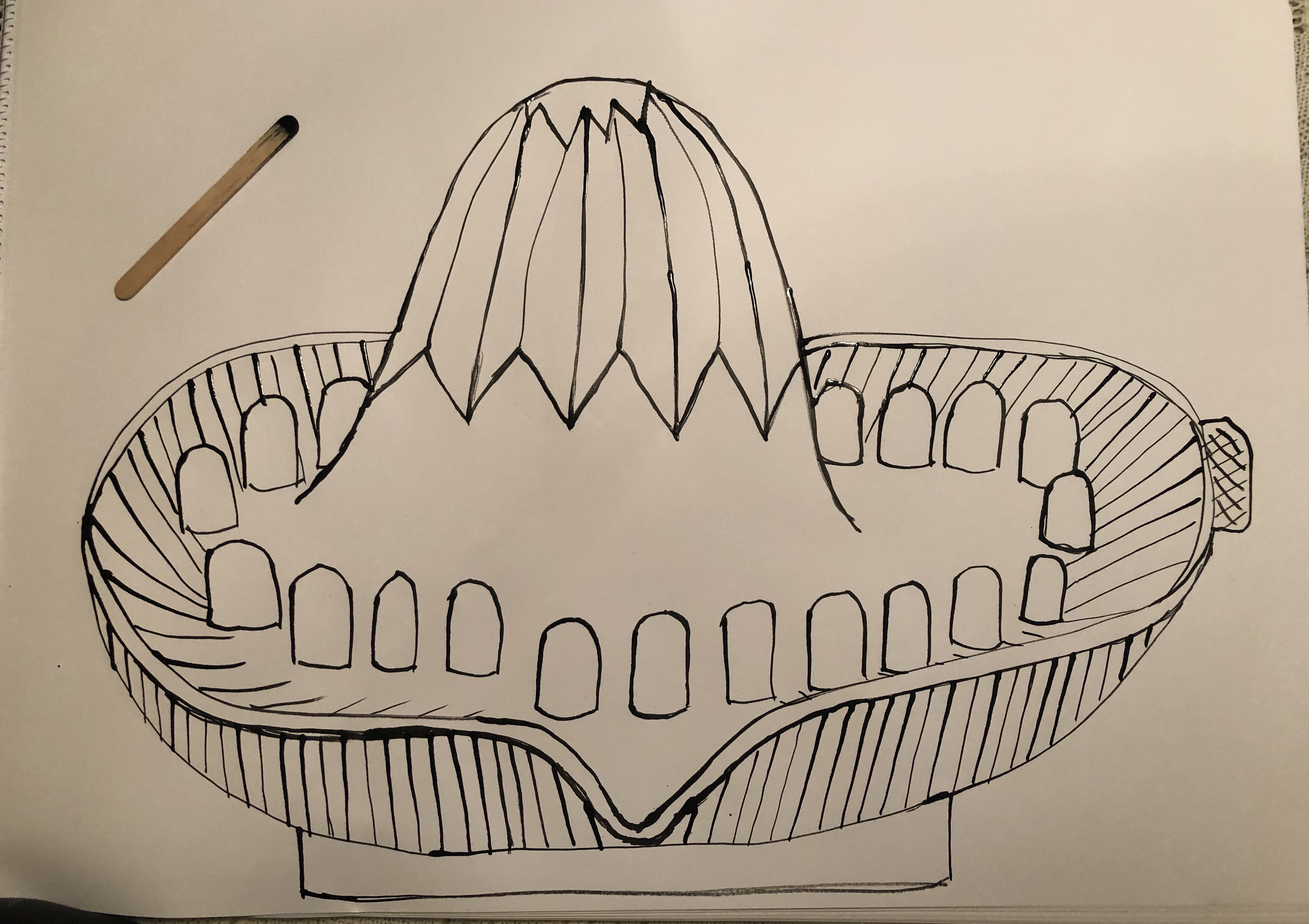
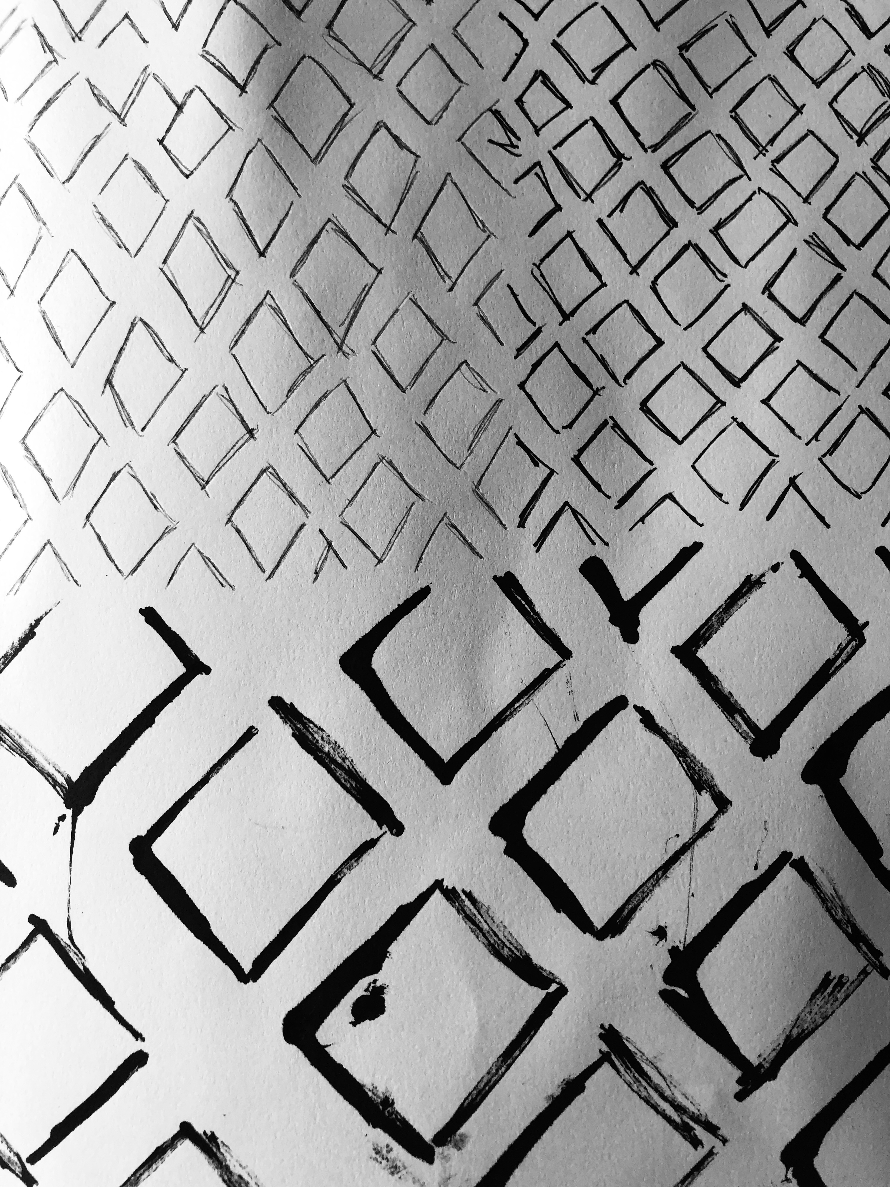
I enjoyed trying to sketch blocks and diamond shapes to replicate netting, the middle sketch had a three dimensional look to it.
I enjoyed getting messy with the above piece as I have done this before on journal covers and it has worked well to give more texture to a plan cover. With this piece it gave a very fragile feeling and reminded me of deep sea creatures skin.

This piece was fun to make as it was bigger than it looks on the photo and the masking tape layers stood out well against the background.
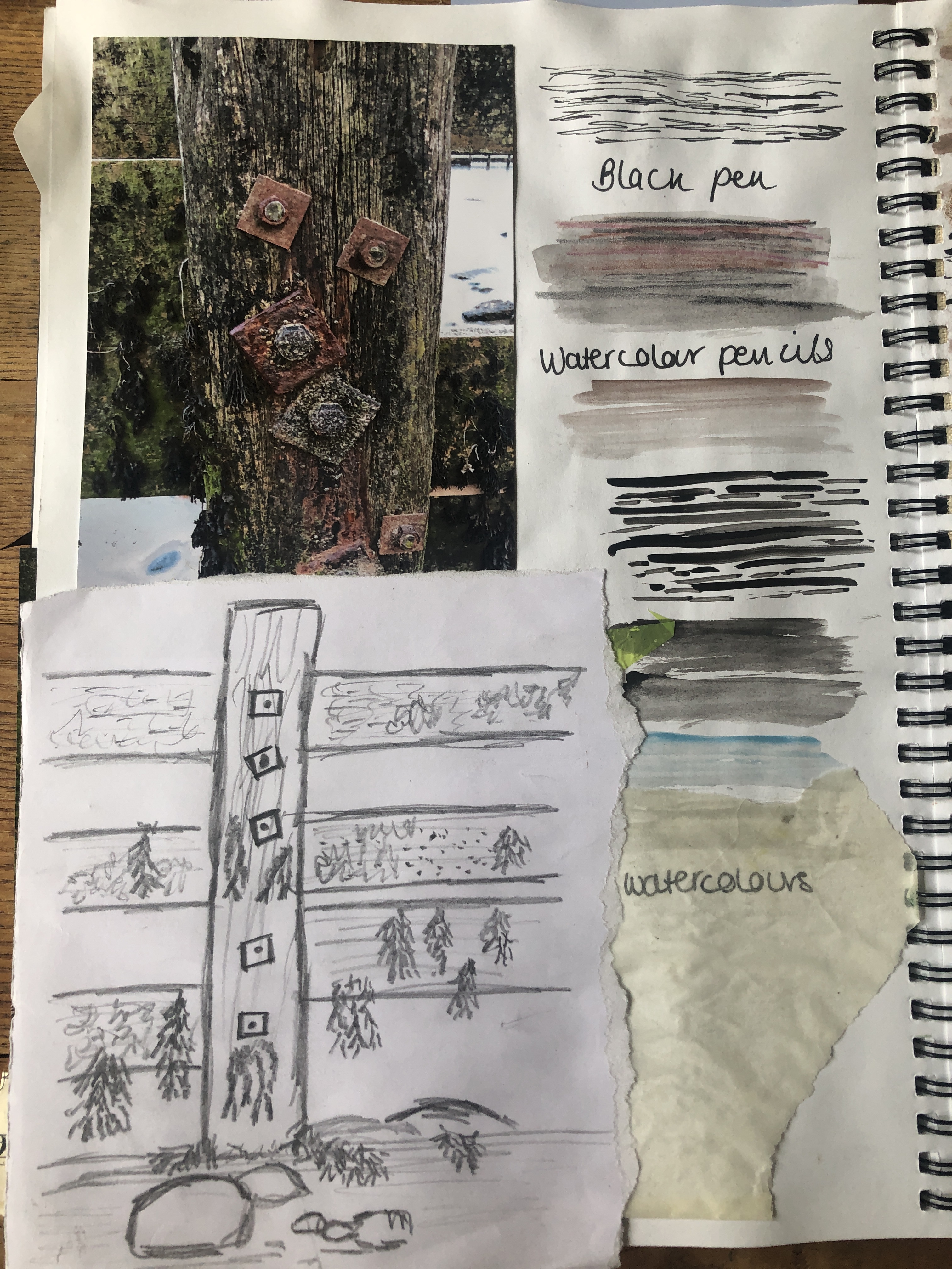
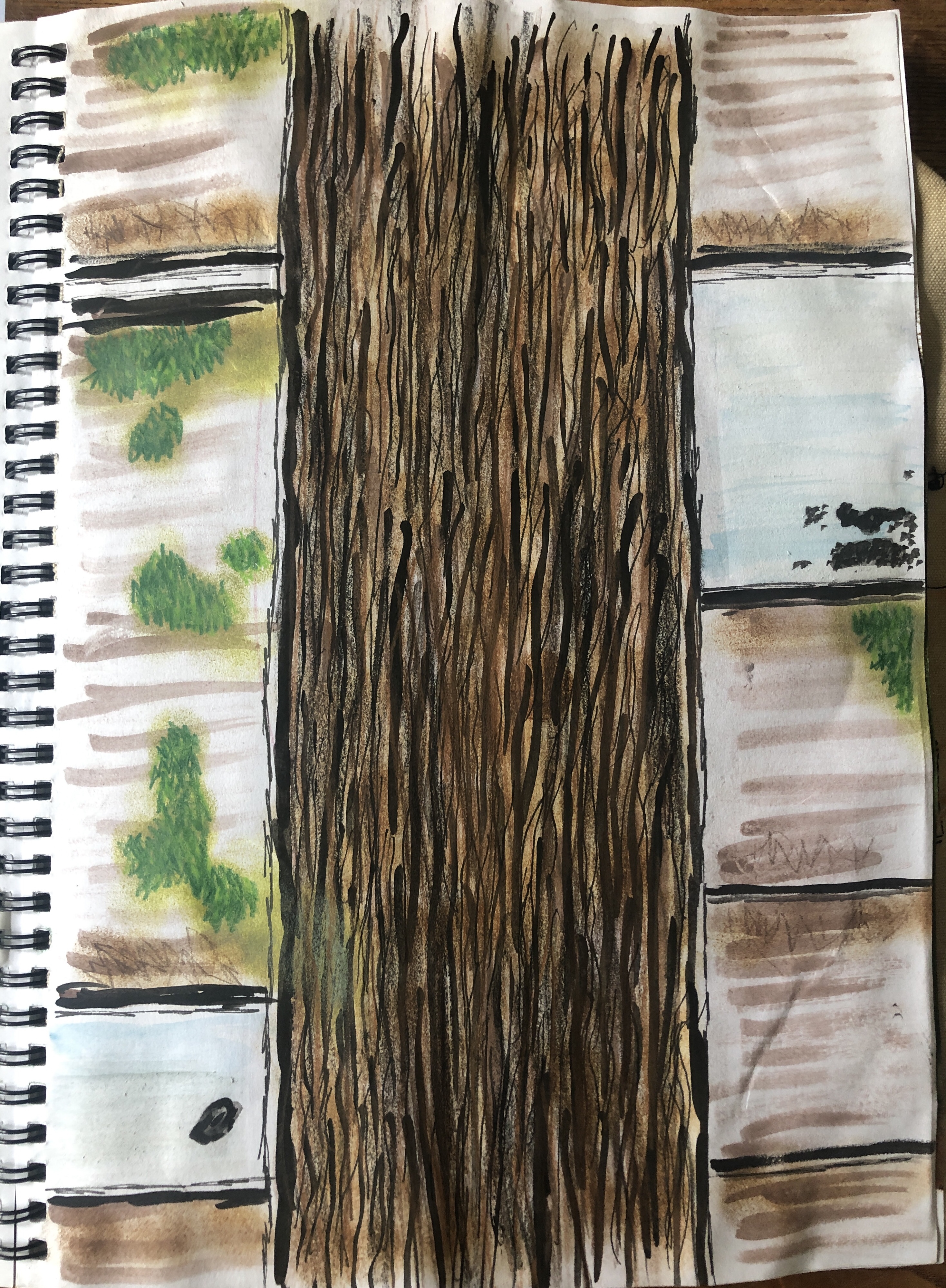
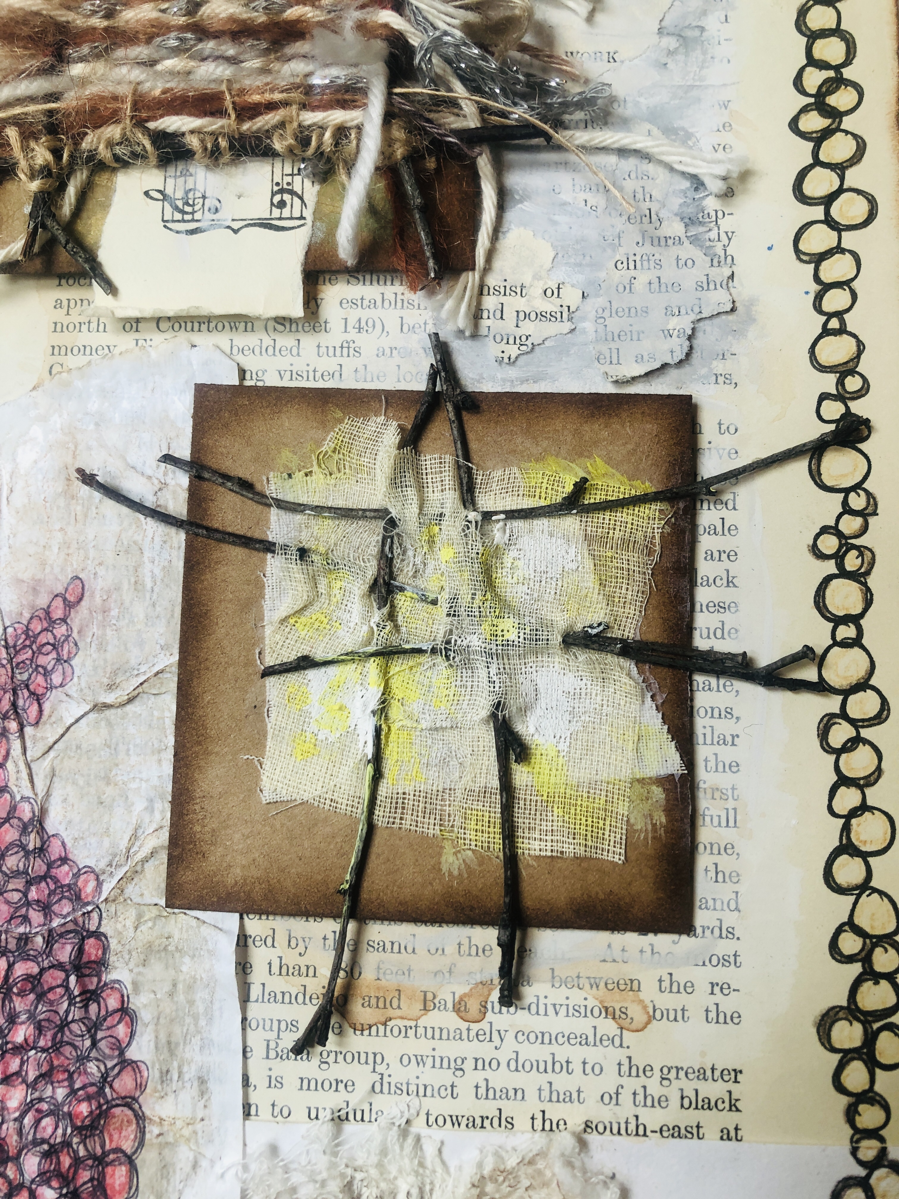
Again, I was over critical of the above sketches, even though my tutor had provided links to an artist who does use the above approach. I did think the close up section of wood did convey texture as I worked into it over and over again with a mixture of mark making tools and colours. I also seem to not be able to sketch straight as all the sketches above were somewhat lopsided. The pencil sketch worked the best, I liked the pencil as it was actually one out of a voting booth, they were all getting thrown away due to infection control so I had to bring a couple home!
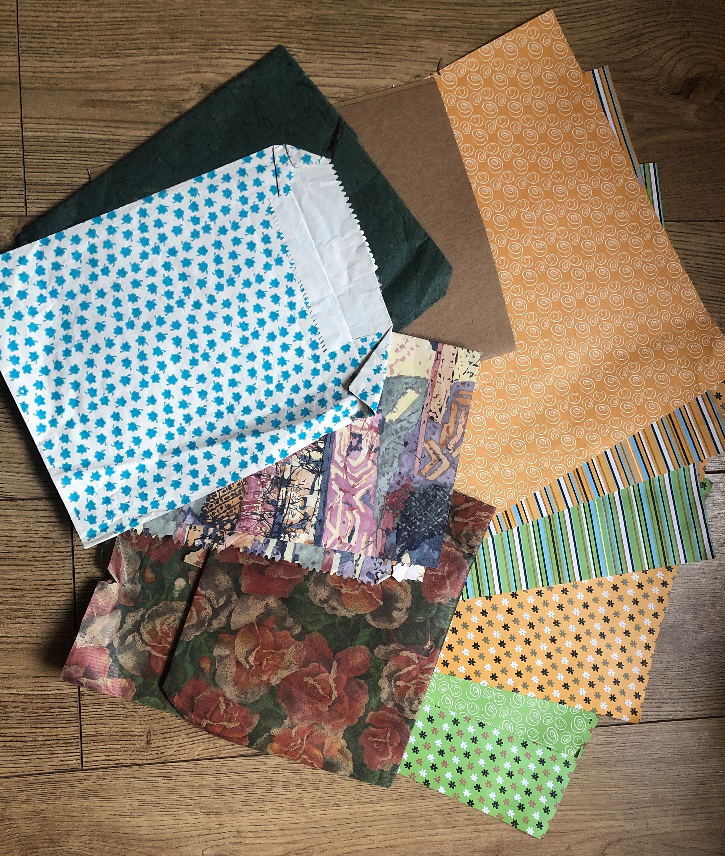
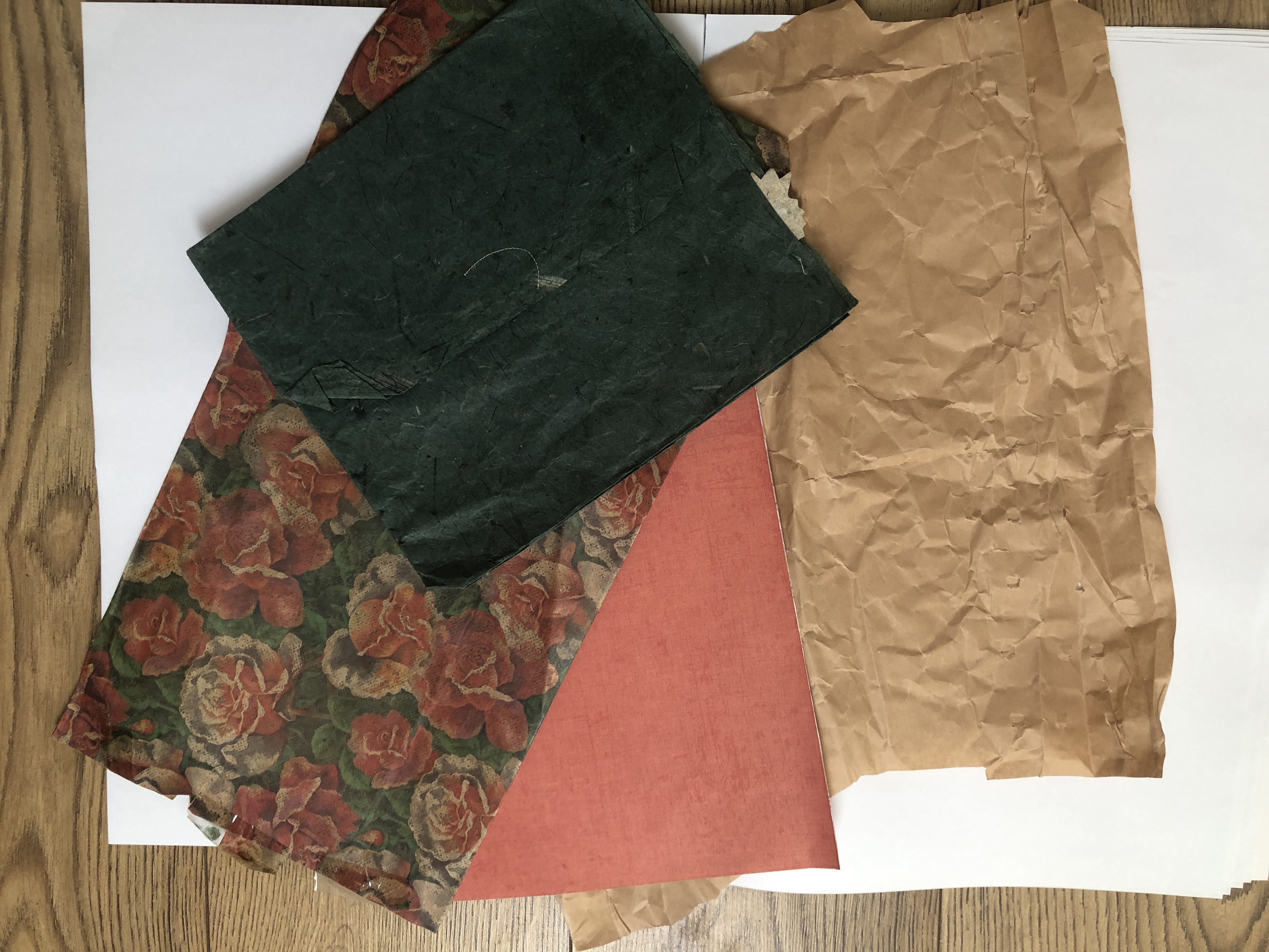
I had assembled some of the items I had collected from the beaches together on several pieces of A2 white paper so I could look at them more closely. As much as I would have loved to draw the whole lot as a group, I instead chose a few items from the collection to study and draw.


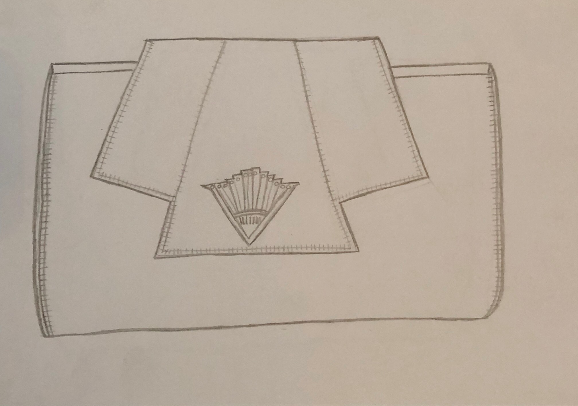
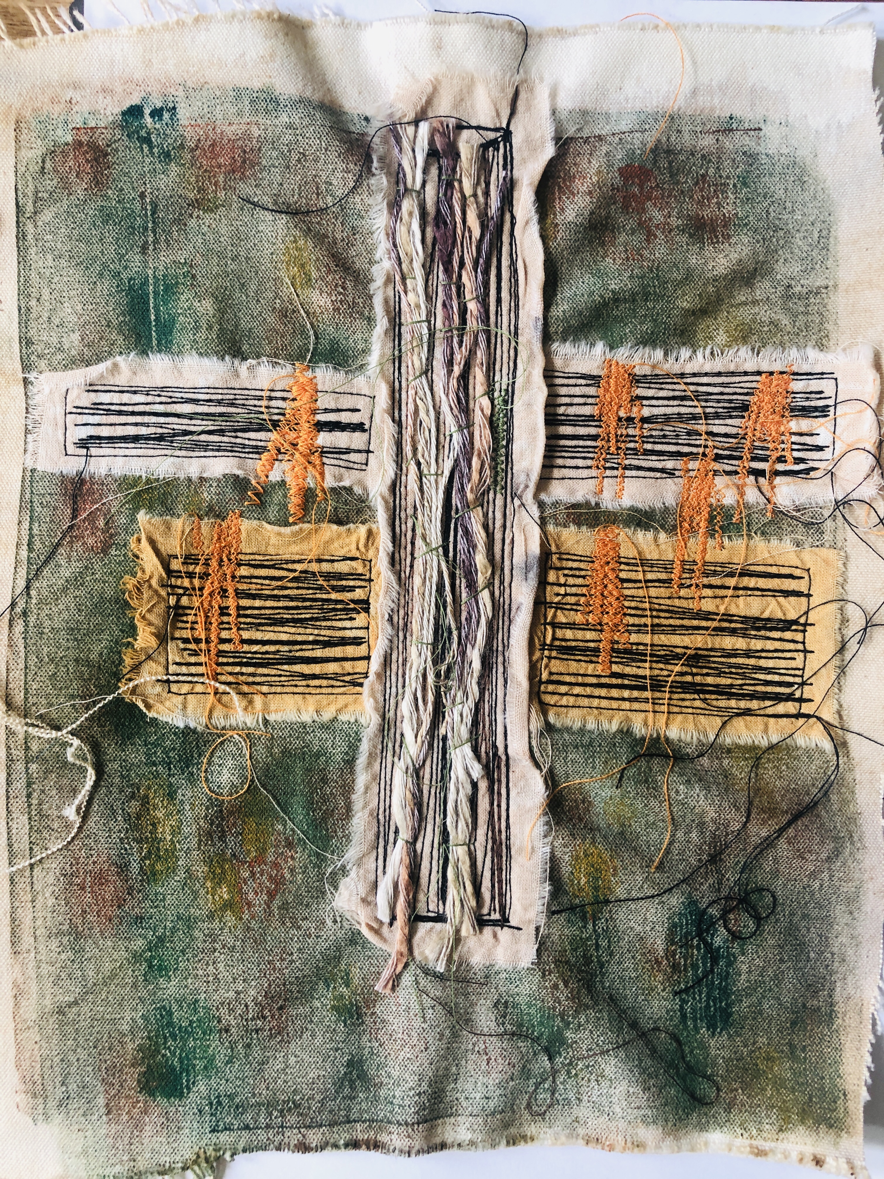
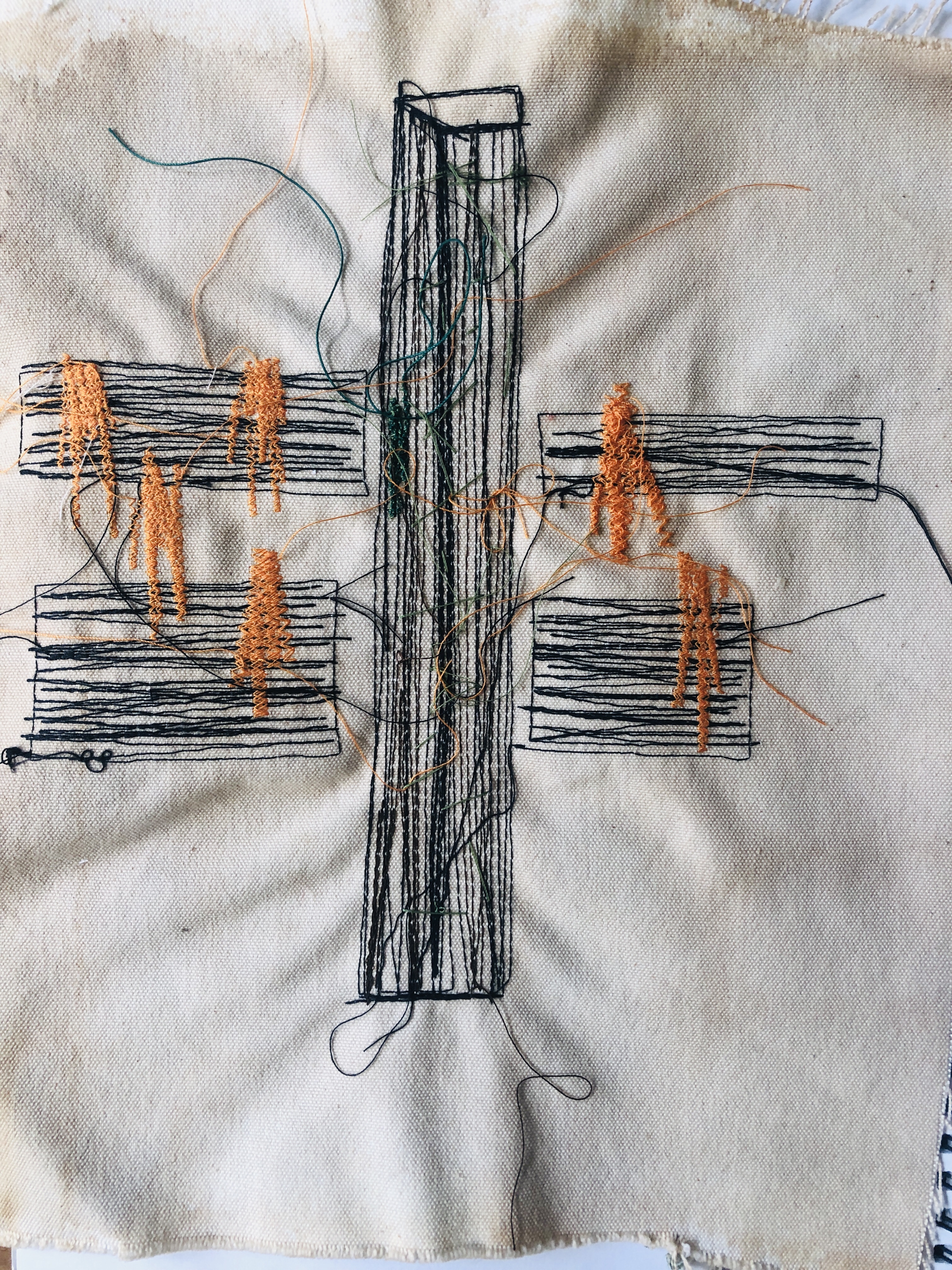
Having done a lot more sketches and also only added the ones which I liked most instead of adding every last one (!) I began to look at samples for the final large scale material manipulation piece. I had a clear idea in mind and that I did not want the piece to be “flat” or completely the same. I wanted to continue on themes I had often used in previous assignments and for the piece to have texture, movement and three-dimensional. I have gained the most satisfaction from making tactile samples and although I have had success with sewn samples, I wanted to achieve something challenging and sculptural, the most difficult factor was space to work on and store the final piece whilst it was in construction and time to complete it. Another reason was that I wanted to keep some of the ideas I had used in previous sections of Foundation Textiles to use in the degree level Textiles and I did not want to use something I had already been assessed for. Some ideas need to be kept on the back burner for a reason and however good it could have been to do a giant wall hanging of some of the samples over my studies, I almost did not want to waste them.
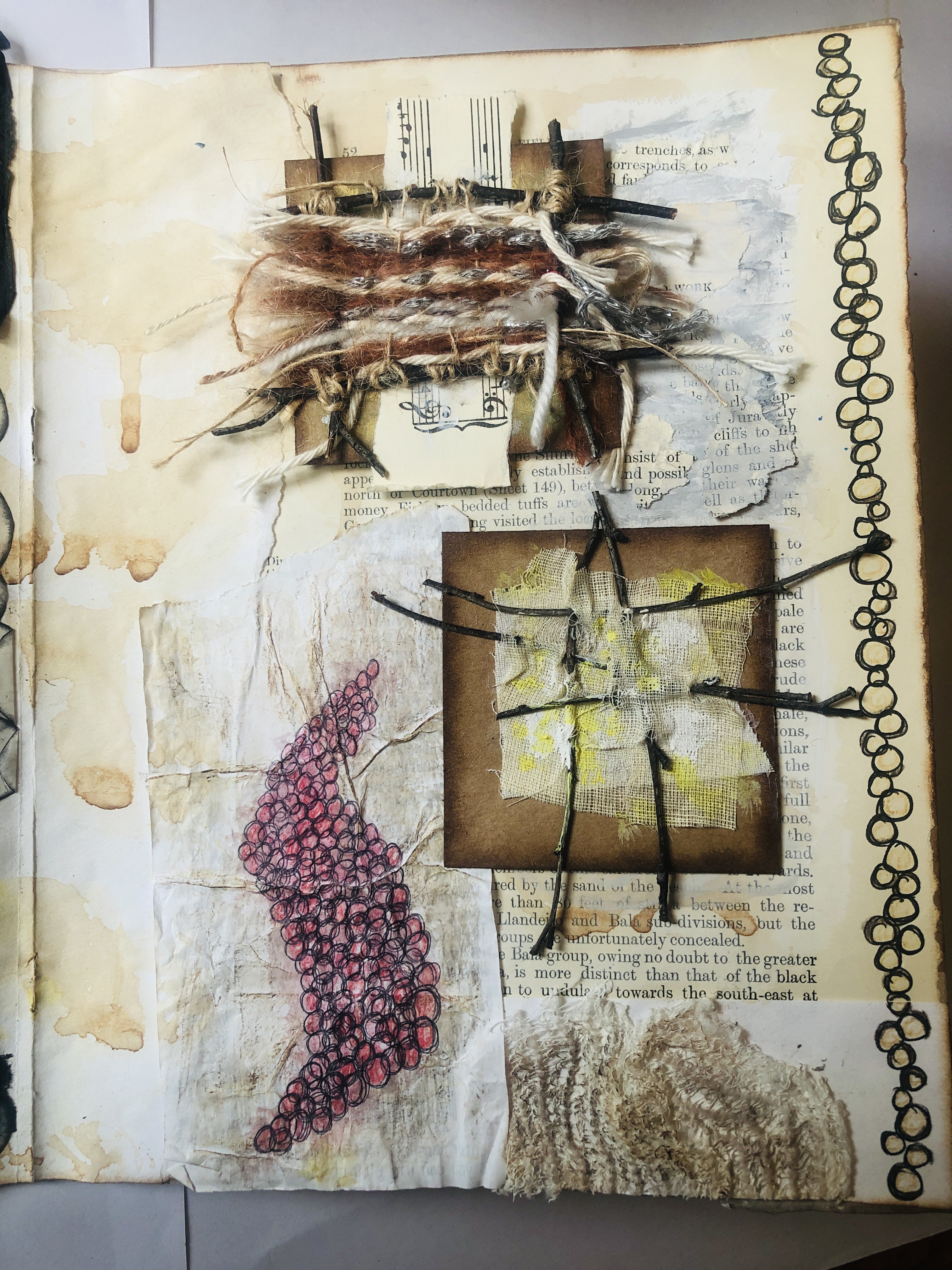
As I had written in the beginning of Part 5, my thought process was around ocean and beach plastic pollution and so I wanted to look at something that would be netting/woven related in its concept. I revisited an earlier idea and began with looking at how wire interacted with another textile source and so knitted up a sample in wire and threaded orange crepe paper twists through it. Crepe paper is so much easier as it is less likely to rip or fragment and I liked the outcome but knitting something the size of one metre squared in wire was not going to be friendly on my finances.

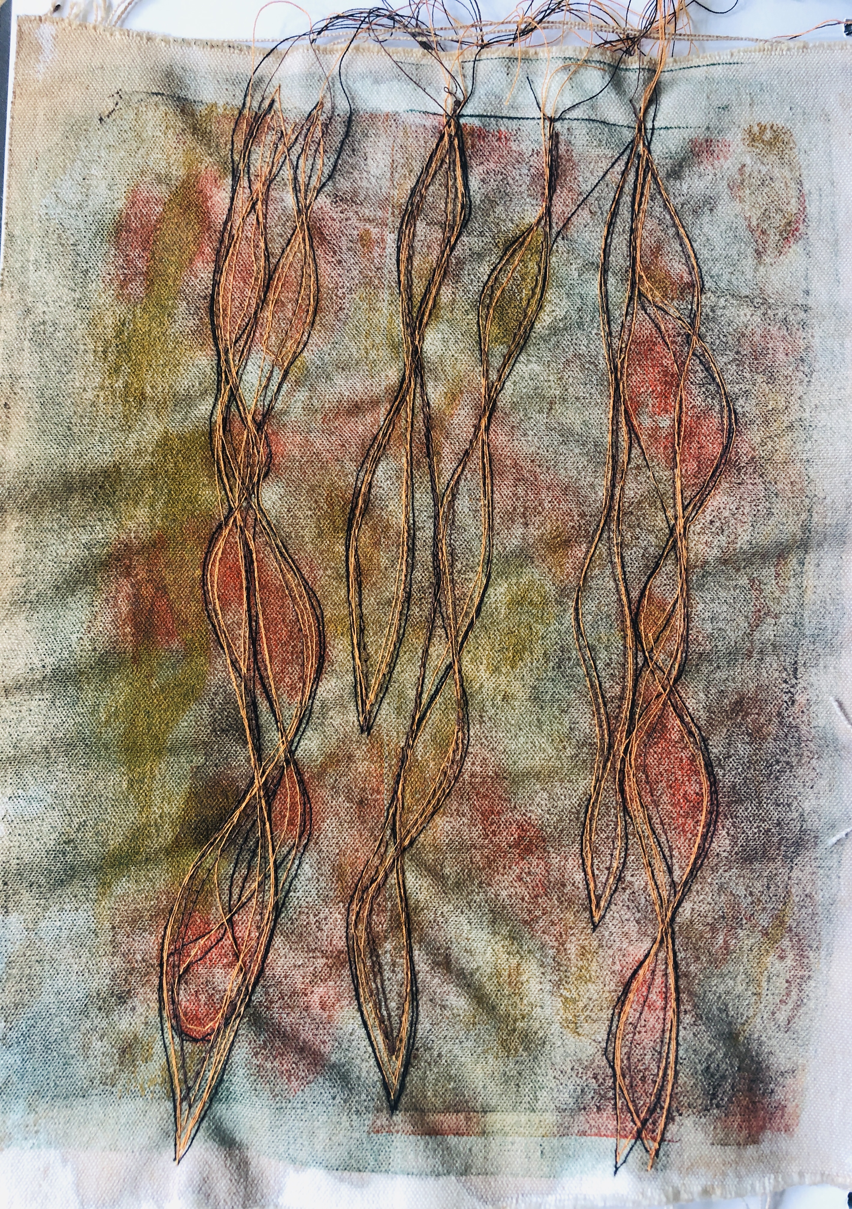

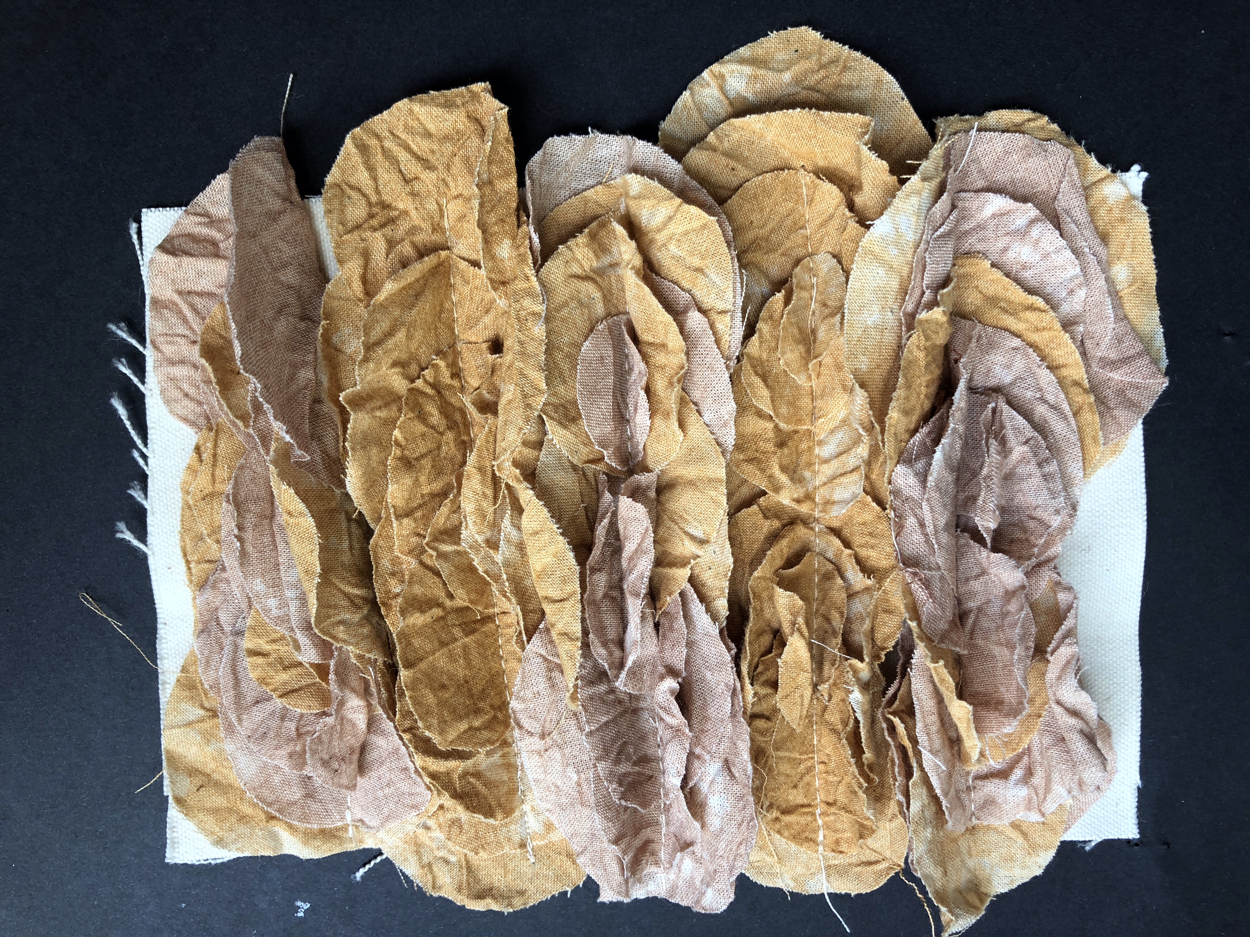
I did like the idea of some form of seaweed in the final piece and I made a fabric sample in calico and free motion sewing to test out the structure of making some form of seaweed. I found both sides of the above sample interesting and successful so I moved onto if knitting could be an option to make this in a physical form. I have made scarves from this particular way of knitting which was in itself a happy accident but I’ve always enjoyed making scarves from fine knit all the way up to the chunkiest yarn I can fit onto needles, so I knew I needed to try it again. I chose seaweed colours to estimate whether the idea would work in practice.

Out of the two samples, I preferred the orange knitted piece as it was more colourful and as it was a yarn of blended coloured fibres it did not have such a flat colour as the green one and the blended shades almost gave ripples of colour like real seaweed. I probably could have found giant woollen yarn and knitted the whole final piece from it but it would not have fit in with my criteria of pollution or carried a message as well, personally I wanted hidden meanings as well as a piece which was interesting to look at.
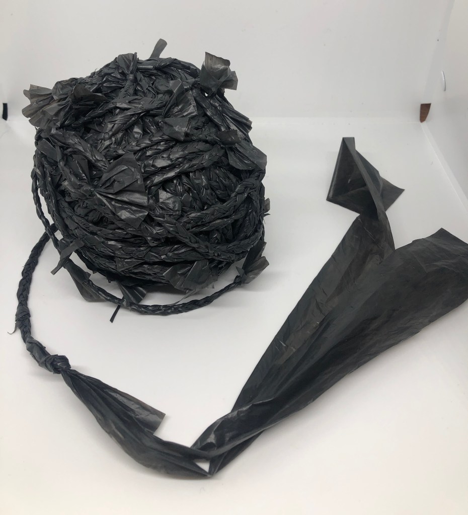
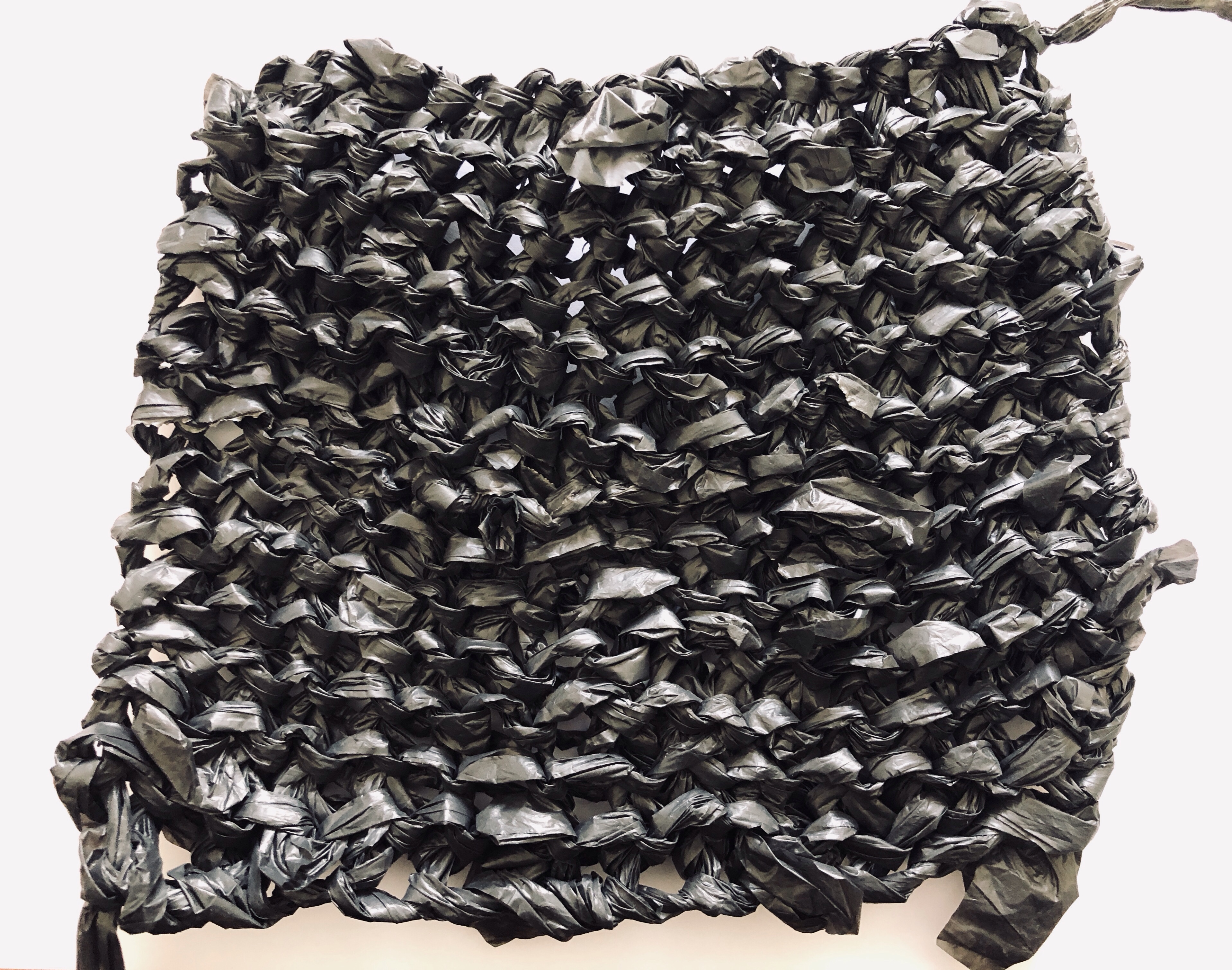
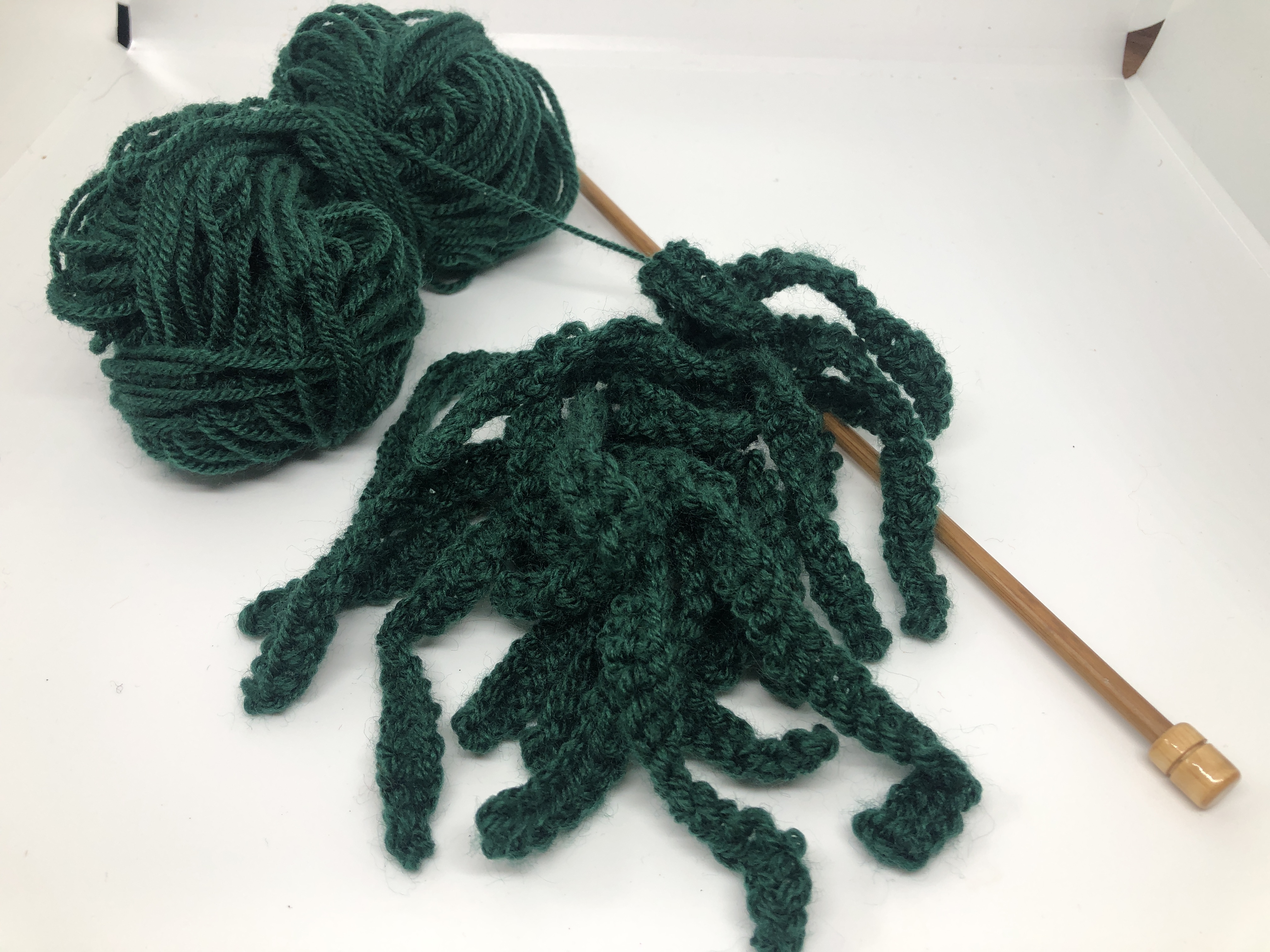
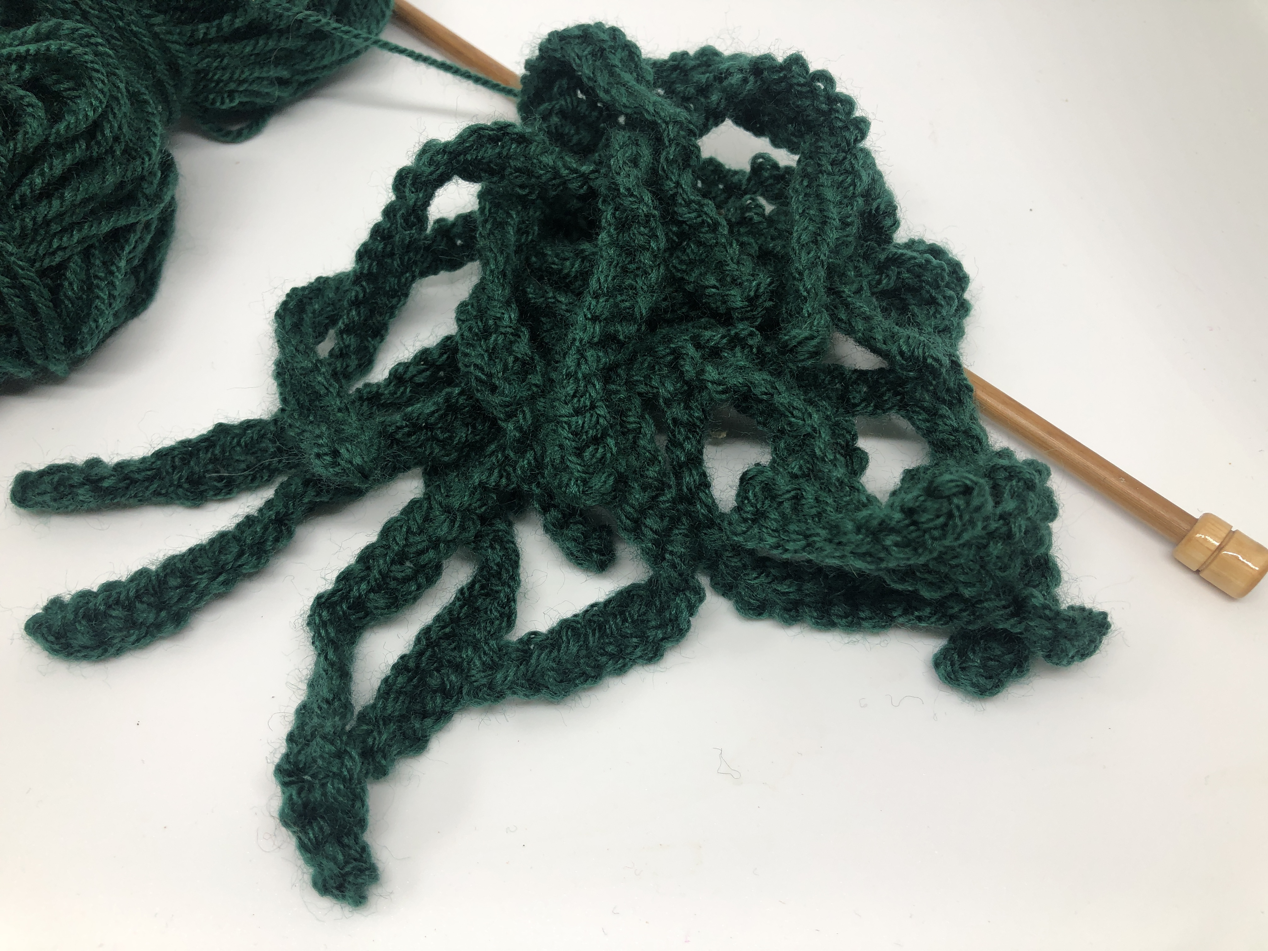
I had asked my father to make me a pair of giant wooden knitting needles and had already done a quick test of how the needles would work with a dustbin liner as I had done a few rows of knitting with just strips of the plastic and the knitting was just not strong enough on a larger scale as it had been on a smaller scale, so I realised that I would have to make my own yarn. It took so long to make as I was literally sitting and plaiting each evening for over a week in order to produce just one ball of the yarn. I had not planned to have a whole square metre of the same yarn as it would not only possibly be a bit boring and also would not allow some of the woven in items to be seen as if the knitting was too large it would dominate over everything else I wanted to show.
I had a trial piece to see how cardboard and yarn could interact and so had collected and flattened out sections of recycled packing cardboard that I then lashed together using garden twine. The plan was to try threading rope through the lattice but having done this I looked at it from several angles for some time but I hated it! I did like the actual lines where I had connected the pieces together and was surprised by the physical strength of this, I could see that this was again something to remember and keep on the back burner as it could work very well as a sculpture piece but not as a flat material manipulation. It was way too basic for the Part 5 brief and I knew that I wanted the final piece to be something that I liked and was confident about.

So having ditched this idea, I moved onto looking at my ball of yarn and I decided that I needed to go back to looking at how this could be used better. I bought a reel of garden twine and began knitting with my homemade yarn and then joined it in with the yarn I had made. It was surprisingly easy to knit with and I tied the twine to baling twine from straw bales and then having knitted with this for a couple of rows went back to the garden twine. I then carried on knitting until I had a metre square net and cast off.
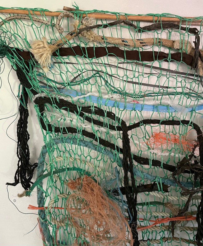
Taking the various pieces of rope and other items I had collected, I wove them into the net having mounted the net on two sticks I had found in the garden. The finished piece was interesting but probably not what I had hoped for, it would certainly have been better had I had more rope or materials to weave with but it isn’t actually that easy to find in plentiful supply.
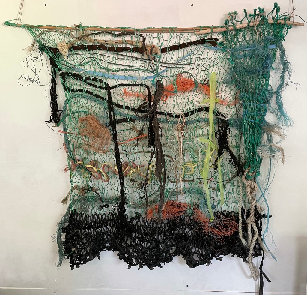

The baling twine was the most difficult to knit with as it kept its straight shape so well and so it was hard to re-manipulate it to a different shape. I left the rope ends hanging to emulate the tattered and aged aspect but also the fact that they had not been able to biodegrade.
I particularly liked this section as I had mounted the fishing net onto a section of stick also found on the beaches and then wove further rope into this to again explain that man made textiles do not readily decay and become part of pollution.
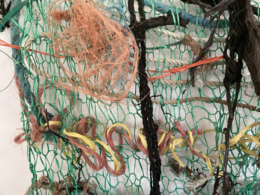
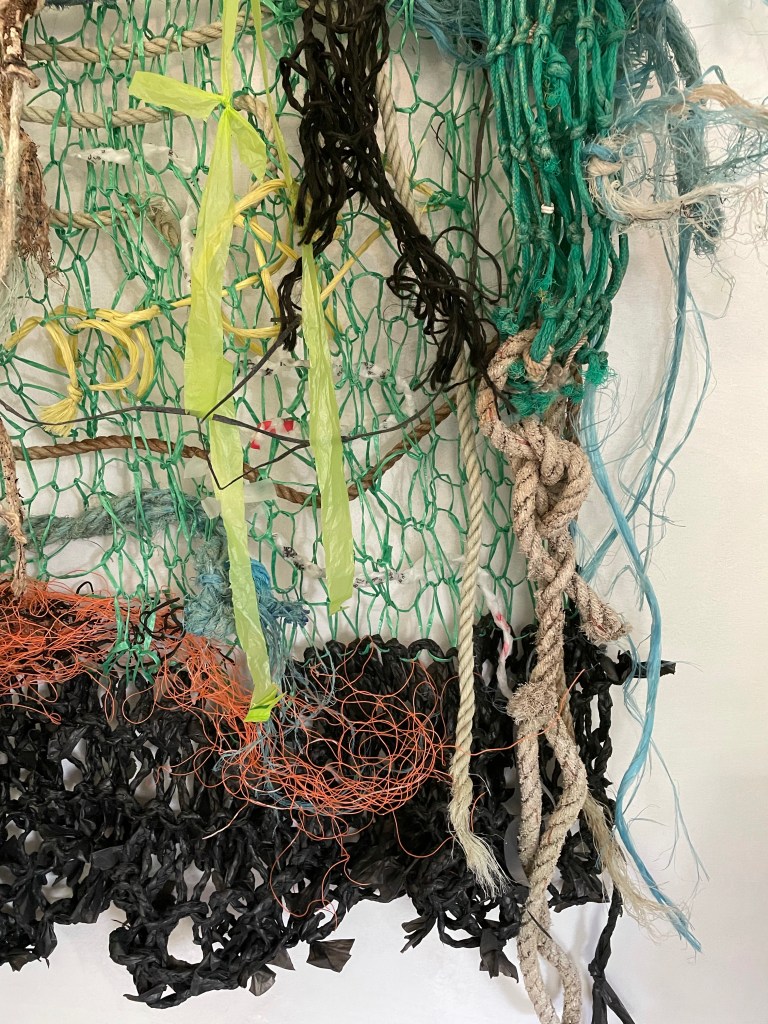
I liked the tactile feel of the ropes and strips of fabric as they were very soft and I also wove in a piece of rubber and some wire.


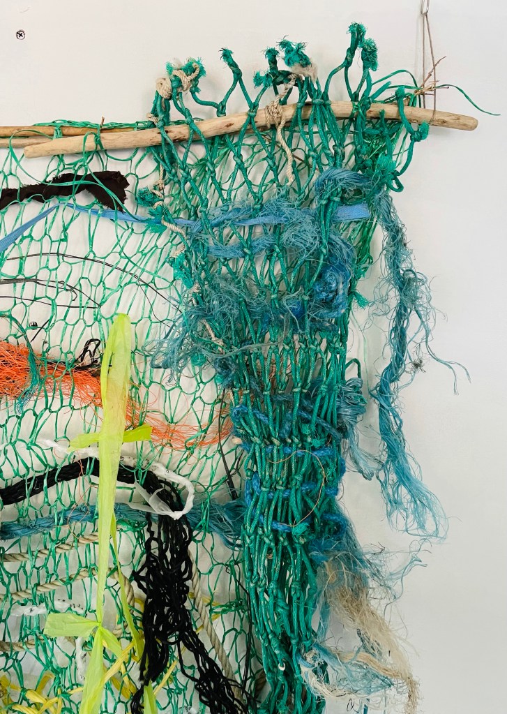
I felt pleased with the section of the piece made from my home made black yarn, it rippled fluidly and the raw ends added interest. It was incredibly strong and flexible and I think this yarn on a much bigger scale could be a very attractive thing.


This part was my favourite as from a few steps away, the plaits cannot be seen but close up they look far more delicate and almost ethereal.
What I do like about my finished large scale material manipulation is that it is unusual and the homemade yarn was absolutely fantastic to work with as well as being unbelievably strong. It looked like lacework at the bottom of the net and when the wind catches it it literally ripples which is very eye-catching. As it will not decay I may have it as an installation on the end gable of my workshop as if it was evenly pegged out it could be used to grow honeysuckle or sweet peas on and I think this would give back to nature rather than take away. It may not turned out as I envisaged but after much time leaving it hung up and going back and revisiting it, I felt happier with it. I was often too busy thinking it wasn’t perfect enough but less is definitely more as too many items in the knitted net would have made it impossible to see the detail and different textiles within it.
Reflection on Foundation Textiles
I have been both enamoured with and frustrated by Foundation Textiles with OCA. It has taken me far far longer to complete the course than I ever thought it would and whilst I can partially attribute this to the Covid 19 pandemic and its effects on my family and wider society, it is also due to my own timekeeping as I did not always devote enough time to my studies and I would do lots of reading but not enough practical work despite my good intentions.
I have invested in a proper workshop to incorporate my small business and also it has room for me to have a large table of my own to work on and which I can leave my work and tools out on rather than have to pack all my things away ready for mealtimes. I have verbalised enough by now about OCA’s decision to no longer accept Textiles assignments being sent to our tutors to be assessed and although I hope at time of writing that this would be reversed, I somehow don’t think it could be and I will have to improve my digital skills, especially photography.
But what I cannot thank OCA for enough is the lifelong impact of learning so much, not only about myself but in the skills I didn’t know I had. I had no idea about how to draw and that I don’t need to be able to draw to a fine art standard and that making and using my own tools to draw with would be so good and so much fun. These are good skills to build on in the future for when I am ready to start the degree in Textiles and I now prefer to draw with a stick and black ink from a pot rather than a pencil. I have loved creating three dimensional samples and structures, making my own natural dyes and even got more comfortable with my sketchbook. I don’t want to lose those skills so will be continuing to widen them over the following year before I begin the degree course as I have decided to have a break in between the next chapter in Textiles. I am grateful to my family for putting up with me creating so much mess and for the amount of clutter I have created with all good intentions of using found objects in my studies, but once you start collecting found objects it is hard to stop! I am also very grateful to my tutor Lizzy Levy for listening to my tales of woe, for inspiring me and encouraging me and for all the information, guidance and motivation she provided. Without such good people in my life I would not have been able to have done Foundation Textiles.