Research
From the course materials for part two I was asked to begin by conducting research on three artists who have used collage in their work. I chose Hannalore Baron, Henri Mattise and Hannah Hoch. I don’t know much at all about art and do not consider myself to be an art critic in any way at all, but I’m going to write about some examples of art by the above artists, what I liked about their art and why I like those particular pieces. I have purposely not read other peoples own thoughts on the collages as I wanted to see what I came up with on my own.
Hannalore Baron (1926 – 1987)

Hannalore Baron was born in Germany and had escaped the pre-war Nazi regime in 1939, subsequently Baron and her family then settled in New York City. I read that in her adult life, Baron had experienced claustrophobia and depression and often had relapses in her mental health throughout her life.
Baron began making her first collages as a stay at home mother in the 1950s, she gave a one person art exhibition in 1969 at Ulster County Community College and then she began to make the box constructions that would become her signature work. Baron dedicated her time to creating artwork in the 1970s having established her own studio.
Baron’s theme was centred around personal and political statements, which she explained in her own words.
Everything I’ve done is a statement on the, as they say, human condition…the way other people march to Washington, or set themselves on fire, or write protest letters, or go to assassinate someone. Well, I’ve had all the same feelings that these people had about various things, and my way out, because of my inability to do anything else for various reasons, has been to make the protest through my artwork… H.B.
(source: https://en.wikipedia.org/wiki/Hannelore_Baron)
I felt an affinity towards Baron, she seemed a quiet rebel and also I think the 1950s perfect family image must have made so many women feel trapped in an endless cycle of domesticity. As much as I love my own children, I needed focus in my life and to have something to aim for and to learn, which oddly enough was why I chose to do this course. I think having a creative outlet is so important for mental health and when I looked at Baron’s box constructions, I felt genuine empathy for how she must have struggled during a mental health relapse and especially how the agoraphobia had reflected in her work, that she felt she was living in a box and unable to escape. Through using a physical piece of art, Baron was able to communicate in ways she may not have been able to verbally, plus to extend that almost secret code of art to try and reach expressively to other people who may have similar experiences.

(Untitled C. 1970)
(source: http://hannelorebaron.net/works.html
I know this is not a paper collage but the above piece interested me as I saw it as a cupboard of the mind with recesses where thoughts and memories were stored and I liked the construction of it with the different layers, almost like a treasure chest. I like the aged appearance and how each part of the box is fitted together and supporting those sections around it. It is very detailed and the lower left hand section resembles a dartboard and has holes in it. The top right section made me think of a person hiding in a room and only having one window from which to make sense of the world outside. When Baron and her family escaped persecution in Germany, her father had been beaten during Kristallnacht and their home was ransacked so I wondered if these difficult times in Baron’s life had contributed to this piece.

(Untitled, 1976)
(Source: http://hannelorebaron.net/works.html)
The collage above is Untitled (1976) and is made from paper, cloth and ink. I saw a rawness here and perhaps a silent scream by the red lines at the top. It felt like it was trying to convey order with the images side by side but then that Baron had almost scribbled on the page, possibly to release pent up angst and her own frustration at not being able to live her own real life as she wanted to as her mental health was a barrier.
The collage also features numerals and symbols in red ink, I was unsure if this could be a secret code or a mathematical formula. From what I could see there is found paper or cloth also used and the whole piece looks very fragile and delicate. I really liked the detail in this piece and that this isn’t seen until you look much deeper at it. I found the colours used complimented one another well and made the use of red stand out much more. I would love to look at this piece very closely in order to make further observations about the use of the red details but this one was my favourite out of the four examples I chose.

(Untitled, 1982)
(Source: (source: http://hannelorebaron.net/works.html)
The piece above is Untitled (1982) made from paper, cloth and ink. I thought this may have been made with found paper and fabrics. This piece in particular made me sad looking at the two little figures and they also looked almost childlike and vulnerable. Upon looking closer, I think the figures are mirror images of one another and almost like twins, I wasn’t sure if this was a block silhouette to ensure the figures would match. There seems to be a third figure to the right but in a deep red colour and a slightly different shape.
I liked the colours used in the collage in the middle and the different patterns as they light up the page and instantly draw the eye to that area. In 1973 Baron was diagnosed with cancer and I felt that the darker figures could represent her children and the more faded figure could be Baron’s concerns about her childrens lives without her and her own deep worries about the future and her own mortality. The collage tells a story which I found interesting to look at.
I found Baron’s work particularly interesting as her colour palette is similar to my liking for vintage and distressed fabric and paper. I have collected vintage lace over the years and the most faded and discoloured sections are my favourites as they reflect history and a different way of life when such items were not always the more common man made threads and produced in giant factories.
Hannah Hoch (1889 – 1978)

Hannah Hoch was a German Dada artist who gained recognition during the Weimar period, which was the beginning of an arts and sciences movement which occurred during the interwar time in between World War One and World War Two. Dada itself was an art movement which reflected the terrible consequences of war and represented it in an art form as nonsensical and to enable awareness of negative attitudes to such human suffering.
Hoch’s concept was using photomontage as a way of making a collage to raise awareness as discussed in the previous paragraph, Hoch was among the first artist who used the photomontage to express Dada art and her own messages. Hoch showed similar themes of feminism at times like those of Hannelore Baron.
Hoch said the following to emphasise her artistic direction:
‘I wish to blur the firm boundaries which we self-certain people tend to delineate around all we can achieve.’
(source: https://www.azquotes.com/author/75714-Hannah_Hoch)

Cut with the Kitchen Knife Dada through the Last Weimar Beer-Belly Cultural Epoch of Germany, 1919. Hannah Hoch.
(source: https://www.inthein-between.com/hannah-hoch/)
I chose this example of a paper collage made by Hoch as there is so much information within it. It combines both words and images to provoke thoughts of the influences Hoch was conveying. It has many images of men, some of men in army uniform and dressed in suits and top hats, possibly the same men who were wealthy and using that wealth to promote their own political views and allegiances, effectively those men at the top of the food chain and who had all the power. There are men working at desks, in queues, in groups and also an image of children, maybe this is the impact of the war upon children who may have lost family members or their own lives.
There seems to be machinery parts distributed throughout the collage, perhaps the infamous ‘cogs of war’. A female face is placed within one section of cogs, almost as if she could be ground up by them. There are also images of female forms with a man’s head on them, my particular favourite was the piece of a chubby baby’s body with a bearded man’s face on top looking the opposite way, perhaps reinforcing a childish attitude.
The other favourite image on the collage is of a woman reaching above her, seemingly to catch a man, this made me think that the woman is depicted as the reliable safety net when things all go wrong.
The collage has words cut out from magazines or newspapers with phrases in German and also ‘Dada’ several times, this could have been to explain the new art style and to help orientate the person viewing it with a clear message. ‘Leger die ihr geld’ in German translates as ‘relaxed her money’ and I’m not sure if this was money being invested into political parties and subsequent war or a message towards fellow artists within the Dada group as described in the quote below:
‘Hans Richter patronizingly dismissed her contribution to the movement by calling it merely “the sandwiches, beer and coffee she managed somehow to conjure up despite the shortage of money,” failing to note that Hoch was among the few members of her immediate artistic circle with a reliable income’.
(source: https://www.inthein-between.com/hannah-hoch/)
To sum up the above work by Hoch in this 1919 piece, it is so emotive of the feelings of both women in that time as well as showing the futility of war and its effects on the German people. I found it emotional to look at and would love to see a bigger print of it as there is so much more for it to tell.

Dompteuse (Tamer), 1930. Hannah Hoch.
(source:https://www.inthein-between.com/hannah-hoch/)
I thought the background of this collage resembled an iron plate which reminded me of a ship’s hull. I felt this could emphasise the iron will and strength of women to cope with family life, work and change. The collage also seems to depict the woman with muscled hairy arms to convey the physical aspects required to meet the demands of work and the challenges of living in a time when women were very much viewed as the weaker sex and that a woman’s role was to provide a home and to be obedient towards their husbands. This collage was in the pre-war years of World War Two and there were many changes occurring in Germany where the society’s themes were dominated by politics with the growing undertone of antisemitism. ‘Dompteuse’ in English means ‘tamer’ and it made me wonder if the woman was trying to tame her husband or men generally.
The woman’s clothing was interesting to me, the top she is wearing looks almost military but the skirt is very soft and feminine and designed to emphasise the curve of a woman’s hips to reflect her sexuality and desirability.
I like the face of the woman as she reminded me of a statue of the Virgin Mary, perhaps this is the kind of theme Hoch wished to convey as the ideal values for a wife and mother. She looks downcast and her eyes are narrow and from what I could make out, the eye shape seems very similar to those of the seal emerging from the water in the lower right section of the collage. The top of the woman’s head appears to be empty as if she is not supposed to have a brain or perhaps be able to express her own choices and decisions.
The seal peering out of the blackness looks scary to me, I could not think of any possible meaning behind it but it did look malevolent.
What I really liked about this collage was the way that Hoch used torn edges to create a frame for the woman to sit in, I’ve always liked torn edges as they are more difficult to create and take time and often several attempts but it creates a softness to the whole image. This particular collage by Hoch was my favourite as it was simple yet effective in providing a message and I enjoyed researching Hoch’s work and it made me think about what I would like to achieve through a collage myself.
Henri Matisse (1869 – 1954)
Matisse was a French painter, sculptor and collage artist who ‘is commonly regarded, along with Pablo Picasso, as one of the artists who best helped to define the revolutionary developments in the visual arts throughout the opening decades of the twentieth century, responsible for significant developments in painting and sculpture.’ (Source: https://www.tate.org.uk/art/artists/henri-matisse-1593).
Matisse was a draughtsman and printmaker and his highly colourised style of painting gave him great notoriety, later in life due to ill health he began working with cut paper collages which I shall now discuss.
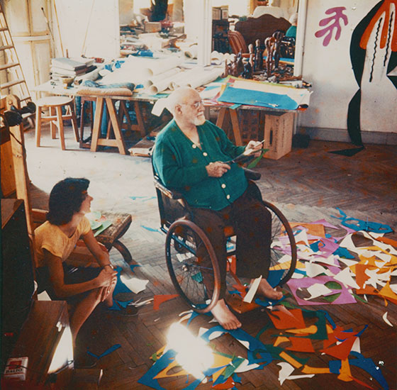
Matisse at the Hotel Regina, Nice in 1952.
(Source: https://www.moma.org/interactives/exhibitions/2014/matisse/the-cut-outs.html)
Matisse began with cut paper collages that he called ‘cut outs’ using paper that had been painted with gouache with some collages being murals and later room size. This form of expression was used until his death aged 84. Matisse coined the phrase ‘drawing with scissors’ and used varying sizes of scissors in his work.

( La Gerbe, 1953) (source: http://www.henri-matisse.net/paintings/ex.html)
La Gerbe was a paper cut out of leaves to resemble a whole flower. Matisse created this only a few months before his death. From what I can see, there are different styles of leaf which some look like block silhouette pattern repeat. I really like the colours and the layout of the leaves as an abstract and it does remind me of a rose by the way it is possible to see petals of a rose by the similar colour leaf pattern. I like its simplicity and it reflects beauty to me rather than a series of hidden metaphors, although I could be wrong! From what I have read, this cut out was actually wall sized and so cutting gouache painted paper at this size would have been not only difficult but would have required extensive planning to maintain the equal sizes of the different types of leaves. 
Blue Nude, Matisse, 1952
(source: https://www.henrimatisse.org/cutouts.jsp#prettyPhoto%5Bpaintings%5D/2/)
I really like this particular cut out as it has such clean and defined lines and that the lines are of the same thickness. The whole picture has such fluidity and the colour of the woman stands out against the background. The woman is in a relaxed pose and has one leg curled protectively around herself. This cut out has taken extreme skill in being able to cut out each piece in order for it to fit perfectly next to those adjacent to it. I also like from what I can gather is that the cut out pieces are not perfectly coloured as the effect is more textured than flat colour.
I have read that Matisse would direct his staff in how he wanted each piece placed and that many cut out collages were placed on a wall with pins and moved and pinned again until Matisse was satisfied with the result. Some of Matisse’s work was also traced with tracing paper as Matisse was concerned about the art pieces being damaged or ageing in any way. Matisse also liked the gouache brush strokes in some of his pieces and had designed his own colour palette.

Project for The Strana Forandola, 1938
(Source:http://artobserved.com/2014/08/london-henri-matisse-the-cut-outs-at-the-tate-modern-through-september-7th-2014/andola, 1938)
The above collage caught my eye and interested me as upon first glance I thought there were little dots on the cut out but when I looked closer I saw the dots were colour coordinated pins. From my research Matisse liked to try and create a three dimensional aspect to some of his cut outs and this does make this collage really pop. I could not decide whether the figure in white was resembling a peacock or Icarus flying towards the sun with golden wings, whilst the black coloured figure looks up in wonder.
I liked the colours, the combinations of which really made the white figure appear almost translucent against the blue background. The pose of the black coloured figure I think is very clever as it does give the air of great emotion which may not have worked as well had this section of the cut out been one single piece. I also thought the use of a contrasting frame was innovative, almost creating a snapshot in time with the yellow line to break up the orange and almost acting as a title. I found the whole collage very appealing and that Matisse brought a great deal to art through his paintings and collages which have certainly stood the test of time.
All three artists who I have researched have their own styles and signature of work and I have enjoyed learning more about Baron, Hoch and Matisse and also about collage. I have gained ideas and concepts from which I would like to influence my work in Part 2 of the course. I felt my favourite of the three artists was Baron as I could see her isolation and low mood and felt empathy with how she must have felt.
So with this research exercise completed I will now look into the next exercise on collage with found papers.
